Introduction
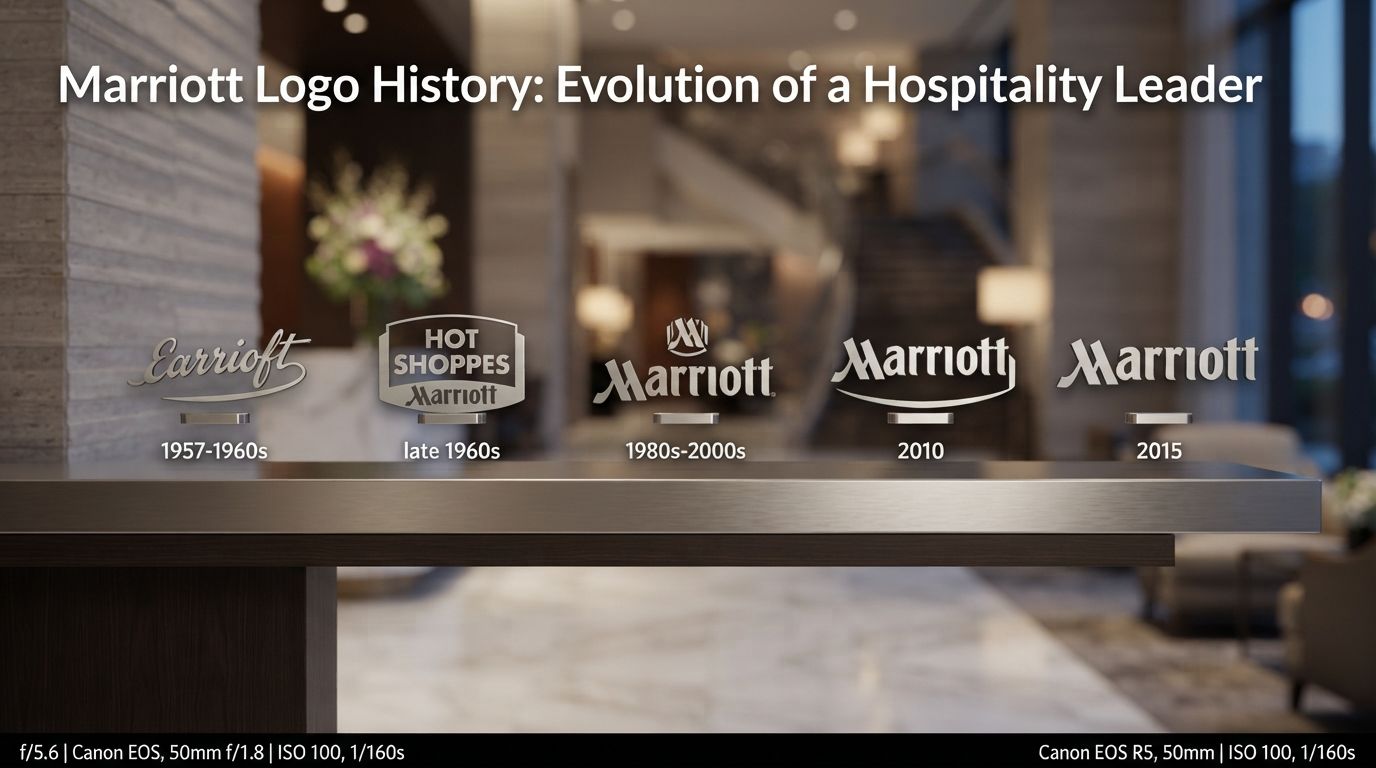
In the highly competitive world of global hospitality, visual identity is not merely an aesthetic choice; it is a foundational pillar of trust, expectation, and brand equity. When travelers navigate unfamiliar cities across the globe, a familiar emblem on a skyscraper or above a grand entrance provides an instant promise of comfort, safety, and world-class service. Among the most recognizable symbols in this industry is the Marriott logo. The story behind this visual mark is not just a study in graphic design, but a reflection of a corporate journey that spans nearly a century. From a humble nine-seat root beer stand in Washington, D.C., to an international hospitality powerhouse managing over 30 brands and thousands of properties worldwide, the Marriott Logo History: Evolution of a Hospitality Leader serves as a masterclass in brand evolution and strategic adaptation.
Understanding how Marriott’s visual identity transitioned through various design eras requires looking beyond the logos themselves. It demands an examination of shifting consumer behaviors, the post-World War II travel boom, the rise of digital-first branding, and the complex architecture of modern corporate portfolios. Over the decades, Marriott has successfully balanced the preservation of its heritage with the necessity of modern minimalist design. This article provides an exhaustive, multi-layered exploration of the Marriott Logo History: Evolution of a Hospitality Leader, analyzing how each stylistic pivot aligned with the company’s broader business strategy and set new benchmarks for the global service sector.
The Humble Beginnings: Hot Shoppes and Early Visuals (1927–1950s)
Before Marriott became synonymous with luxury suites and business hotels, it was a modest food service enterprise. In the spring of 1927, J. Willard Marriott and his wife, Alice, opened an A&W Root Beer franchise in Washington, D.C. As the colder winter months approached, they realized that cold beverages alone would not sustain the business. They pivoted by adding hot Mexican food items to their menu, renaming the establishment “Hot Shoppes.” This transition marked the birth of a brand that would eventually reshape the global hospitality landscape.
The Visual Identity of Hot Shoppes
The early visual identity of Hot Shoppes was highly reflective of mid-century American diner culture. Far from the minimalist, abstract corporate logos we see today, the early Hot Shoppes branding relied on illustrative, friendly, and narrative-driven graphics. The goal was simple: project warmth, affordability, and family-oriented service to a rapidly growing suburban population.
The primary visual assets of this era included:
- The Running Boy Mascot: Often referred to as the “Hot Shoppes Boy,” this cartoonish mascot depicted a cheerful curb-service waiter running with a tray. It communicated speed, efficiency, and friendly customer service—essential values during the rise of drive-in dining in America.
- Bold, Playful Typography: The signage utilized thick, custom-drawn script and block letters. These were designed to catch the eyes of passing motorists on increasingly busy American roadways.
- Vibrant Color Palette: High-contrast colors, particularly warm oranges, reds, and yellows, were utilized to stimulate appetite and create an inviting, energetic atmosphere.
This early era established a crucial precedent for the company: the visual identity must directly serve the customer experience. As the company expanded into in-flight catering services for airlines and corporate cafeterias during the 1930s and 1940s, the branding adapted to project hygiene, efficiency, and reliability, laying the groundwork for its eventual entry into the lodging sector.
The Transition to Lodging: The Twin Bridges Era (1957–1960s)
The year 1957 marked a monumental shift in the company’s trajectory. Recognizing the immense potential of the interstate highway system and the growing mobility of the American family, the Marriotts opened their first lodging property: the Twin Bridges Motor Hotel in Arlington, Virginia. Managed by J. Willard Marriott’s son, Bill Marriott, this move initiated the company’s transformation from a food service provider into a hospitality leader.
The First Lodging Marks
With the opening of Twin Bridges, and subsequently the Key Bridge Marriott in 1959, the company needed a visual identity that conveyed comfortable lodging rather than fast food. The initial logos for these motor hotels were heavily influenced by the architectural and design trends of the late 1950s and early 1960s, a period dominated by “Googie” architecture and space-age optimism.
During this transitional phase, the branding featured:
- Mid-Century Geometric Fonts: The typography moved away from the whimsical scripts of Hot Shoppes toward cleaner, more structured sans-serif and slab-serif typefaces. This conveyed a sense of modern structural integrity and professionalism.
- The “Motor Hotel” Descriptor: The early signs prominently featured the words “Motor Hotel” or “Motor Hotel by Hot Shoppes,” bridging the gap between the established food brand and the new lodging venture. This strategic choice leveraged existing brand equity to build trust in a completely new industry sector.
- Illuminated Neon Signage: On the roadside, the logo was translated into massive, glowing neon installations. These signs acted as literal beacons for travelers, emphasizing high visibility, cleanliness, and modern amenities like air conditioning and swimming pools.
In 1967, reflecting the massive diversification of the business, the corporate name was officially changed to Marriott Corporation. This name change necessitated a standardized, cohesive corporate logo that could unify the company’s expanding portfolio of hotels, restaurants, and travel services.
The Birth of the Iconic Stylized ‘M’ (1970s–1980s)
As Marriott entered the 1970s, it was no longer a regional player. It was rapidly becoming a national and international hospitality powerhouse. To match this corporate maturity, the company underwent a comprehensive rebranding initiative. This era gave birth to what would become one of the most recognizable logos in corporate history: the stylized, bold Marriott “M.”
Analyzing the Design Mechanics of the Classic ‘M’
Introduced in the early 1970s, the new corporate logo moved completely away from illustrative elements and regional aesthetics. Instead, it embraced the principles of Swiss design and corporate modernism, which favored abstraction, clean geometry, and high functional versatility.
The key design characteristics of this legendary logo included:
- The Stylized Letter ‘M’: The focal point of the logo was a custom-designed capital letter “M.” The letter featured unique, sweeping curves that suggested movement, growth, and welcoming open doors. It was robust, balanced, and instantly memorable.
- Elegant Burgundy and Red Color Palette: The primary color shifted to a deep burgundy or rich red. In color psychology, burgundy and deep red represent luxury, stability, passion, and authority. This distinguished Marriott from competitors who often used standard blues and greens, positioning the brand as a premium, reliable choice for business and leisure travelers alike.
- Serif Typography: The word “Marriott” was rendered in a classic, high-contrast serif font. This typographical choice balanced the modern, abstract nature of the stylized “M” with a sense of timelessness, heritage, and prestigious tradition.
This logo was a masterpiece of functional design. It translated perfectly across an incredibly diverse range of touchpoints. Whether printed on a tiny matches box, stitched onto staff uniforms, embossed on corporate letterheads, or fabricated into massive three-dimensional signs atop high-rise hotels, the logo maintained its visual integrity and immediate brand recognition. It was during this era that the core foundation of the *Marriott Logo History: Evolution of a Hospitality Leader* was firmly cemented in the minds of global consumers.
Evaluating Corporate Identity Shift with Logo Designs
When analyzing the evolution of global brands like Marriott, it becomes evident that a corporate logo is never static. It must continually adapt to represent corporate restructuring, mergers, acquisitions, and shifting market dynamics. For businesses seeking to navigate these complex transitions, partnering with professional agency services like Logo Designs can provide the strategic insight and creative expertise required to execute a seamless brand evolution.
A professional design approach ensures that when a brand modernizes, it does not lose the valuable brand equity built over decades. Just as Marriott carefully managed the transition of its iconic “M” through various corporate restructuring phases, contemporary businesses must approach logo redesigns with a balance of historical respect and forward-looking innovation. Professional design services specialize in creating cohesive brand architectures, ensuring that master brands and their sub-brands communicate a unified message across all physical and digital channels.
The Era of Brand Architecture and Diversification (1990s–2000s)
By the late 1980s and early 1990s, the hospitality industry was undergoing a massive shift toward segmentation. Travelers were no longer viewed as a single, homogenous group. Instead, the market was divided into distinct segments: budget-conscious road trippers, extended-stay business travelers, mid-scale family vacationers, and ultra-luxury executives.
Rather than trying to serve all these segments under a single monolithic brand, Marriott initiated an aggressive multi-brand strategy. They launched or acquired specialized brands such as Courtyard by Marriott, Fairfield Inn, Residence Inn, and eventually the ultra-luxury Ritz-Carlton. This diversification posed a massive challenge for corporate identity and brand architecture.
Monolithic vs. Endorsement Branding
To manage this growing portfolio, Marriott adopted an “endorsement” branding strategy. The corporate Marriott brand acted as a guarantor of quality, while the individual sub-brands maintained their own unique visual identities tailored to their specific target audiences.
The visual execution of this strategy included:
- The “By Marriott” Endorsement: Sub-brands like Courtyard and Fairfield prominently featured the phrase “by Marriott” alongside their unique logos. This endorsement was accompanied by a mini-version of the classic stylized “M” or the standard Marriott serif typeface. This assured travelers that they would experience Marriott’s high standards of service, regardless of the price point.
- Refining the Corporate Logo: In the late 1990s, the core corporate logo underwent subtle refinements. The lines of the stylized “M” were cleaned up, and the typography was adjusted to improve legibility on digital screens, which were beginning to play a role in travel planning and booking.
- Color Standardization: The deep corporate burgundy was standardized across all corporate communications, creating a unified visual thread that tied the sprawling empire together.
This careful management of brand architecture allowed Marriott to scale rapidly without diluting the premium value of its core brand. It demonstrated that a successful logo history is not just about changing symbols, but about strategically managing how those symbols interact with a diverse portfolio of products and services.
Modern Minimalism and Digital-First Redesign (2010s–Present)
The dawn of the smartphone era and the rise of digital travel platforms completely transformed how consumers interacted with hospitality brands. Booking apps, mobile keycards, and social media feeds became the primary touchpoints for the modern traveler. This digital revolution demanded a radical shift in visual identity. Logos needed to be highly legible at small scales, adaptable to responsive web designs, and resonant with a younger, experience-driven demographic.
The Simplified Flat ‘M’
To thrive in this digital-first ecosystem, Marriott introduced a modernized, flat version of its iconic logo. The 3D gradients, shadows, and complex textures of the past were completely stripped away in favor of clean, flat design principles.
The characteristics of this modern digital identity include:
- High Digital Scalability: The flat, solid-color “M” remains perfectly legible whether displayed as a tiny icon on a smartphone screen, an app notification, or a massive sign on a building facade.
- Typographical Modernization: The serif typeface of the word “Marriott” was modernized. The letters were given cleaner curves and optimized spacing to enhance readability across all digital platforms.
- Adaptable Color Strategy: While the classic burgundy remains the primary corporate color, the logo is frequently used in monochrome (black or white) configurations, allowing it to integrate seamlessly into diverse design layouts and digital interfaces.
The Launch of Marriott Bonvoy (2019)
Perhaps the most significant visual transformation in recent *Marriott Logo History: Evolution of a Hospitality Leader* occurred in 2019. Following the massive $13 billion acquisition of Starwood Hotels & Resorts in 2016, Marriott merged its three existing loyalty programs (Marriott Rewards, Ritz-Carlton Rewards, and Starwood Preferred Guest) into a single, unified program: **Marriott Bonvoy**.
The creation of the Marriott Bonvoy logo represented a shift from a traditional corporate hotel brand to an experiential travel program:
- Experiential Branding: The word “Bonvoy” (derived from the French phrase “Bon Voyage”) was paired with a highly contemporary, minimalist logo. It features a bold, sans-serif font with a stylized, flowing “O” that evokes travel, connection, and global horizons.
- A Youthful and Dynamic Identity: The Bonvoy visual identity uses vibrant lifestyle photography, bold typography, and a modern color palette to appeal to millennial and Gen-Z travelers who prioritize experiences over standard business lodging.
- The Ecosystem Anchor: Today, the Marriott Bonvoy logo acts as the primary consumer-facing brand, anchoring the entire portfolio of over 30 hotel brands under a single, highly engaging visual umbrella.
Key Takeaways from Marriott’s Brand Evolution
The journey of Marriott’s visual identity provides invaluable lessons for brand strategists, designers, and business leaders. Here are the key takeaways from the Marriott Logo History: Evolution of a Hospitality Leader:
- Align Design with Business Strategy: Every major shift in Marriott’s logo—from the playful Hot Shoppes mascot to the modern flat “M”—was directly driven by a fundamental change in the company’s business model and target audience.
- Maintain Core Brand Equity: Even as Marriott modernized its visual identity, it preserved key historical elements, such as the iconic “M” shape and the sophisticated burgundy color palette, ensuring long-term brand recognition and trust.
- Prioritize Scalability and Versatility: A world-class logo must perform flawlessly across an endless variety of mediums, from massive physical building signage to mobile app icons and digital screens.
- Manage Brand Architecture Strategically: Through endorsement branding (“by Marriott”) and the creation of Marriott Bonvoy, the company successfully managed a diverse portfolio without diluting the value of its master brand.
- Adapt to Technological Shifts: Transitioning to flat design principles and digital-first typography ensures that the brand remains highly relevant, legible, and engaging in an increasingly mobile-centric world.
Frequently Asked Questions
1. When was the first Marriott logo created?
The first corporate Marriott logo was established in 1967 when the company officially changed its name from Hot Shoppes, Inc. to Marriott Corporation. Prior to this, the company utilized illustrative logos and mascots for its Hot Shoppes food chain and early motor hotels.
2. What does the Marriott ‘M’ logo represent?
The stylized Marriott “M” introduced in the 1970s represents modernism, structural stability, and a welcoming gesture. The elegant, flowing curves of the letter are designed to suggest movement, global reach, and open doors, aligning with the brand’s core mission of hospitality.
3. Why did Marriott change its loyalty brand to Marriott Bonvoy?
Marriott launched Marriott Bonvoy in 2019 to unify its three separate loyalty programs (Marriott Rewards, Ritz-Carlton Rewards, and SPG) following the Starwood acquisition. The name and modern logo were designed to shift the brand from a transactional hotel rewards program to an experiential travel brand.
4. What is the significance of the burgundy color in the Marriott logo?
In color psychology, burgundy and deep red symbolize luxury, reliability, authority, and warmth. Marriott adopted this color palette in the 1970s to distinguish itself from competitors and to visually communicate a premium, trustworthy hospitality experience.
5. How does the Marriott logo handle digital-first branding?
Marriott modernized its identity by transitioning to a flat design version of its iconic “M” logo. This eliminated complex gradients and shadows, ensuring maximum legibility, high scalability, and seamless performance across smartphones, apps, and digital platforms.
Conclusion
The Marriott Logo History: Evolution of a Hospitality Leader is a compelling testament to the power of strategic visual communication. Over nearly a century, Marriott has demonstrated an extraordinary ability to reinvent its visual assets to match its corporate growth, technological advancements, and shifting consumer preferences. By successfully transitioning from a regional roadside eatery to an international luxury hospitality titan, the company has proven that a logo is not just a static mark, but a living asset that must grow, adapt, and resonate with every generation of travelers.
By preserving the core equity of the iconic stylized “M” while daringly launching modern, experiential brands like Marriott Bonvoy, Marriott has established a timeless visual system. It remains a shining beacon of trust, quality, and hospitality on every continent. As the digital landscape continues to evolve and new travel trends emerge, Marriott’s visual identity will undoubtedly continue to adapt, reinforcing its position as an undisputed leader in the global hospitality industry.