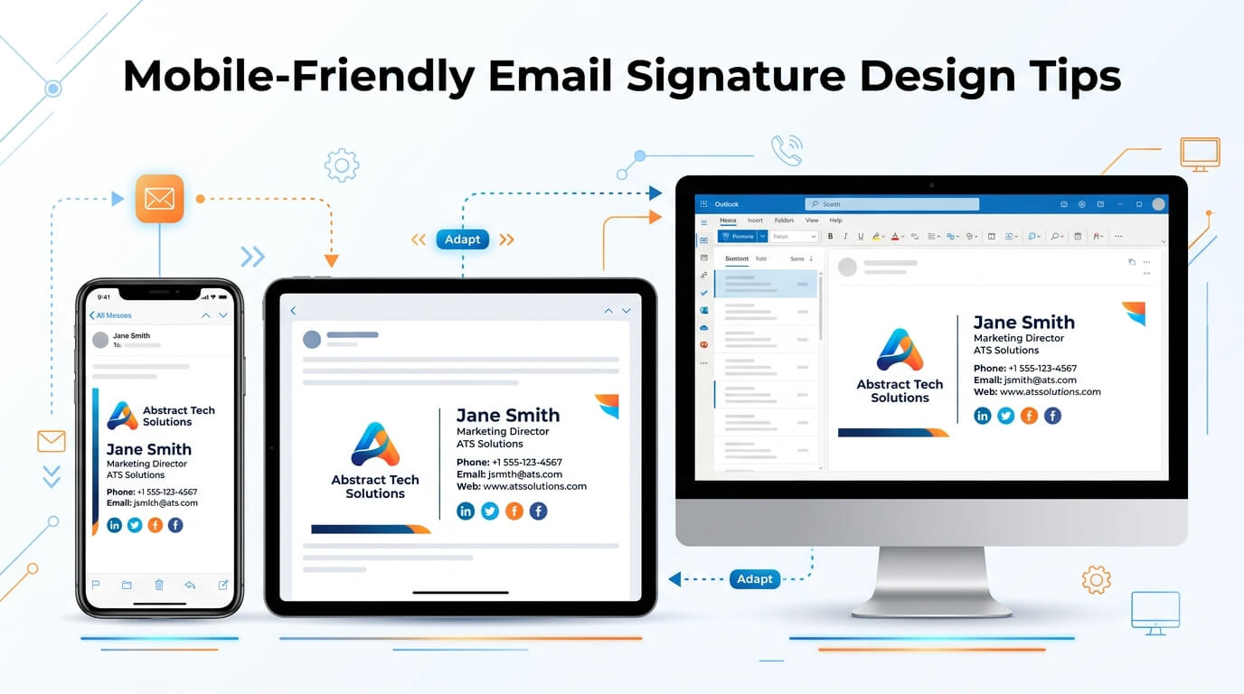
Email signatures have become a small but important part of professional communication. A signature may appear at the end of an email, but it often carries several pieces of information at once, including a person’s name, job title, company details, contact information, website, social media profiles, and sometimes a logo or promotional message. When an email is opened on a desktop computer, there is usually enough screen space to display these elements comfortably. Mobile devices are different. A signature that looks polished on a large monitor can quickly become crowded, difficult to read, or awkwardly arranged on a smartphone.
With more people reading and responding to emails from phones and tablets, mobile-friendly email signature design has become an important consideration for businesses of all sizes. A well-designed signature should remain readable, functional, and visually balanced regardless of the screen on which it appears. This means paying attention to layout, font sizes, images, links, spacing, and the amount of information included.
Mobile optimization does not necessarily mean creating a completely different signature. Instead, it means designing the signature with smaller screens in mind from the beginning. The goal is to create a professional email signature that communicates essential information without making the recipient zoom, scroll excessively, or struggle to find a phone number or link.
Why Mobile-Friendly Email Signatures Matter
Email communication has changed significantly as smartphones have become a routine part of professional life. Employees frequently check messages while traveling, between meetings, during commutes, or while working away from their desks. This makes mobile email usability an important part of everyday business communication.
An email signature that works well on mobile can make contact information easier to access. If someone receives an email from a potential client and wants to call the sender, the phone number should be easy to locate and tap. Similarly, a website or social media link should be recognizable and functional without forcing the reader to manipulate the screen.
A mobile-friendly signature also contributes to the overall impression of a company. Small design problems can make an otherwise professional email feel outdated. A logo that becomes enormous, several lines of text that wrap awkwardly, or social icons that appear scattered across the screen can distract from the actual message.
The signature should therefore support the email rather than compete with it. Good design keeps the information organized while maintaining a visual connection with the company’s branding.
Keep the Signature Simple and Focused
Include Only Information That Matters
One of the most important principles of mobile-friendly email signature design is simplicity. A smartphone screen provides much less space than a desktop monitor, so every element needs to have a purpose.
A professional signature might include the sender’s full name, position, company name, phone number, email address, and website. Depending on the organization, it may also include a physical address, booking link, social media icons, or a short legal disclaimer. However, including every possible detail can make the signature unnecessarily long.
The more information a signature contains, the more likely it is to become difficult to scan on a small screen. Instead of asking whether another element can be added, consider whether it genuinely helps the recipient understand who sent the email or how to contact them.
Prioritize Contact Information
Contact details should be presented according to their importance. A person’s name and professional role should generally receive the strongest visual emphasis. Contact methods can follow underneath in a clear and logical order.
For example, a mobile-friendly structure might place the person’s name first, followed by their role and company, then a phone number and website. This creates a natural reading path and makes essential information easy to locate.
Choose Fonts Carefully
Typography has a major impact on how an email signature appears on mobile screens. A font that looks comfortable on a large display can become difficult to read when reduced to a smartphone-sized layout.
Use Readable Font Sizes
Small text may help fit more information into a signature, but it can make the signature frustrating to read on a phone. A comfortable font size is generally preferable to trying to squeeze every detail into a limited area.
The exact size can vary depending on the font, platform, and design, but the underlying principle is consistent: readability should come before compactness. Names and important contact details should be especially easy to read.
Select Web-Safe and Familiar Fonts
Simple fonts are often more reliable across email applications and devices. Using an unusual typeface can create inconsistent results if the recipient’s email application does not support it.
Clean sans-serif fonts are frequently used in professional email signatures because they tend to remain clear at smaller sizes. The objective is not to make the signature look highly decorative. It is to make it feel polished while ensuring that the recipient can read it quickly.
Design for a Narrow Screen
A desktop email signature can use horizontal space effectively. A mobile screen cannot. This is one of the most important differences to consider when designing an email signature.
Avoid Wide Layouts
Two-column layouts can look attractive on desktop screens, with contact information on one side and a logo or photograph on the other. However, those columns may become compressed or wrap unexpectedly on mobile devices.
A narrow, vertical structure is usually easier to adapt to different screen sizes. Information can flow naturally from one line to the next instead of being forced into a rigid arrangement.
Think About Text Wrapping
Text wrapping is not necessarily a design problem. In fact, allowing information to move onto a second line can be better than creating an overly wide signature. What matters is whether the wrapping remains intentional and readable.
Long company names, job titles, addresses, and website URLs can cause unexpected line breaks. Testing the signature on multiple screen widths helps identify these problems before the signature is used across an organization.
Optimize Images and Logos
Images are common in professional email signatures, particularly company logos, employee photographs, and promotional graphics. They can strengthen branding, but they also need to be handled carefully for mobile use.
Use Appropriately Sized Logos
A company logo should reinforce the brand without dominating the entire signature. A logo that appears reasonably sized on a desktop can look enormous on a smartphone if it has been inserted at a fixed width without proper consideration for smaller screens.
The logo should have enough space around it to remain visually distinct from the surrounding text. At the same time, it should not push important contact information too far down the screen.
Compress Image Files
Large image files can increase email size and potentially affect loading performance. A signature does not need a high-resolution image intended for print. It needs an appropriately optimized image that remains clear on digital displays.
Compressing images while preserving sufficient quality can help keep the signature lightweight. This is especially useful for recipients who may be viewing emails through mobile networks or slower connections.
| Email Signature Element | Mobile-Friendly Approach | Common Problem |
| Name | Use clear, readable text | Making it too small |
| Job title | Keep concise | Long titles wrapping awkwardly |
| Phone number | Make it easy to tap | Plain or difficult-to-read formatting |
| Website | Use a short, recognizable link | Very long URLs |
| Logo | Keep it appropriately sized | Oversized graphics |
| Social icons | Use only relevant platforms | Too many icons |
| Disclaimer | Keep necessary text compact | Taking up most of the signature |
| Promotional banner | Use sparingly | Large graphics dominating the screen |
Make Phone Numbers and Links Easy to Use
One major advantage of mobile email is that contact information can become interactive. A recipient can often tap a phone number to initiate a call or tap an email address to compose a message. A well-designed signature should take advantage of this functionality.
Make Important Links Easy to Identify
Links should look like links without creating visual clutter. A website address can be presented clearly, while a booking page or portfolio can use descriptive linked text rather than a long and complicated URL.
For example, displaying “View Portfolio” is usually cleaner than showing a lengthy web address containing multiple characters and parameters. This saves space and improves the overall appearance of the signature.
Use Clickable Phone Numbers
A phone number should be formatted consistently and should remain easy to tap on mobile devices. Avoid placing phone numbers inside images because recipients may not be able to interact with them easily.
Clickable contact information makes a signature more useful. Instead of simply telling someone how to contact the sender, the signature can provide a direct path to taking action.
Use Social Media Icons Carefully
Social media icons can be useful for companies that actively maintain professional profiles. However, adding every available platform can quickly make a mobile signature look crowded.
A better approach is to include only the platforms that are genuinely relevant to the sender or organization. If a company primarily communicates through LinkedIn, for example, a LinkedIn icon may be more useful than a collection of inactive social accounts.
Icons should be large enough to tap comfortably without taking up excessive space. They should also have enough separation to prevent accidental clicks.
Be Careful With Promotional Banners
Many businesses use email signatures to promote events, services, reports, newsletters, or special offers. This can be effective, but promotional graphics can create problems on mobile devices.
A large banner may push the actual contact details far down the screen. If the recipient has to scroll through a promotional image before reaching the sender’s phone number, the signature is no longer serving its primary purpose efficiently.
When a promotional banner is necessary, it should be visually restrained and appropriately sized. The message should be short, relevant, and easy to understand. The signature should still feel like a professional contact block rather than a full advertisement.
Pay Attention to Spacing
Spacing is often overlooked when designing an email signature, but it has a significant influence on mobile readability. When elements are packed too closely together, the signature can appear cluttered. When there is too much empty space, it can become unnecessarily long.
A balanced design separates major pieces of information without creating excessive vertical height. Space between the name, contact information, logo, and social links can establish clear visual sections.
The key is consistency. Similar elements should have similar spacing, and the overall signature should feel deliberate rather than assembled from unrelated components.
Avoid Excessive Colors
Brand colors can make an email signature recognizable, but using too many colors can reduce clarity. Mobile screens vary in brightness and display quality, so subtle color combinations may not always remain easy to read.
A restrained palette is generally more effective. One primary brand color can be used for links, headings, or visual accents while the main contact information remains in a highly readable neutral color.
Contrast is especially important. Light gray text may look elegant on a large monitor but become difficult to read on a phone. Important information should always have enough contrast against its background.
Consider Accessibility
Mobile-friendly design should also consider accessibility. Recipients may have different visual abilities, screen settings, and device configurations. A signature that relies entirely on color or images can create problems for some readers.
Text should remain meaningful without relying on graphics. Images should have appropriate alternative text when relevant, and essential contact information should never exist only inside an image.
Accessible design often improves usability for everyone. Clear typography, logical organization, adequate contrast, and simple navigation are useful whether the recipient is using a standard smartphone or an assistive technology.
Test the Signature on Multiple Devices
Designing an email signature without testing it is risky. Email applications do not always interpret HTML and formatting in exactly the same way. A signature that looks perfect in one environment may behave differently elsewhere.
Testing should include both desktop and mobile environments. Different operating systems and email applications can produce different results. Pay particular attention to line breaks, image sizing, link behavior, spacing, and font rendering.
It is also useful to send actual test emails rather than relying only on the signature editor’s preview. The received message can reveal problems that were not obvious during design.
Check Both Portrait and Landscape Views
Most smartphone users view email in portrait orientation, but landscape mode should not be ignored. A responsive signature should remain understandable when the available screen width changes.
The signature does not need to look identical in every situation. It simply needs to remain readable, functional, and visually coherent.
Keep Legal Disclaimers Under Control
Some businesses need legal disclaimers, confidentiality notices, or regulatory information in their email signatures. These requirements can make signatures considerably longer.
Where possible, the disclaimer should be separated visually from the main contact information. Smaller text may be appropriate for secondary legal content, but it should still remain readable.
Businesses should also determine whether every piece of disclaimer text is genuinely required. Unnecessary legal copy can make mobile signatures excessively long and reduce the visibility of important contact details.
Create a Consistent Company-Wide System
For organizations with multiple employees, mobile-friendly email signature design should not be treated as an individual preference. A standardized system can help maintain consistent branding across departments.
The company can establish rules for logo size, typography, colors, contact details, social links, and promotional elements. This makes it easier for employees to use signatures that look professional while reducing inconsistent formatting.
A centralized signature system can also make updates easier. If a company changes its website, branding, office address, or promotional campaign, the relevant information can be updated across employee signatures without requiring everyone to manually redesign their own.
Common Mobile Email Signature Mistakes
One common mistake is trying to include too much information. A signature can contain multiple phone numbers, several email addresses, a complete office address, social profiles, promotional messages, disclaimers, awards, certifications, and multiple images. While each item may be useful individually, the combined result can be overwhelming on a small screen.
Another issue is oversized imagery. Large logos and banners can dominate the mobile display and push useful information below the fold. Fixed-width designs can create similar problems by forcing the recipient to scroll horizontally or deal with awkward wrapping.
Tiny text is another frequent issue. Designers sometimes reduce font sizes to keep signatures short, but this sacrifices usability. A shorter signature with readable text is generally more effective than a compact signature that requires zooming.
Poorly organized links can also reduce usability. A recipient should not have to search through a block of text to determine where to click. Clear labels and sensible spacing make interactive elements easier to use.
A Practical Approach to Mobile-Friendly Design
Creating a mobile-friendly email signature does not require complicated design techniques. Start by identifying the information recipients actually need. Build a simple hierarchy around the sender’s name, professional role, company, and primary contact methods.
Next, select a readable font and establish a restrained color palette. Add the company logo only if it contributes to the design. Make important contact details clickable, and keep promotional elements secondary.
Once the basic structure is complete, test it across several email clients and mobile devices. Look for unnecessary wrapping, oversized images, tiny text, and excessive vertical length. Adjust the design based on what appears difficult to read or use.
The best signature is rarely the one with the most features. It is the one that makes the right information easy to find while maintaining a professional visual identity.
Conclusion
A mobile-friendly email signature should be simple, readable, responsive, and useful. As professional communication increasingly takes place on smartphones, businesses need to consider how their signatures behave on smaller screens rather than designing exclusively for desktop viewing.
Readable typography, appropriately sized images, concise contact information, clickable links, sensible spacing, and careful testing can make a significant difference. The objective is not to fill every available space but to create a signature that works naturally wherever an email is opened.
When mobile usability is treated as part of the design process from the beginning, an email signature can remain professional and functional across a wide range of devices and email applications.
FAQ
Q. What makes an email signature mobile-friendly?
A mobile-friendly email signature uses readable text, a narrow and adaptable layout, appropriately sized images, clear spacing, and clickable contact information. It should remain easy to read without requiring excessive zooming or horizontal scrolling.
Q. How long should a mobile email signature be?
There is no single required length, but shorter signatures are generally easier to use on mobile devices. Essential contact and professional information should take priority over unnecessary details, large banners, or excessive social links.
Q. Should an email signature include a company logo?
Yes, a company logo can help reinforce brand identity, provided it is appropriately sized and optimized. An oversized logo can make the signature unnecessarily long or visually dominant on a smartphone.
Q. Are social media icons useful in an email signature?
They can be useful when the social profiles are active and relevant to the recipient. Including only important platforms helps prevent the signature from becoming crowded, especially on smaller screens.
Q. How can I test whether an email signature works on mobile?
Send test emails to several mobile devices and email applications. Check font readability, image size, line wrapping, link functionality, spacing, and the overall length of the signature in both portrait and landscape views.