The Iconic Silhouette: An In-Depth Look at the NBA Logo History
Few symbols in the world of sports marketing are as instantly recognizable as the National Basketball Association (NBA) logo. It is a masterpiece of minimalism, a triumph of branding, and a cultural icon that transcends the court. For designers, marketers, and basketball historians alike, understanding the NBA Logo History: Design Evolution and Brand Significance provides a masterclass in how visual identity can anchor a multi-billion dollar global enterprise.
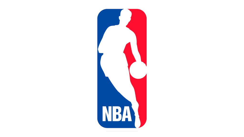
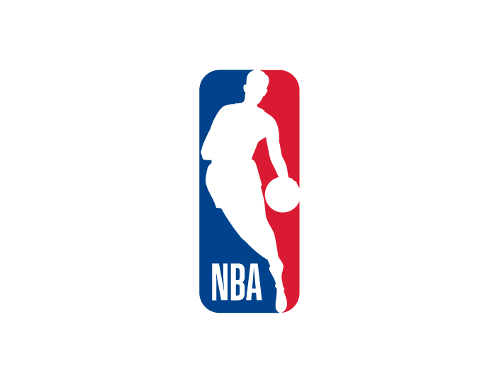
While the logo appears simple—a white silhouette of a player dribbling against a red and blue background—its creation was a strategic maneuver to professionalize the league and assert dominance in a crowded sports market. This article explores the deep history, the design mechanics, the controversial origins of the silhouette, and the subtle modernizations that have kept the brand fresh for over half a century.
The Pre-Logoman Era: The Early Identity Crisis (1946–1969)

To fully appreciate the genius of the current design, one must first examine the visual identity of the league prior to 1969. The NBA was not always the global juggernaut it is today. In its infancy, it was a league struggling for legitimacy, market share, and a cohesive identity.
The Basketball Association of America (BAA) Roots
The story begins in 1946 with the Basketball Association of America (BAA). The branding during this era was rudimentary at best. The logos generally featured literal interpretations of the sport: a basketball with the league name written across it. There was no attempt at abstraction or emotional connection; the design was purely functional. When the BAA merged with the National Basketball League (NBL) in 1949 to form the NBA, the branding remained largely stagnant. The early NBA logo was a simple basketball with the words “National Basketball Association” inscribed on the surface. While functional, it lacked the dynamism and excitement of the game itself.
The Threat of the ABA
By the late 1960s, the NBA faced a significant threat: the American Basketball Association (ABA). The ABA was flashy, introduced the three-point line, and used a red, white, and blue ball. They were marketing themselves as the cooler, more exciting alternative to the traditional NBA. The NBA’s visual identity felt dated and static in comparison. The league needed a rebrand that would not only modernize its image but also project an aura of established American professionalism. This competitive pressure was the catalyst for the NBA Logo History: Design Evolution and Brand Significance taking a sharp turn toward iconic status.
The 1969 Redesign: Alan Siegel and the Birth of an Icon
In 1969, NBA Commissioner J. Walter Kennedy recognized the need for a major overhaul. The league turned to Alan Siegel, a brand identity consultant who had previously worked on the Major League Baseball (MLB) logo. The brief was challenging yet clear: create a logo that positions the NBA as the premier professional basketball league in the world.
Inspiration from Baseball
Siegel was heavily inspired by the MLB logo, which had been designed a year earlier by Jerry Dior. The MLB logo featured a silhouette of a batter sandwiched between red and blue fields. Siegel recognized that this design formula was potent. It communicated “All-American” values through its color palette and focused on the human element of the sport rather than the equipment. Siegel decided to apply this same logic to basketball. He wanted to move away from the static image of a ball and capture the fluidity and athleticism of the players.
The Search for the Perfect Image
To find the perfect silhouette, Siegel combed through the photo archives of Sport magazine. He was looking for an image that captured the essence of the game—focus, movement, and grace. He eventually found a photograph of Los Angeles Lakers star Jerry West. In the photo, West is driving to the basket, his body angled, dribbling with his left hand. The image was dynamic and vertical, perfectly suited for the rectangular aspect ratio Siegel envisioned.
Siegel created a high-contrast white silhouette from the photo and placed it against a split background of red and blue. The result was immediate and striking. It wasn’t just a logo; it was a symbol of motion. The design was approved quickly and has remained virtually unchanged for over 50 years, a testament to its timeless quality.
Design Mechanics: Why the Logo Works
From a technical design perspective, the NBA logo is a textbook example of effective branding. It utilizes several psychological and visual principles that ensure it remains memorable and versatile.
Figure-Ground Relationship and Negative Space
The core strength of the logo lies in its use of negative space. The white silhouette acts as the “figure” while the red and blue blocks serve as the “ground.” However, because the silhouette is white (the color of the page in most print applications), it creates a seamless integration with the background while popping against the heavy colors. This technique allows the brain to instantly recognize the human form without needing detailed facial features or uniform specifics. It creates a universal avatar for the basketball player.
Color Psychology: Red, White, and Blue
The choice of colors was strictly strategic. In 1969, utilizing red, white, and blue was a deliberate effort to position basketball as an intrinsic part of American culture, similar to baseball. It equated the NBA with patriotism and stability. Furthermore, the colors provide high contrast:
- Red: Symbolizes energy, passion, and aggression, capturing the intensity of the sport.
- Blue: Represents professionalism, stability, and trust, reassuring investors and fans of the league’s longevity.
- White: Provides clarity and purity, acting as the visual breath that separates the two intense colors.
Dynamic Orientation
Unlike the static basketballs of the 1950s, the “Logoman” is in motion. The diagonal lines created by the player’s limbs and the lean of the body suggest forward momentum. The viewer’s eye is led from left to right, matching the direction of reading in Western cultures, which subconsciously implies progress and future-forward movement.
The Jerry West Controversy: The Silhouette’s Identity
No discussion of NBA Logo History: Design Evolution and Brand Significance is complete without addressing the “elephant in the room”: Jerry West. For decades, it has been an open secret that the silhouette is based on the former Lakers guard. Alan Siegel has confirmed this in numerous interviews, stating that the photo of West was the direct reference.
Why the NBA Won’t Officially Confirm It
Despite Siegel’s confirmation, the NBA has never officially acknowledged that Jerry West is the logo. The reasoning is likely legal and financial. If the league were to officially state that the logo is a specific person, they might be liable for likeness rights and royalties dating back to 1969. By maintaining that the logo is a generic representation of a basketball player, the NBA avoids complex intellectual property disputes. It allows the logo to represent every player, rather than just one.
West’s Perspective
Jerry West, known as “The Logo,” had a complicated relationship with the symbol. While it is an immense honor, West was known for his humility and often expressed that he wished the league would change it or that he wasn’t the sole focus. He famously stated that he didn’t want to be the logo, feeling it drew too much attention to himself rather than the collective history of the league. Sadly, with West’s passing, the logo has taken on a memorial quality, immortalizing his contribution to the game.
The 2017 Brand Refresh: Subtle Modernization
For 48 years, the logo remained untouched. However, in 2017, the NBA rolled out a refreshed global identity. To the casual observer, the changes were imperceptible, but to designers, they were significant. The goal was to optimize the logo for a digital-first world, ensuring it scaled perfectly on mobile screens and social media avatars.
Typography Changes
The most distinct change was the typography. The original logo used a font similar to Helvetica with a distinct slab serif feel on the “NBA” letters. The 2017 refresh introduced a custom typeface called “Action.” This font is leaner, taller, and more geometric. The letters “NBA” were modified to better complement the silhouette. The new font improved legibility at small sizes, a crucial requirement for favicons and app icons.
Color and Shape Refinement
The colors were deepened slightly to appear richer on high-definition screens. The silhouette itself underwent a minor “fitness” regime. The definitions of the player’s shorts and arm muscles were cleaned up to reduce visual noise. The overall aspect ratio was adjusted, making the logo slightly taller. These micro-adjustments ensured that the NBA Logo History: Design Evolution and Brand Significance continued to evolve without alienating fans who had grown up with the classic image.
The 75th Anniversary Logo and Special Editions
While the primary logo remains consistent, the NBA utilizes secondary logos for milestones, demonstrating the brand’s flexibility. The most notable recent variation was the 75th Anniversary logo used during the 2021-2022 season.
This design took the classic Logoman and placed it inside a diamond shape (symbolizing the diamond anniversary). It featured a prism-like texture, mimicking the facets of a diamond, and incorporated the years “1946” and “2021.” This temporary rebranding allowed the league to celebrate its heritage while keeping the core identity intact. It demonstrated how a strong logo can be accessorized without losing its fundamental recognizability.
Brand Significance and Cultural Impact
The NBA logo has transcended its purpose as a corporate identifier. It has become a fashion statement and a symbol of pop culture. In the 1990s, with the explosion of basketball’s popularity globally (thanks largely to Michael Jordan and the Dream Team), the logo became a badge of cool. Wearing a jacket or hat with the NBA logo—regardless of the specific team—signaled an affinity for American street culture and athleticism.
This cultural penetration is the ultimate goal of any logo design. The NBA logo appears on luxury fashion runways, in hip-hop videos, and on playgrounds from Beijing to Brooklyn. Its simplicity allows it to be recolored (as seen in team-specific merchandise) while retaining its form. The ability of the silhouette to be filled with the Lakers’ purple and gold or the Celtics’ green and white, yet still remain the “NBA logo,” is a triumph of flexible branding.
Key Takeaways
- Origin: The iconic logo was designed in 1969 by Alan Siegel, inspired by a photo of Jerry West.
- Strategy: The design was intended to professionalize the league and compete with the ABA, using a patriotic red, white, and blue color scheme.
- Design Principles: The logo relies on figure-ground reversal and negative space to create a dynamic, high-contrast image that implies motion.
- The “Secret”: The NBA does not officially recognize Jerry West as the logo to avoid royalty and likeness disputes, maintaining the image as a universal symbol.
- Evolution: The logo underwent a subtle refresh in 2017 to improve typography and digital scalability, proving that great design requires maintenance, not reinvention.
- Global Impact: The logo has evolved from a sports league identifier to a global fashion icon and status symbol.
Frequently Asked Questions (FAQ)
Is the NBA logo officially Jerry West?
Officially, no. The NBA states the logo represents a generic player. However, the designer, Alan Siegel, has confirmed multiple times that the silhouette was traced directly from a photograph of Jerry West. The league maintains ambiguity likely for legal and financial reasons.
Has the NBA logo ever changed?
The core design has remained remarkably consistent since 1969. However, there was a brand refresh in 2017. This update tweaked the colors for digital screens, cleaned up the silhouette’s edges, and introduced a new, custom typeface for the “NBA” lettering. The visual essence, however, remained the same.
Will the NBA change the logo to Kobe Bryant?
Following the tragic death of Kobe Bryant in 2020, millions of fans signed petitions to change the silhouette to honor him. While the sentiment was powerful, the NBA has given no indication that they will change the logo. The current logo is globally recognized and carries billions of dollars in brand equity. Changing it would be a massive logistical and financial undertaking, and the league prefers the silhouette to remain a timeless, “faceless” representation of the sport.
Why are the NBA logo colors red, white, and blue?
In 1969, the NBA wanted to position itself as a premier American sports league, comparable to Major League Baseball. Using the national colors of the United States helped subconsciously anchor the league as a patriotic and established institution, contrasting it with rival leagues.
What font is used in the NBA logo?
Prior to 2017, the font was a modified version of Helvetica with slab serifs. Since the 2017 refresh, the NBA uses a custom proprietary typeface family called “NBA Action” and “NBA Slasher,” designed to be more legible on digital platforms and merchandise.
Conclusion
The NBA Logo History: Design Evolution and Brand Significance is a testament to the power of simplicity. By distilling the complex action of basketball into a single, fluid motion, Alan Siegel created more than a logo; he created a legacy. The design has survived mergers, rival leagues, global expansion, and the digital revolution.
For business owners and designers, the lesson of the NBA logo is clear: trends fade, but clarity and storytelling endure. The refusal to drastically change the logo over five decades has allowed the NBA to build unparalleled brand equity. As the league continues to expand into new global markets, the silhouette of Jerry West—whether officially acknowledged or not—will continue to serve as the ambassador of the game, instantly recognizable to billions of people around the world.