
Introduction
In the fast-paced realm of global entertainment, few corporate identities command the same level of nostalgic reverence, authority, and instant recognition as Nintendo. To the modern consumer, the brand is synonymous with cutting-edge gaming consoles, pioneering software design, and legendary intellectual properties like Mario, Zelda, and Pokémon. However, the visual identity of this corporate giant was not forged overnight in the crucible of the digital revolution. The Nintendo Logo History: More Than a Century of Branding is a fascinating journey that spans over 130 years, reflecting not only the evolution of a single company but also the broader shifts in global trade, technology, graphic design philosophy, and consumer psychology.
To understand the trajectory of Nintendo’s visual branding is to study the history of modern commercial art. From its humble origins as a handcrafted playing card manufacturer in late 19th-century Kyoto to its current standing as a titan of the interactive entertainment industry, Nintendo has continuously adapted its visual signifiers. This article provides an exhaustive, deep-dive analysis of the Nintendo Logo History: More Than a Century of Branding, dissecting the historical contexts, typographical choices, color theories, and strategic corporate decisions that shaped one of the world’s most enduring brand marks.
The Genesis of Nintendo: 1889 to 1949 (Hanafuda Cards Era)
The Genesis of Nintendo: 1889 to 1949 (Hanafuda Cards Era)
The Koppai Start-up and Fusajiro Yamauchi
The story of Nintendo begins on September 23, 1889, in the ancient capital of Kyoto, Japan. A craftsman named Fusajiro Yamauchi established a small business named “Nintendo Koppai” to manufacture and distribute Hanafuda (flower cards). These traditional Japanese playing cards featured intricate, hand-painted illustrations of seasonal flora, animals, and cultural motifs. Because the Japanese government had banned foreign playing cards and gambling-related merchandise, Hanafuda cards operated in a complex socio-legal landscape. Yamauchi’s cards, crafted from the bark of mulberry trees, quickly gained a reputation for superior quality, durability, and artistic merit.
During this foundational period, the concept of a “corporate logo” in the Western sense did not exist within the Japanese market. Instead, businesses relied on traditional calligraphic signatures, woodblock prints, and regional stamps (known as hanko or inkan) to certify authenticity and ownership. The earliest packaging of Nintendo Koppai featured calligraphic marks and ornate woodblock illustrations that served as the primary visual identifiers for the brand.
The Original Kanji Logo and Its Semiotic Meaning
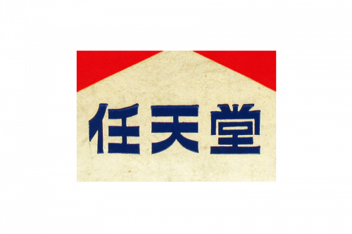
The earliest formalized logo of the company consisted of three Japanese Kanji characters: 任天堂 (Nin-ten-do). To this day, the exact etymological translation of these characters remains a subject of rich scholarly and corporate debate. The most widely accepted translation is “Leave luck to heaven” or “In heaven’s hands,” where:
- 任 (Nin): Meaning to entrust, duty, responsibility, or let one do.
- 天 (Ten): Meaning heaven, the sky, or the divine.
- 堂 (Do): Meaning shrine, temple, hall, or a grand building typically used as a suffix for prestigious shops.
Alternative historical interpretations suggest that the name may have subtle linguistic ties to the local Kyoto card-playing subculture, potentially translating to “the temple of free hanafuda.” Visually, the original kanji logo was rendered in a classic, hand-carved calligraphic style (resembling the Kaisho or Gyosho scripts). It was often stamped in red ink onto the wooden boxes and paper wrappers containing the playing cards. This calligraphic mark communicated heritage, meticulous craftsmanship, and cultural authenticity—essential traits for a product deeply rooted in Japanese tradition.
The Transition and Diversification Era: 1950 to 1959
The Transition and Diversification Era: 1950 to 1959
The Marufuku Logo and Corporate Restructuring
As the mid-20th century approached, Nintendo underwent significant structural changes. In 1949, Hiroshi Yamauchi, the great-grandson of the founder, took the reins of the company. Yamauchi was a visionary, albeit demanding, leader who recognized that the traditional Hanafuda market was reaching its saturation point. To modernize operations and expand distribution, he established a dedicated sales and distribution company called “Marufuku Co., Ltd.” in 1947.
The Marufuku logo represented Nintendo’s first major step toward abstract geometric branding. The mark consisted of a solid outer square enclosing a perfect circle, inside of which was the Kanji character 福 (Fuku), which translates to “good fortune,” “blessing,” or “wealth.” The design of the Marufuku logo was heavily influenced by traditional Japanese family crests (Kamon). The symmetry of the square and circle represented stability, cosmic order, and industrial reliability, while the central character reinforced the theme of luck and prosperity inherent in gaming products. This logo was prominently stamped on playing card decks, shipping crates, and corporate letterheads throughout the late 1940s and 1950s.
Post-War Consumerism and Plastic Playing Cards
Following the devastation of World War II, Japan entered a period of rapid economic recovery and intense Westernization. Hiroshi Yamauchi recognized that to survive in this new era, Nintendo had to adopt Western manufacturing standards and marketing strategies. In 1953, Nintendo became the first company in Japan to successfully mass-produce plastic playing cards. This technological breakthrough required a corresponding shift in visual identity.
The traditional Kanji and Kamon-style logos, while respected, felt antiquated to a younger generation of Japanese consumers who associated Western goods with progress, luxury, and modern living. Nintendo began experimenting with Romanized text (Rōmaji) on its packaging. The word “Nintendo” started appearing alongside the traditional Japanese characters, rendered in simple, clean sans-serif or slab-serif Latin typefaces. This dual-language branding served as a transitional bridge, preparing the local market for a globalized corporate identity.
The Westernization and Playful Experiments: 1960 to 1964
The Westernization and Playful Experiments: 1960 to 1964
The Disney Partnership and Visual Licensing
In 1959, Nintendo secured a monumental licensing agreement with Walt Disney Productions. This deal allowed Nintendo to print beloved Disney characters—such as Mickey Mouse, Donald Duck, and Bambi—directly onto their playing cards. The product line was an unprecedented success, selling over 600,000 card packs in a single year and opening up the youth market for Nintendo.
The Disney partnership had a profound impact on the Nintendo Logo History: More Than a Century of Branding. Working with a global entertainment giant exposed Nintendo to strict international trademark standards and character branding practices. It became clear that the corporate identity needed to be playful, highly legible, and appealing to children. During this period, the company’s logos reflected a whimsical, animated aesthetic. The heavy, formal calligraphic stamps of the past were replaced by bouncy, rounded letterforms and hand-drawn, cartoon-like scripts that mirrored the visual style of mid-century American animation.
The Era of Script and Handwritten Logotypes
The early 1960s was an era of intense experimentation and visual instability for the Nintendo brand. As the company ventured beyond playing cards into board games, mechanical toys, and novelty items, it utilized a dizzying array of different logotypes. There was no centralized brand style guide, resulting in various iterations of the “Nintendo” name appearing on store shelves simultaneously:
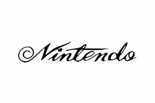
- The Elegant Cursive Script: A flowing, handwritten script logo that closely resembled the typography of classic American brands like Coca-Cola or Ford. This was used to convey a sense of premium quality and international sophistication.
- The Bold Sans-Serif Block: A heavy, geometric, all-caps logotype designed to project industrial strength and modern toy-manufacturing capabilities.
- The Playful Italicized Wordmark: A casual, slanted typeface with rounded corners, emphasizing fun, recreation, and youth culture.
This lack of visual cohesion was a reflection of a company in transition. Nintendo was searching for its true identity, trying to find a balance between its traditional Japanese heritage and its aspirations of becoming a modern, global toy manufacturer.
The Birth of the Modern Identity: 1965 to 1969
The Birth of the Modern Identity: 1965 to 1969
The Hexagonal and Line Logotypes
By the mid-1965, Hiroshi Yamauchi realized that the chaotic, decentralized branding of the early 1960s was counterproductive to building long-term brand equity. If Nintendo wanted to compete with established international toy companies like Mattel or Hasbro, it required a standardized, instantly recognizable visual mark. The company began a concerted effort to simplify and codify its logo.
One of the first serious attempts at standardization occurred in 1965 with the introduction of the “Hexagonal Logo.” This design featured a stylized, bold capital letter “N” enclosed within a perfect hexagon. Below the hexagon, the full name “Nintendo” was written in a clean, high-contrast serif font. The hexagon symbolized structure, science, and technological precision—a fitting choice as the company began incorporating basic mechanical and electronic components into its toys. Shortly after, Nintendo experimented with a “Line Logo,” where the wordmark was underlined by a thick, sweeping horizontal bar, a design trend highly popular in mid-century corporate modernism.
The Genesis of the “Racetrack” Oval
In 1967, Nintendo introduced a design element that would become the cornerstone of its visual identity for decades to come: the rounded capsule, commonly referred to by graphic designers as the “racetrack” border. The initial iteration of this design featured the word “Nintendo” enclosed within a tight, pill-shaped oval frame.
The introduction of the racetrack border was driven by practical packaging requirements. In retail toy environments, product packaging is incredibly busy, filled with vibrant illustrations, photographs, and promotional text. A standalone wordmark can easily get lost in the visual noise. By enclosing the “Nintendo” name inside an oval capsule, designers created a visual “shield.” This boundary separated the corporate name from the surrounding artwork, ensuring high legibility and instant brand recognition regardless of the background design. Furthermore, the rounded corners of the capsule softened the overall aesthetic, making the brand feel approachable, safe, and friendly—critical attributes for products aimed at children.
The Arcade and Home Console Revolution: 1970 to 1982
The Color TV-Game Series and Early Electronic Branding
The 1970s marked Nintendo’s definitive pivot from traditional toys to electronic entertainment. Under the brilliant engineering leadership of Gunpei Yokoi (creator of the Ultra Hand, Game & Watch, and Game Boy), Nintendo began exploring the nascent field of video games. In 1977, in partnership with Mitsubishi, Nintendo released the “Color TV-Game” series—a line of dedicated home consoles that allowed consumers to play simple versions of Pong and light-gun games on their television sets.
The branding of the Color TV-Game consoles represented a fusion of futuristic technology and mass-market appeal. The logos of this era embraced the “space age” aesthetic of the 1970s, featuring bold, blocky typography, neon color accents, and stylized representations of television screens and electronic signals. However, amidst these hardware-specific sub-brands, the parent “Nintendo” wordmark inside its racetrack capsule began appearing with greater frequency and consistency, acting as a seal of technological quality and reliability.
The Arcade Cabinets and the Standardization of the Wordmark
As Nintendo expanded into the coin-operated arcade market in the late 1970s and early 1980s, the company faced a new set of branding challenges. Arcade environments were dark, loud, and visually overwhelming. To attract players, arcade cabinets required striking marquee artwork and highly visible corporate branding.
It was during this period, around 1982, that the typography of the Nintendo wordmark was finalized into the precise, custom sans-serif font we recognize today. The designers made several critical typographic adjustments:
- The “t” Characteristic: The horizontal crossbar of the lowercase “t” was slightly elongated and angled, adding a subtle sense of forward motion and dynamism.
- The “O” Geometry: The uppercase “N” and the circular “O” characters were given a heavier, more uniform stroke weight, projecting stability and confidence.
- The Racetrack Proportions: The proportions of the surrounding oval were mathematically balanced with the height and width of the text, creating a harmonious, unified graphic mark.
This refined, standardized racetrack logo was prominently featured on the cabinets of legendary arcade games like Donkey Kong (1981), Popeye (1982), and Mario Bros. (1983), cementing the brand identity in the minds of millions of gamers worldwide.
The Golden Era of Gaming: 1983 to 2005
The Golden Era of Gaming: 1983 to 2005
The Famicom vs. NES Split Brand Strategy
In 1983, Nintendo released the Family Computer (Famicom) in Japan. The console was an astronomical success, completely dominating the domestic market. The visual identity of the Famicom was friendly, toy-like, and vibrant, featuring a red-and-white plastic chassis and a whimsical, handwritten logo that appealed directly to Japanese children and families.
However, when Nintendo prepared to launch the console in North America in 1985, the video game industry was in a state of total collapse. The infamous “Atari Shock” of 1983 had left Western retailers and consumers deeply cynical of anything labeled a “video game.” To bypass this hostility, Nintendo executed one of the greatest rebranding campaigns in corporate history. They redesigned the console to look like a sophisticated, high-tech piece of consumer electronics (resembling a front-loading VCR) and renamed it the “Nintendo Entertainment System” (NES).
The branding of the NES was calculated to project technological sophistication, premium quality, and safety. The primary logo featured a sleek, futuristic, italicized sans-serif typeface, often paired with a high-contrast red grid pattern. To rebuild consumer trust, Nintendo introduced the “Official Nintendo Seal of Quality.” This circular, gold-foil emblem featured the classic racetrack logo surrounded by a starburst border. It served as a visual guarantee that the software had been rigorously tested and approved by Nintendo, effectively reviving the Western home console market single-handedly.
The Red Capsule and the Psychology of Red
By the late 1980s, the classic red-and-white racetrack logo had become the global standard for Nintendo. The choice of red as the primary corporate color was a highly deliberate branding decision rooted in color psychology and retail strategy:
- High Visibility: In crowded retail aisles, red has the longest wavelength of any color on the visible spectrum, making it the fastest color processed by the human eye. It demands immediate attention.
- Emotional Resonance: Red is psychologically linked to passion, excitement, energy, and youth—emotions that align perfectly with the experience of playing video games.
- Cultural Heritage: In Japanese culture, red (aka) represents energy, vitality, and good fortune, echoing the company’s original name and its roots in the traditional Marufuku logo.
The solid red racetrack on a crisp white background became an iconic visual shorthand for quality entertainment, dominating the gaming landscape throughout the 8-bit and 16-bit eras of the NES and Super Nintendo Entertainment System (SNES).
Hardware-Specific Visual Systems: N64 and GameCube
As the video game industry transitioned from 2D sprites to 3D polygonal graphics in the mid-1990s, Nintendo adapted its branding to reflect this technological leap. Instead of relying solely on the parent corporate logo, the company designed highly specialized, three-dimensional visual systems for its individual hardware platforms:
- The Nintendo 64 Logo (1996): Designed to showcase the power of 64-bit 3D rendering, this iconic logo featured a bold, three-dimensional letter “N” constructed from interlocking, colorful blocks (primary colors: blue, red, green, and yellow). The logo was a geometric marvel, consisting of exactly 64 faces and 48 vertices, perfectly mirroring the hardware’s technical specifications.
- The Nintendo GameCube Logo (2001): Representing the optical disc era, the GameCube logo was a masterclass in negative space and Gestalt psychology. It featured a stylized, 3D cube within a cube, where the negative space formed a capital letter “G” and the positive space formed a capital letter “C,” representing “Game” and “Cube” respectively. The deep purple and black color palette gave the console a sleek, high-tech, yet playful aesthetic.
The Blue Ocean Strategy: 2006 to 2015
The Blue Ocean Strategy: 2006 to 2015
The Wii and Nintendo DS Minimalist Pivot
By the mid-2005, the video game industry had become locked in an aggressive, high-stakes arms race of raw processing power and complex, adult-oriented software. Nintendo’s competitors, Sony (PlayStation) and Microsoft (Xbox), were targeting hardcore gamers with dark, gritty, and technologically complex experiences. Recognizing that this market was becoming oversaturated, Nintendo’s visionary president, Satoru Iwata, implemented the “Blue Ocean Strategy.”
The goal of the Blue Ocean Strategy was to create an entirely uncontested market space by designing hardware and software that appealed to non-gamers, seniors, women, and young children. The result of this strategy was two of the most successful gaming platforms of all time: the Nintendo DS (2004) and the Wii (2006).
To align with this new, inclusive corporate philosophy, the iconic red racetrack logo underwent a radical visual transformation. The vibrant, aggressive red color palette was completely retired, replaced by a soft, sophisticated, and neutral slate gray (Pantone Cool Gray). The typography remained the same, but the overall presentation was clean, quiet, and highly minimalist.
The psychological reasoning behind this shift was profound. The color red, while exciting, could be perceived as aggressive, toy-like, or exclusive to youth culture. Gray, on the other hand, communicated accessibility, cleanliness, and lifestyle integration. It made the console feel less like a “toy” and more like a modern, elegant household appliance—akin to an Apple iPod or a sleek kitchen device. The Wii logo itself featured a friendly, lowercase sans-serif font, where the two “i” characters resembled two people standing side-by-side, symbolizing social play and family connection.
The Wii U and Nintendo 3DS Visual Challenges
While the minimalist gray branding worked wonders for the original Wii and DS, it created significant branding challenges during the subsequent console generation. In 2011 and 2012, Nintendo released the Nintendo 3DS and the Wii U, respectively.
The visual identities of these platforms struggled to communicate their unique selling propositions to the general public. The Wii U logo, for example, simply added a blue, rounded-square “U” to the existing gray Wii wordmark. Because the branding was so visually similar to the original Wii, many casual consumers and parents did not realize that the Wii U was an entirely new, next-generation console. They mistakenly believed it was merely an expensive controller accessory for the existing Wii. This branding confusion contributed significantly to the Wii U’s commercial struggles, highlighting the critical importance of distinct visual differentiation in product lifecycle marketing.
The Modern Era: 2016 to Present (The Switch Era)
The Modern Era: 2016 to Present (The Switch Era)
The Return of the Red and Visual Inversion
In 2016, under the leadership of Tatsumi Kimishima and later Shuntaro Furukawa, Nintendo prepared to launch its most ambitious hardware concept yet: the Nintendo Switch—a hybrid console that seamlessly transitioned from a home television system to a portable handheld device. To mark this bold new chapter, Nintendo executed a triumphant return to its visual roots, reclaiming the color red as its primary brand identifier.
However, the modern logo was not a simple copy of the 1980s design. It featured a sophisticated visual inversion. Instead of a red wordmark inside a red outline on a white background, the new logo featured a solid, vibrant red rectangular box with the word “Nintendo” and its racetrack border rendered in clean, high-contrast white. This design choice was highly functional for the digital age, ensuring that the logo popped brilliantly on high-definition screens, mobile app icons, social media profiles, and glowing retail displays.
Visual Mechanics and Optical Illusion in the Nintendo Switch Logo
The primary logo for the Nintendo Switch hardware itself is a masterpiece of modern graphic design and optical engineering. The logo features a stylized representation of the console’s signature detachable Joy-Con controllers, enclosed within a perfect circle.
To the untrained eye, the two halves of the Joy-Con logo appear perfectly symmetrical. However, they are actually highly asymmetrical—a deliberate design choice made to account for a common optical illusion known as “visual weight.”
- The Mathematical Problem: If the two halves of the logo were designed with mathematically identical physical dimensions, the left side (which is solid red with a cut-out white dot) would appear visually much heavier and larger than the right side (which is mostly open negative space with a solid red dot).
- The Optical Solution: To create the illusion of perfect balance, the designer made the left Joy-Con shape approximately 12% narrower than the right side. Additionally, the positioning of the dots and the central dividing line were subtly offset.
This meticulous attention to visual ergonomics ensures that the logo looks perfectly harmonious and balanced to the human eye, demonstrating the deep artistic and scientific rigor that defines Nintendo’s modern branding philosophy.
The Art and Science of Professional Logo Designs
Consistency vs. Adaptability in Long-Term Branding
When analyzing the Nintendo Logo History: More Than a Century of Branding, we discover a profound case study in the delicate balance between brand consistency and corporate adaptability. A brand that never changes risks becoming obsolete, irrelevant, and forgotten. Conversely, a brand that changes too frequently or too drastically fails to build long-term consumer trust and brand equity.
Nintendo has masterfully navigated this tension. While the company has radically pivoted its core business model multiple times—from playing cards to toys, to arcades, to home consoles, to mobile gaming—it has maintained a thread of visual continuity. The custom sans-serif typography of the “Nintendo” wordmark has remained virtually unchanged since 1982. This consistency acts as an anchor of trust. No matter how experimental or unusual the company’s new hardware might be, the presence of the classic racetrack wordmark reassures consumers of the underlying quality and heritage of the product.
Semiotics and Typographic Anatomy of the Nintendo Wordmark
From a graphic design perspective, the custom Nintendo wordmark is a brilliant study in geometric harmony and subtle playfulness. Let us dissect the typographic anatomy of the logo:
- The Letter ‘N’: The capital ‘N’ features thick vertical stems and a strong diagonal stroke, establishing a solid, structural foundation for the entire wordmark.
- The Letter ‘t’: The unique, asymmetrical crossbar of the ‘t’ adds a touch of whimsical movement, preventing the logo from feeling too rigid or corporate.
- The Letter ‘d’: The ascender of the ‘d’ perfectly matches the height of the capital ‘N’, creating a satisfying visual symmetry across the length of the word.
- The Letter ‘o’: The perfectly circular ‘o’ characters act as geometric bookends, reinforcing the friendly, rounded aesthetic of the surrounding racetrack capsule.
These subtle design choices combine to create a logo that is simultaneously authoritative and approachable, professional yet profoundly fun.
Key Takeaways from Nintendo’s Brand Evolution
- Embrace Strategic Flexibility: Nintendo’s survival over 130 years is directly attributed to its willingness to pivot its business model and adapt its visual identity to new markets and technologies.
- Understand Visual Weight and Optical Correction: As demonstrated by the Nintendo Switch logo, professional design often requires prioritizing human visual perception over rigid mathematical symmetry.
- Color Psychology is a Powerful Tool: The strategic shift from vibrant red (excitement, youth) to neutral gray (accessible lifestyle) and back to high-contrast red (modern digital authority) shows how color can redefine a brand’s target audience.
- Protect the Wordmark with Visual Framing: The introduction of the “racetrack” oval capsule in 1967 is a classic packaging design solution, protecting the legibility of the brand name against complex, colorful backgrounds.
- Build Trust Through Consistency: Keeping the core typography of the wordmark consistent since 1982 has allowed Nintendo to build an invaluable reservoir of global brand equity and nostalgic trust.
Frequently Asked Questions
1. What does the word “Nintendo” actually mean?
While the most common translation of the three Kanji characters (任天堂) is “Leave luck to heaven” or “In heaven’s hands,” some historians suggest it may have a double meaning related to local Kyoto card-playing cultures, potentially translating to “the temple of free hanafuda.”
2. Why did Nintendo change its logo color from red to gray in 2006?
The change to slate gray was a core component of the “Blue Ocean Strategy” for the launch of the Wii and Nintendo DS. Nintendo wanted to appeal to non-gamers, seniors, and families. Gray was chosen because it felt modern, sophisticated, and lifestyle-oriented, avoiding the aggressive, toy-like associations of the color red.
3. What is the significance of the “racetrack” oval around the Nintendo logo?
Introduced in 1967, the “racetrack” capsule was designed to serve as a visual shield. It isolated the corporate name from busy, colorful toy packaging illustrations, ensuring high legibility and instant brand recognition on retail shelves.
4. Is the Nintendo Switch logo perfectly symmetrical?
No. To account for the optical illusion of visual weight, the left Joy-Con of the Switch logo is designed to be approximately 12% narrower than the right side. This mathematical asymmetry creates the visual illusion of perfect balance to the human eye.
5. When was the classic Nintendo typography created?
The custom, sans-serif typography used in the modern Nintendo logo was finalized around 1982, right as the company was expanding heavily into the global arcade and home console markets.
6. What was Nintendo’s first logo?
Nintendo’s earliest visual mark consisted of the three traditional Japanese Kanji characters (任天堂) rendered in a hand-carved calligraphic style, which was stamped onto wooden boxes of handcrafted Hanafuda playing cards in 1889.
Conclusion
The Nintendo Logo History: More Than a Century of Branding is far more than a chronological list of graphic design updates. It is a visual testament to corporate resilience, artistic precision, and marketing genius. Over the course of more than a century, Nintendo has evolved from a small, local artisan shop in Kyoto to a global cultural phenomenon, masterfully updating its visual identity to match its revolutionary business pivots.
By studying the evolution of the Kanji calligraphic stamps, the structural Marufuku crest, the playful Disney-era scripts, the iconic red racetrack capsule, the minimalist lifestyle gray of the Wii, and the bold, high-contrast red of the Switch era, we gain deep insights into how a brand can honor its heritage while relentlessly embracing the future. Nintendo’s branding journey proves that a truly world-class visual identity is not static; it is a living, breathing entity that grows, adapts, and triumphs alongside the company it represents.