
Introduction to NVIDIA Logo History: How the Eye Logo Evolved
In the hyper-competitive landscape of global technology, visual identity is not merely an aesthetic choice; it is a declaration of intent, capability, and vision. While corporate giants like Apple, Microsoft, and Google have spent decades refining their visual footprints to reflect consumer accessibility, NVIDIA Corporation has charted a distinctly different, highly specialized path. Today, NVIDIA stands at the absolute pinnacle of the technological frontier. With a market capitalization that has repeatedly scaled the multi-trillion-dollar heights, the company has transitioned from a niche manufacturer of niche graphics cards for PC gamers into the undisputed engine of the global artificial intelligence (AI) revolution, deep learning, high-performance computing (HPC), and the industrial metaverse.
At the center of this monumental corporate trajectory sits a singular visual asset: the iconic green “eye” logo. This emblem, known formally within design circles as the stylized spiral or the all-seeing eye, is one of the most recognizable and intellectually intriguing symbols in the entire tech industry. Yet, the story behind its creation, its deep-seated philosophical roots, and its systematic evolution over the past three decades remains largely untold to the general public. This comprehensive deep-dive into the NVIDIA Logo History: How the Eye Logo Evolved explores the intersection of classical mythology, advanced computational geometry, corporate strategy, and the psychology of visual design.
To understand the evolution of the NVIDIA logo is to understand the evolution of modern computer graphics and artificial intelligence itself. From its humble origins in a Silicon Valley diner to its current status as a symbol etched onto the silicon wafers powering the world’s most advanced supercomputers, this article provides an exhaustive analysis of how a simple geometric spiral became a global emblem of technological supremacy.
The Genesis of NVIDIA: Co-Founding and the Search for Identity
To trace the origin of the NVIDIA logo, one must first understand the unique circumstances of the company’s founding in 1993. Three microchip engineers—Jensen Huang (a former Corel director and LSI Logic designer), Chris Malachowsky, and Curtis Priem (both former engineers at Sun Microsystems)—gathered at a local Denny’s restaurant in San Jose, California. They shared a collective vision: they believed that the next wave of computing would be driven by accelerated, graphics-based architectures. They recognized that while the Central Processing Unit (CPU) was highly efficient for sequential general-purpose processing, it was fundamentally unsuited to handle the massive, parallel mathematical calculations required for real-time 3D rendering.
At the time, the company had no official name. The founders simply referred to their internal files, project plans, and design schematics as “NV,” standing simply for “Next Version.” As the company grew closer to formal incorporation, the founders realized they needed a permanent, legally viable name that reflected their core mission. They began combing through dictionaries, looking for words that began with their placeholder letters, “NV.”
Their search led them to the Latin word “Invidia”. In classical Roman mythology, Invidia is the goddess of envy, jealousy, and retribution. More importantly, the word is etymologically derived from the Latin verb “invidere”, which translates literally to “to look against,” “to look closely at,” or “to cast an evil eye upon.” This linguistic connection was a revelation for the founders. It perfectly bridged two distinct concepts: the sensory process of sight and vision (which is the absolute foundation of computer graphics) and the psychological state of “envy”—which they hoped their competitors would feel when they witnessed the revolutionary performance of NVIDIA’s hardware.
This dual concept of “vision” and “envy” laid the conceptual groundwork for everything that followed. It dictated not only the choice of the corporate name but also the primary brand color (green, the traditional color of envy and the “green-eyed monster”) and the central visual motif of the brand identity: the eye. However, before this sophisticated conceptual framework could fully manifest, the company had to navigate its earliest, most rudimentary branding phase.
The First Mark (1993–1996): The Pre-Eye Era
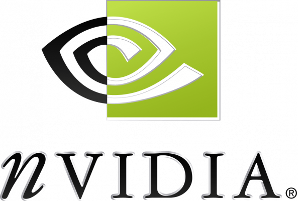
The First Mark (1993–1996): The Pre-Eye Era
The Original NV Logo and Early Corporate Identity
In its first three years of operation, NVIDIA did not possess the iconic eye logo we recognize today. As a highly technical, engineering-first startup operating on venture capital, the company’s initial priority was the physical architecture of its first graphics chip, the NV1, rather than a highly polished corporate brand identity. The original logo used during this formative period was a relatively straightforward, typographic wordmark.
This early logo featured the lowercase letters “nv” rendered in a stylized, slightly italicized sans-serif typeface. The letters were often accompanied by the full corporate name “NVIDIA” written in a clean, uppercase geometric font. The color palette during these initial years was not yet locked into the vibrant, high-contrast green that defines the company today. Instead, the company experimented with muted blues, grays, and basic monochrome schemes, reflecting the standard, conservative corporate design language of early-1990s technology firms.
The Launch of the NV1 and Technical Challenges
The NV1 chip, released in 1995, was an incredibly ambitious piece of hardware. Unlike the polygon-based rendering systems that would eventually become the industry standard (popularized by companies like 3dfx and Microsoft’s Direct3D), the NV1 relied on quadratic curved surfaces for rendering 3D graphics. While technically elegant, this approach required game developers to write custom code specifically for NVIDIA’s hardware, which proved to be a significant barrier to widespread adoption.
The commercial struggles of the NV1, combined with the rapid maturation of the 3D graphics market, forced NVIDIA to undergo a dramatic strategic pivot. The company abandoned quadratic curved surfaces in favor of triangle-based rasterization, a shift that would ultimately culminate in the highly successful RIVA 128 graphics processor. This technical and commercial rebirth necessitated a parallel transformation in how the company presented itself to the world. NVIDIA needed a brand identity that looked futuristic, highly technical, and immediately memorable. It was time to unleash the eye.
Why the Original Brand Mark Needed to Evolve
The original “nv” typographic mark was ultimately deemed too generic for a company aiming to revolutionize human-computer interaction. It lacked a central, unifying symbol that could serve as a visual shorthand for the brand. In the mid-1990s, the tech sector was exploding with new players, and companies like 3dfx, S3 Graphics, and ATI Technologies were competing fiercely for the minds of PC gamers and OEMs (Original Equipment Manufacturers). To survive and dominate, NVIDIA needed an icon that could be instantly recognized on retail packaging, silicon dies, motherboard PCBs, and digital screens. The company required an emblem that spoke directly to the core of what their technology enabled: human vision, digital perception, and unparalleled computational foresight.
The Birth of the Eye: The 1996 Redesign
Introducing the All-Seeing Eye Motif
In 1996, NVIDIA unveiled a complete corporate identity overhaul. This redesign introduced the core visual element that has remained the bedrock of the company’s brand for nearly three decades: the stylized, spiral “eye.” The design was a brilliant exercise in visual metaphor, seamlessly blending the literal concept of human sight with the abstract mathematics of computer graphics.
The logo was designed to represent both an eye looking forward into the future and a mathematical spiral. In computer graphics, spirals and curves are fundamental geometric constructs, requiring complex algorithms and intense mathematical processing to render smoothly on a screen. By utilizing a spiral to form the shape of an eye, the logo’s designers created a visual double entendre that celebrated both the biological organ of sight and the computational math required to simulate it digitally.
Visual Breakdown of the 1996 Logo
The 1996 logo design was rich in contrast, geometry, and symbolic depth. It consisted of a square block divided diagonally into two distinct halves, representing a dualistic design philosophy:
- The Left Side (Dark/Solid): The left half of the logo featured a solid black background, representing the unseen, raw, and unformed computational space. Within this dark space, a series of curved, white concentric lines spiraled outward, tracing the contours of an iris and pupil.
- The Right Side (Light/Contoured): The right half of the logo inverted this relationship. It featured a bright, clean white background with black concentric lines continuing the spiral pattern. This side represented clarity, visualization, and the outputted digital image.
This deliberate play on negative and positive space, light and shadow, was not just an aesthetic choice. It mirrored the fundamental process of computer graphics: taking abstract, unseen digital data (the dark side) and processing it through hardware to create a visible, illuminated image on a monitor (the light side). It also subtly formed the letter “N” through the diagonal intersection of the two halves, further cementing the brand name within the geometry of the icon.
Symbolism: Perception, Vision, and the Future of 3D Graphics
The symbolism of the 1996 design went far beyond simple geometry. In many cultures, the spiral is a symbol of growth, evolution, and infinite expansion. By combining the spiral with the eye, the logo communicated that NVIDIA’s technology was not static; it was an evolving engine of digital perception. The “all-seeing eye” also carried connotations of omniscience, precision, and absolute clarity—attributes that were highly attractive to professional workstation users, game developers, and tech enthusiasts who demanded the highest possible fidelity from their hardware.
The 2006 Refinement: Modernizing for the HD and GPGPU Era
The Transition to CUDA and General-Purpose GPU Computing
By 2006, NVIDIA was no longer just a graphics card company. Under the visionary leadership of Jensen Huang, the company was preparing to make one of the most significant, high-stakes bets in the history of Silicon Valley: the launch of CUDA (Compute Unified Device Architecture). CUDA was a parallel computing platform and programming model that allowed software developers to use NVIDIA GPUs for general-purpose processing (GPGPU), bypassing the CPU for highly complex scientific, mathematical, and data-driven calculations.
This massive technological shift meant that NVIDIA was entering high-performance computing, oil and gas exploration, medical imaging, and financial modeling markets. The existing 1996 logo, while iconic, carried a slightly retro, mid-90s aesthetic that did not fully align with this new era of ultra-modern, enterprise-grade computing. The brand identity needed to be streamlined, cleaned up, and optimized for high-definition digital displays and professional corporate environments.
Design Changes: Simplifying the Eye and Typographic Alignment
The 2006 redesign was an exercise in minimalist refinement. The core concept of the spiral eye was preserved, but the surrounding design elements were heavily simplified to improve legibility, scalability, and modern appeal:
- Removal of the Dual-Colored Square: The complex, diagonally split black-and-white square was retired. Instead, the spiral eye was freed from its geometric frame, becoming a standalone icon.
- Streamlining the Spiral: The lines of the spiral eye were smoothed out and simplified. The design became more cohesive, with the spiral forming a clean, continuous loop that clearly resembled a stylized eye while maintaining its mathematical, algorithmic feel.
- Typographic Evolution: The accompanying “NVIDIA” wordmark was updated. The company adopted a highly customized, clean sans-serif typeface. The letter “n” at the beginning of the wordmark remained lowercase, a subtle nod to the company’s original “nv” roots, while the rest of the letters were presented in structured, geometric uppercase forms. This created a unique visual rhythm and made the wordmark instantly recognizable even without the icon.
The Iconic “NVIDIA Green” (Pantone 382 C) and Its Psychological Impact
Perhaps the most significant aspect of the 2006 brand modernization was the absolute standardization of the company’s signature color: a highly vibrant, luminous shade of green, specifically categorized as Pantone 382 C. While green had been associated with the brand since its early days (referencing the Latin *Invidia*), the 2006 redesign elevated this color to a primary brand asset.
In the psychology of color, green is traditionally associated with growth, renewal, energy, and environmental vitality. However, in the context of high technology, NVIDIA’s specific shade of electric green carried a completely different set of associations. It communicated extreme performance, high efficiency, futuristic energy, and a bold, rebellious spirit that resonated deeply with the PC gaming community. While competitors like Intel utilized a conservative corporate blue and AMD/ATI adopted a fiery red, NVIDIA’s brilliant green sliced through the visual noise, establishing an instantly recognizable, high-contrast presence on retail shelves, digital advertisements, and inside glowing PC chassis.
The Modern Era (2010s–Present): Minimalist Dominance in the AI Age
The Modern Era (2010s–Present): Minimalist Dominance in the AI Age
Flattening the Design: Adapting to Mobile, Web, and Digital Screens
As the world transitioned into the 2010s, the broader graphic design industry underwent a massive paradigm shift. The skeuomorphic, highly detailed, and textured designs of the 2000s were rapidly replaced by “flat design” principles. This shift was driven by the ubiquity of smartphones, high-density retina displays, and the need for responsive user interfaces that could scale seamlessly from a tiny smartwatch screen to a massive 4K monitor.
NVIDIA responded to this trend by executing a subtle yet highly effective flattening of its visual identity. The gradients, subtle shadows, and three-dimensional depth cues that had occasionally been applied to the logo in marketing materials were stripped away. The spiral eye was rendered as a pure, flat, two-dimensional vector asset. This flat version of the logo was exceptionally versatile. It could be rendered in solid white on a dark background, solid black on a light background, or in its signature high-visibility Pantone 382 C green.
The Role of the Logo in the AI Revolution
During this period, NVIDIA’s strategic bet on CUDA and parallel computing paid off in spectacular fashion. The deep learning boom of the 2010s was built almost entirely on NVIDIA hardware. Researchers discovered that the parallel architecture of GPUs was uniquely suited for training deep neural networks, the foundation of modern artificial intelligence. Almost overnight, NVIDIA transitioned from a company that made gaming hardware into the absolute backbone of global AI infrastructure.
As the company’s chips were deployed inside massive hyperscale data centers operated by Google, Microsoft, Amazon, and Meta, the meaning of the NVIDIA logo underwent a profound cultural shift. The “eye” was no longer just about rendering pixels on a screen; it was now a symbol of machine vision, autonomous driving, deep neural processing, and the “all-seeing” cognitive capabilities of artificial intelligence. The eye had evolved from a symbol of human perception into a symbol of machine intelligence.
The Visual Architecture of Modern NVIDIA Product Sub-Brands
As NVIDIA’s product portfolio expanded to cover multiple multi-billion-dollar industries, the company developed a highly structured visual architecture to organize its sub-brands. The central green eye remained the master brand mark, anchoring all corporate communications, but specialized typographic treatments and color accents were developed for specific product lines:
| Product Line | Primary Target Market | Visual Identity & Branding Strategy |
|---|---|---|
| GeForce / GeForce RTX | PC Gamers, Esports Athletes, Creators | Bold, high-contrast green and black aesthetics, sharp geometric angles, and aggressive typography emphasizing raw speed and real-time ray tracing capabilities. |
| NVIDIA RTX (formerly Quadro) | Professional Designers, Architects, Animators | Clean, minimalist, and premium monochrome styling, reflecting absolute computational precision, stability, and enterprise-grade reliability. |
| NVIDIA Drive | Autonomous Vehicle Developers, Automotive OEMs | A sophisticated blend of the core green identity with clean, modern automotive-inspired typography, symbolizing safety, real-time AI perception, and future mobility. |
| NVIDIA DGX / HGX | Enterprise AI, Data Centers, Supercomputing | Ultra-minimalist, industrial-grade branding applied directly to rack-mounted hardware, representing massive computational density and the pinnacle of AI horsepower. |
Analyzing the Design Psychology of the NVIDIA Eye
Gestalt Principles in the NVIDIA Spiral Logo
From a formal design perspective, the enduring success of the NVIDIA logo can be attributed to its masterful application of Gestalt principles of visual perception. Gestalt psychology states that the human brain naturally attempts to organize visual information into cohesive groups, patterns, and wholes rather than focusing on individual, disconnected elements. The NVIDIA logo leverages these cognitive tendencies in several highly sophisticated ways:
- Closure: The human eye naturally completes unfinished shapes. In the NVIDIA logo, the spiral lines do not physically form a closed, solid eye outline. Instead, our brains automatically bridge the gaps between the concentric curves, constructing the complete shape of an eye in our mind’s eye. This active cognitive participation makes the logo highly engaging and memorable.
- Figure-Ground Relationship: The logo plays brilliantly with the relationship between positive space (the green/white lines) and negative space (the black background). The brain is forced to process both the positive shapes of the spiral and the negative spaces between them, creating a dynamic sense of visual movement and energy.
- Continuity: The smooth, sweeping mathematical curves of the spiral guide the viewer’s eye in a fluid, continuous motion from the outer edges of the icon inward toward the center. This visual flow mimics the physical process of focusing one’s vision, reinforcing the core theme of sight and perception.
The Contrast of Sharp Geometries and Organic Spirals
Another key to the logo’s psychological impact is its unique synthesis of organic and inorganic forms. The outer silhouette of the logo (when framed) and the structure of the custom typography are highly geometric, precise, and rigid—qualities that communicate engineering excellence, mathematical accuracy, and technological structure. Conversely, the spiral eye itself is an organic, flowing, and natural form. This contrast is highly symbolic of the company’s ultimate goal: using cold, hard, synthetic silicon and mathematics to simulate, understand, and augment the fluid, organic, and complex physical world.
The Concept of “Invidia” (Envy) and the Green-Eyed Monster Connection
The choice of green as the primary brand color is a masterclass in psychological branding. In western culture, green is deeply linked to the concept of envy—often referred to as the “green-eyed monster” (a phrase popularized by William Shakespeare in *Othello*). By embracing this connection, NVIDIA turned a potentially negative human emotion into a powerful competitive driver. The brand message was clear: if you are a gamer, you want an NVIDIA card so your peers will envy your frame rates; if you are an enterprise data center, you want NVIDIA hardware so your competitors will envy your computational throughput. The green eye is, quite literally, the physical manifestation of this highly motivating, performance-driven envy.
How Professional Logo Designs Can Transform High-Tech Brands
The evolutionary trajectory of the NVIDIA logo provides invaluable lessons for modern technology startups, enterprise organizations, and design agencies alike. In the fast-moving tech sector, companies often make the mistake of choosing logos that are either too literal (e.g., drawing a physical microchip or a computer screen) or too abstract to convey any meaningful brand narrative. Over time, literal designs become rapidly outdated as technology evolves, while overly abstract designs fail to build immediate cognitive connections with the target audience.
This is where the expertise of professional Logo Designs agencies becomes absolutely critical. Designing a visual identity for a high-tech brand requires a deep, multidisciplinary understanding of semiotics, color theory, scalability, and cultural psychology. A world-class design agency does not simply create a pretty graphic; they dig deep into a company’s historical roots, its technological roadmap, and its core corporate values to build a visual system capable of growing with the company for decades.
For instance, a professional design system must solve critical technical challenges, including:
- Cross-Media Scalability: Ensuring that a brand mark remains highly legible and visually impactful whether it is etched onto a sub-millimeter silicon die, displayed as a 16×16 pixel favicon on a web browser, or printed on a massive billboard overlooking Silicon Valley’s Highway 101.
- Color Fidelity: Specifying exact color profiles (such as Pantone, RGB, and CMYK) to ensure that the brand’s signature colors remain completely consistent across digital screens, physical product packaging, corporate apparel, and industrial hardware.
- Sub-Brand Cohesion: Creating a flexible design architecture that allows the master brand to launch new product lines, divisions, and corporate acquisitions without diluting the core visual equity of the parent company.
NVIDIA’s ability to transition seamlessly from 3D gaming to scientific supercomputing while maintaining the exact same visual anchor—the green eye—is a testament to the incredible power of professional, strategic brand design.
Key Takeaways from the NVIDIA Logo History: How the Eye Logo Evolved
- The Linguistic Root: The name NVIDIA and the green eye logo are derived from the Latin word Invidia, meaning envy. This concept directly influenced both the primary green color palette and the eye motif (referencing the “evil eye” or “looking closely at”).
- The 1996 Redesign was the Turning Point: The iconic stylized spiral eye was introduced in 1996, replacing a generic typographic “nv” mark. This redesign established the visual metaphor of digital perception and computational mathematics.
- Simplification for Longevity: In 2006, the logo was heavily streamlined. The complex, diagonally split black-and-white square was removed, allowing the spiral eye to stand alone as a clean, highly scalable vector asset.
- Standardization of Pantone 382 C: The company locked in its signature “NVIDIA Green” (Pantone 382 C) during the 2006 modernization, creating one of the most powerful and instantly recognizable color associations in the entire technology industry.
- Adaptation to the AI Era: In the 2010s and 2020s, the logo was flattened to meet modern responsive design standards. As NVIDIA pioneered the AI revolution, the meaning of the eye evolved from human graphics perception to machine vision and artificial intelligence.
Frequently Asked Questions
What does the NVIDIA logo actually represent?
The NVIDIA logo represents a stylized, mathematical spiral that forms the shape of an eye. It serves as a visual metaphor for both human sight (the foundation of computer graphics) and the advanced mathematical algorithms required to render digital images. It is also a direct visual nod to the company’s name, which is derived from the Latin word Invidia (envy), historically associated with the “all-seeing eye” or “evil eye.”
Why is the NVIDIA logo green?
The logo is green because the company name is derived from Invidia, the Latin word for envy. In cultural psychology and literature, envy is traditionally represented by the color green (e.g., the “green-eyed monster”). NVIDIA embraced this connection to symbolize extreme performance that would make their competitors envious, while also conveying the energy, growth, and futuristic vitality of their technology.
Who designed the original NVIDIA eye logo?
The stylized spiral eye logo introduced in 1996 was the result of a collaborative corporate rebranding effort involving professional graphic designers and NVIDIA’s founding team. The design was specifically engineered to replace the company’s original, basic “nv” text mark with a highly symbolic, mathematically inspired emblem that could serve as a permanent corporate anchor.
Has the NVIDIA logo changed significantly over time?
While the core concept of the spiral eye has remained remarkably consistent since its introduction in 1996, the logo has undergone two major refinements. In 2006, the complex diagonally split black-and-white square background was removed, and the spiral was simplified. In the 2010s, the design was completely flattened to remove gradients and shadows, optimizing it for modern digital screens and responsive branding systems.
What font is used in the NVIDIA logo?
The NVIDIA logo uses a highly customized, proprietary sans-serif typeface. A key feature of this custom wordmark is the lowercase “n” at the very beginning of the word, while the remaining letters (“VIDIA”) are presented in structured, geometric uppercase forms. This unique typographic treatment pays homage to the company’s early placeholder name, “NV.”
Is the NVIDIA logo associated with artificial intelligence?
Yes. While the logo was originally created to represent 3D computer graphics and visual rendering, its meaning has evolved alongside the company’s technology. Today, the green eye is globally recognized as the premier symbol of artificial intelligence, deep learning, machine vision, and the high-performance supercomputing infrastructure that powers modern generative AI models.
Conclusion
The story of the NVIDIA logo is a masterclass in the power of strategic visual branding. Over the past three decades, the company has successfully navigated multiple seismic shifts in the technology industry—transitioning from a struggling startup trying to define the future of 3D gaming into a global superpower driving the next industrial revolution through artificial intelligence. Throughout this historic journey, the stylized green eye has remained a constant, unyielding anchor.
By rooting their identity in deep linguistic, psychological, and mathematical concepts, NVIDIA’s founders and designers created a brand mark that transcended the temporary lifespans of individual hardware products. The eye is not merely a logo printed on a box; it is a profound visual statement about human curiosity, machine perception, and the infinite, spiraling potential of computational science. As NVIDIA continues to push the boundaries of what is possible in the realms of AI, autonomous systems, and the metaverse, the iconic green eye will undoubtedly remain at the very forefront of human innovation, looking steadily into the future.