
Introduction
In the rapidly evolving landscape of global financial technology, visual identity is far more than an aesthetic choice. It is a critical bridge of trust between a digital platform and its users. When money transitions from physical banknotes to digital ledger entries, consumers require reassurance, security, and absolute reliability. Over the past quarter-century, few companies have navigated this transition as successfully as PayPal. As we explore the PayPal Logo History: Every Logo Redesign Explained, we uncover not just the visual modifications of a brand, but the historical trajectory of online commerce itself.
From its origins as a cryptography startup in the late 1990s to its current status as a global payment monolith processing billions of transactions annually, PayPal’s visual branding has undergone several profound transformations. Each design iteration reflects a broader industry trend: the transition from desktop-centric web pages to mobile-first interfaces, the shift from skeuomorphic gradients to flat minimalist design, and the integration of highly accessible, digital-first design systems. This article provides an exhaustive, chronological analysis of PayPal’s visual evolution, exploring the strategic, psychological, and technological motivations behind every major redesign.
The Genesis of PayPal: Confinity, X.com, and the Pre-PayPal Era (1998–1999)
The Genesis of PayPal: Confinity, X.com, and the Pre-PayPal Era (1998–1999)
Before PayPal became a household name, the foundation of the company was laid through two distinct entities: Confinity and X.com. To understand the early visual identity of the brand, one must understand the chaotic, fast-moving landscape of Silicon Valley during the dot-com boom of the late 1990s.
The Confinity Era (1998–1999)
Founded in December 1998 by Max Levchin, Peter Thiel, and Luke Nosek, Confinity initially focused on software security for handheld devices, specifically the Palm Pilot. The name itself was a portmanteau of “confidence” and “infinity,” signaling a secure, endless network of digital connections. Confinity’s early visual branding was functional, technical, and highly reflective of late-90s software companies. The logo was utilitarian, featuring simple sans-serif typography that prioritized clarity over artistic expression. It was designed for an era when software was distributed on physical media or downloaded via slow dial-up connections, and the primary objective was to convey technical competence rather than mainstream lifestyle appeal.
The X.com Merger (1999–2000)
In 1999, Elon Musk founded X.com, an ambitious online financial services and e-mail payment company. X.com’s logo was famously minimalist and futuristic, consisting of a stylized, metallic “X” with a blue glow, often set against a dark background. The design was aggressive, modern, and aligned with Musk’s vision of disrupting traditional, slow-moving banking institutions. When Confinity and X.com merged in March 2000, a branding conflict emerged. While X.com possessed the infrastructure and capital, Confinity had developed a highly popular product called “PayPal,” which allowed users to send money via email.
The merged entity initially retained the X.com name and its futuristic logo. However, consumer focus groups quickly revealed that the name “X.com” failed to inspire trust. Many consumers associated the letter “X” with adult entertainment websites rather than secure financial transactions. Furthermore, the metallic, sharp-edged logo felt cold and distant to everyday consumers who were already hesitant about trusting the internet with their bank accounts. Recognizing these barriers to adoption, the company made the strategic decision in 2001 to phase out the X.com brand entirely and rename the corporation PayPal.
The First Official PayPal Logo (1999–2007): Establishing Digital Trust
The First Official PayPal Logo (1999–2007): Establishing Digital Trust
With the decision to focus entirely on the PayPal product, the company needed a visual identity that could quickly establish credibility on a global scale. E-commerce was in its infancy, and online fraud was rampant. The first official PayPal logo, introduced in late 1999 and refined in 2001, was specifically engineered to project stability, security, and approachability.
Visual Breakdown of the 1999 Logo
The inaugural PayPal logo was a simple, italicized wordmark. It featured a bold, sans-serif typeface where the letters were rendered in a dark blue color, outlined with a thin white border, and cast against a soft shadow. The choice of italics was highly deliberate; it communicated speed, forward momentum, and efficiency—crucial attributes for a service promising instant electronic payments in an era of slow paper checks and wire transfers.
The Psychology of Blue in Fintech
The primary design choice of this era was the heavy reliance on the color blue. In color psychology, blue is universally recognized as the color of trust, dependability, intelligence, and security. Traditional financial institutions like Chase, Citibank, and Barclays had long used blue in their branding to signal institutional strength. By adopting a deep blue palette, PayPal visually aligned itself with established banking giants, subtly reassuring skeptical internet users that their money was safe.
Adapting to the eBay Ecosystem
In 2002, eBay acquired PayPal for $1.5 billion. For the next several years, the PayPal logo became a ubiquitous fixture on eBay listing pages worldwide. The logo had to perform under challenging technical constraints: it needed to be legible at very low resolutions on CRT monitors, stand out amidst cluttered web page layouts, and fit seamlessly into the user interfaces of third-party merchants. The bold, outlined wordmark succeeded because of its high contrast and simplicity, serving as a beacon of secure checkout for millions of early online shoppers.
The 2007 Redesign: Modernizing for the Web 2.0 Era
The 2007 Redesign: Modernizing for the Web 2.0 Era
By 2007, the digital landscape had shifted dramatically. The rise of “Web 2.0” brought a new design philosophy characterized by clean interfaces, rounded shapes, gradients, and a focus on user-generated content and community. PayPal, now processing billions of dollars in transactions, had outgrown its simple, slightly rigid early logo. It was time for a modernization that reflected a friendlier, more accessible financial service.
The Shift to a Two-Tone Color Palette
The 2007 redesign introduced a fundamental change that would define the brand for years to come: a two-tone blue color scheme. The wordmark was divided into two distinct visual segments: “Pay” was rendered in a deep, authoritative navy blue, while “Pal” was rendered in a lighter, friendlier mid-tone blue. This separation served several critical purposes:
- Enhanced Readability: By splitting the compound word into two distinct colors, the logo became instantly easier to read and parse at a glance.
- Softening the Brand: The introduction of the lighter blue tone reduced the institutional coldness of the original logo, making the platform feel more like a helpful assistant (a “pal”) rather than a monolithic corporate processor.
- Visual Balance: The contrast between the dark and light blues created a sense of depth and dynamic energy without resorting to complex graphic elements.
Typography and Letterform Adjustments
In addition to the color shift, the typography was significantly updated. The sharp, angled edges of the 1999 wordmark were softened. The new typeface featured rounded corners, wider letter spacing (kerning), and a more humanist geometry. The italicization was retained but softened to a gentler angle, maintaining the association with speed and efficiency while projecting a much more welcoming, modern, and consumer-friendly persona. This logo carried PayPal through its period of explosive international expansion and its integration into the early mobile web.
The 2014 Landmark Rebrand: The Interlocking Monogram
The 2014 Landmark Rebrand: The Interlocking Monogram
By 2014, the technological landscape had undergone another massive paradigm shift. The smartphone revolution was in full swing, and mobile commerce was rapidly overtaking desktop web browsing. Consumers were increasingly managing their finances on small screens, smartwatches, and through mobile applications. PayPal’s existing wordmark, while highly legible on a desktop monitor, struggled to perform as a mobile app icon. It was too wide, and when scaled down to fit a smartphone screen, it became virtually unreadable. To address this, PayPal partnered with the renowned design agency Fuseproject, led by industrial designer Yves Béhar, to execute a comprehensive, ground-up visual rebrand.
The Birth of the Double-P Monogram
The most significant outcome of the 2014 rebrand was the creation of PayPal’s first true graphic symbol: the interlocking “PP” monogram. Prior to this, PayPal had relied solely on wordmarks. The new monogram featured two bold, italicized capital “P”s, with one overlapping the other. This design element was a masterclass in modern brand storytelling:
- The Symbolism of Connection: The overlapping, translucent nature of the two letters symbolized connection, partnership, and the seamless exchange of money between people. It visually represented the buyer and the seller, the sender and the receiver, coming together through PayPal.
- The Power of Transparency: Where the two “P”s overlapped, a third, darker shade of blue was created. This transparency was a deliberate metaphor for the transparency and security that PayPal promised in all its financial dealings.
- Optimized for Mobile Tiles: The compact, square-friendly geometry of the interlocking “P”s provided PayPal with a powerful, instantly recognizable icon for app stores, mobile home screens, and digital wallets.
Refining the Typography and Vibrant Color Palette
Alongside the monogram, the wordmark received a major overhaul. Fuseproject selected a customized, rounded sans-serif typeface that was highly legible at both micro and macro scales. The letters were set closer together, and the overall profile of the wordmark was streamlined to match the modern, flat-design aesthetics popularized by modern mobile operating systems.
The color palette was also injected with new energy. The muted blues of the 2007 logo were replaced with a vibrant, high-saturation royal blue and deep sky blue. This increased brightness was specifically designed to pop on LED and OLED smartphone screens, ensuring that PayPal remained highly visible in a crowded digital environment.
Analyzing Fintech Branding with Professional Logo Designs
The evolutionary trajectory of PayPal highlights a fundamental truth in the world of corporate branding: a logo is never static. It must evolve alongside technology, consumer psychology, and market dynamics. For modern businesses looking to establish their own digital presence, studying PayPal’s history provides invaluable insights. Translating complex corporate values—such as security, speed, and user-centricity—into a simple, scalable visual asset requires deep expertise in typography, color theory, and responsive design systems. This is why leading enterprises invest heavily in professional Logo Designs to ensure their visual identity is not only beautiful but structurally optimized for every digital touchpoint, from mobile apps to physical print media.
In the fintech space, a poorly designed logo can actively drive away customers by projecting amateurism or insecurity. Conversely, a highly polished, mathematically balanced visual identity builds immediate credibility, allowing startups and established firms alike to compete on a global stage. As PayPal demonstrated in 2014 and again in its subsequent updates, a successful visual system balances heritage with innovation, preserving brand equity while aggressively modernizing for future platforms.
The 2022 Subtle Refinement: Optimizing for the Digital-First Age
The 2022 Subtle Refinement: Optimizing for the Digital-First Age
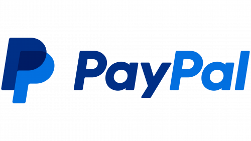
As PayPal entered its third decade, the brand found itself in an incredibly crowded marketplace. No longer just a button on eBay, PayPal had expanded into a massive ecosystem encompassing peer-to-peer payments (Venmo), merchant services (Braintree), buy-now-pay-later (BNPL) solutions, and cryptocurrency transactions. In 2022, the company introduced a subtle but highly strategic refinement to its visual identity, focusing on accessibility, contrast, and cross-platform coherence.
Color Calibration and Accessibility (WCAG Compliance)
The primary driver of the 2022 update was digital accessibility. Under the Web Content Accessibility Guidelines (WCAG), brands are required to ensure their digital interfaces provide sufficient contrast for users with visual impairments. The vibrant blues of the 2014 logo, while eye-catching, occasionally fell short of these stringent contrast ratios when placed against certain backgrounds.
To resolve this, PayPal calibrated its color palette, deepening the blues to achieve higher contrast ratios while preserving the signature vibrant feel of the brand. The darker blue in the monogram was adjusted to a richer navy, and the lighter blue was shifted to a more saturated, luminous tone. This subtle tweak significantly improved the readability of the logo across digital interfaces, ensuring compliance with modern accessibility standards without alienating the existing user base.
Structural Geometries and Responsive Scaling
During this refinement, the geometry of the interlocking “PP” monogram was subtly adjusted. The angles of the italics were mathematically aligned with the customized wordmark typography, creating a more harmonious visual rhythm when the monogram and wordmark were displayed together. This level of precision styling is characteristic of mature digital brands that prioritize visual consistency across millions of diverse touchpoints, including merchant checkouts, physical debit cards, and digital wallets.
The 2024 Rebrand by Pentagram: A Bold Step into Modern Minimalism
The 2024 Rebrand by Pentagram: A Bold Step into Modern Minimalism
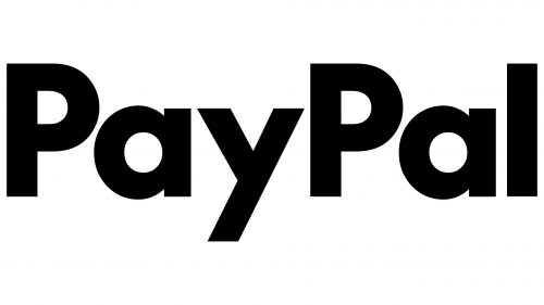
In late 2024, under the leadership of new CEO Alex Chriss, PayPal unveiled its most significant visual transformation in a decade. Designed in partnership with the legendary global design consultancy Pentagram, the new visual identity represents a bold departure from the friendly, rounded aesthetics of the past and a decisive leap into ultra-premium, modern minimalism.
A Clean, Custom Sans-Serif Typographic System
The most striking element of the 2024 rebrand is the complete overhaul of the wordmark typography. Pentagram retired the rounded, friendly typeface of the 2014 era in favor of a highly sophisticated, custom geometric sans-serif typeface. This new typography features sharp, precise angles, perfectly circular geometries, and a more robust weight. The letters are no longer italicized, signaling a shift from a pure focus on “speed” to a focus on structural stability, institutional strength, and modern elegance.
The Evolution of the Monogram: Flatness and Pure Geometry
While the iconic interlocking “PP” monogram remains a central component of the brand, its execution was heavily streamlined. The transparency effect at the intersection of the two letters was simplified into a clean, flat overlapping structure, optimized for maximum clarity on the highest-resolution modern displays. The monogram was decoupled from its reliance on vibrant gradients, allowing it to be rendered in high-contrast solid colors—such as deep black, pure white, and a single, refined shade of signature PayPal blue.
A Unified Brand Architecture
The 2024 rebrand was not just about updating a logo; it was about creating a unified visual language for PayPal’s sprawling suite of products. Pentagram developed a comprehensive brand architecture that allows the new design system to scale seamlessly across PayPal, PayPal Business, Venmo, and Honey. By utilizing a shared typographic DNA and a highly disciplined color system, PayPal successfully positioned itself as a premium, modern financial operating system for the next generation of global commerce.
The Chronological Timeline of PayPal’s Visual Identity
To provide a clear, structured overview of the PayPal Logo History: Every Logo Redesign Explained, the following table details the key characteristics, design agencies, and strategic motivations behind each era of the brand’s visual evolution.
- 1998–1999 (Confinity Era): A basic, utilitarian sans-serif wordmark designed for software security applications, focusing on technical clarity.
- 1999–2000 (X.com Era): A futuristic, metallic, glowing “X” designed by Elon Musk’s team, representing disruptive digital banking but lacking consumer trust.
- 1999–2007 (First Official PayPal Logo): A bold, italicized blue wordmark with a white border and drop shadow. Designed to establish digital trust and speed in early e-commerce.
- 2007–2014 (Web 2.0 Redesign): A rounded, humanistic sans-serif wordmark split into a two-tone blue palette (“Pay” in dark blue, “Pal” in light blue) to enhance readability and friendliness.
- 2014–2022 (The Landmark Rebrand): Designed by Fuseproject. Introduced the interlocking, translucent “PP” monogram and vibrant, high-saturation blues optimized for mobile screens.
- 2022–2024 (Digital Refinement): Subtle color and geometric calibrations designed to meet WCAG contrast accessibility standards and improve responsive digital performance.
- 2024–Present (Pentagram Rebrand): Designed by Pentagram. A premium, non-italicized geometric sans-serif wordmark and flat monogram, projecting modern minimalism and institutional strength.
The Psychology of Colors and Typography in PayPal’s Branding
The success of PayPal’s visual identity lies in its masterful application of design psychology. Every curve of a letter, angle of italicization, and shift in color hue has been calibrated to elicit specific cognitive responses from consumers. Understanding these design choices provides a masterclass in fintech brand strategy.
Color Psychology: The Science of Trust and Vitality
Throughout its history, PayPal has remained fiercely loyal to the color blue, but the specific shades of blue have evolved to match cultural and technological shifts:
- Deep Navy and Dark Blue (Trust & Stability): Used consistently in the word “Pay” and the primary layers of the monogram, these deep tones tap into the psychological associations of traditional banking: security, capital preservation, and institutional permanence.
- Vibrant Sky Blue (Innovation & Accessibility): Introduced in 2007 and amplified in 2014, the lighter blue tones represent accessibility, digital innovation, and energy. It prevents the brand from feeling overly conservative, positioning PayPal as a forward-thinking tech company.
- Monochromatic Adaptability (Premium Modernity): The 2024 Pentagram rebrand introduced a high-contrast black-and-white colorway for premium applications, aligning the brand with modern luxury, design-forward tech brands (like Apple and Uber), and high-end lifestyle services.
Typographic Geometry: From Speed to Stability
The physical structure of PayPal’s typography tells an equally compelling story. In the early days, the aggressive italicization of the wordmark was a direct response to the slowness of traditional banking. The tilt of the letters physically pointed to the right—the direction of progress and the future—reassuring users that their transactions were moving at the speed of the internet.
The transition to a straight, non-italicized geometric sans-serif in 2024 reflects a brand that no longer needs to prove its speed. Today, instant transactions are an industry standard. What consumers now seek is stability, clarity, and protection in an increasingly complex digital landscape. By standing upright, the new typography projects a sense of calm authority and architectural permanence.
Key Takeaways
- Trust is Paramount: PayPal’s consistent use of the color blue across three decades highlights how critical color psychology is in establishing and maintaining consumer trust in the financial sector.
- Mobile-First Optimization: The 2014 introduction of the interlocking “PP” monogram was a vital strategic response to the mobile revolution, proving that a brand must adapt its visual assets to the screens where its users live.
- Accessibility Drives Design: The 2022 refinements demonstrate that modern branding must prioritize digital accessibility (WCAG compliance), ensuring that logos remain legible and usable for all demographics.
- Minimalism is the Future: The 2024 Pentagram rebrand aligns PayPal with the broader industry trend toward premium, geometric minimalism, shifting the brand’s visual tone from “friendly tech helper” to “authoritative global financial operating system.”
- Responsive Brand Architecture: A successful modern logo must be part of a larger, cohesive design system that can scale effortlessly from a smartwatch screen to a massive physical billboard.
Frequently Asked Questions
Why did PayPal change its logo in 2024?
PayPal updated its logo in 2024 as part of a global rebrand designed by Pentagram. The redesign was initiated under new leadership to project a more premium, modern, and stable image, transitioning from the friendly, rounded aesthetics of the mobile app era to a highly sophisticated, geometric visual system suitable for a mature, global financial operating platform.
Who designed the iconic interlocking “PP” monogram?
The interlocking “PP” monogram was designed in 2014 by the world-renowned industrial designer Yves Béhar and his design agency, Fuseproject. The interlocking and translucent design was created to symbolize human connection, partnership, and the seamless exchange of money.
What do the colors in the PayPal logo represent?
The PayPal logo utilizes a strategic combination of blues. The deep navy blue represents security, trust, and institutional stability, while the vibrant light blue represents innovation, energy, and digital accessibility. The 2024 rebrand also introduced sleek black-and-white colorways to convey a premium, high-end lifestyle feel.
Why did PayPal shift away from italicized text in 2024?
In its early years, PayPal used italicized text to emphasize speed, momentum, and rapid electronic transactions. In the modern era, where instant digital payments are standard, the 2024 Pentagram rebrand shifted to an upright, non-italicized typeface to project structural stability, clarity, and institutional authority.
How does the PayPal logo ensure digital accessibility?
During the 2022 and 2024 design updates, PayPal carefully calibrated the contrast ratios of its blue hues to comply with Web Content Accessibility Guidelines (WCAG). This ensures that the logo remains highly legible on digital screens for individuals with visual impairments or color vision deficiencies.
Conclusion
The journey of PayPal’s visual identity is a compelling testament to the power of strategic brand evolution. As detailed in this exploration of the PayPal Logo History: Every Logo Redesign Explained, the platform has consistently used design as a tool to solve complex business challenges, build global trust, and adapt to seismic technological shifts.
From the early, utilitarian wordmarks designed to reassure skeptical desktop users in the late 1990s, to the vibrant, mobile-optimized monogram of 2014, and finally to the premium, minimalist architectural branding of 2024, PayPal has masterfully navigated the delicate balance between preserving brand equity and embracing bold innovation. As fintech continues to evolve into the realms of decentralized finance, Web3, and artificial intelligence, PayPal’s visual identity stands prepared to lead, serving as an enduring symbol of secure, seamless, and accessible global commerce.