
Logos are the visual embodiment of a brand’s identity, values, and vision. Few logos have undergone as dramatic, recognizable, and iconic a transformation as the Pepsi logo. From its humble beginnings in the 1890s to its sleek, modern look in the 21st century, the Pepsi logo tells a rich story of cultural relevance, branding evolution, and strategic Logo design changes that reflect over a century of American and global trends.
This article explores the Pepsi logo’s origin, design shifts, cultural influences, and branding strategies that helped the beverage giant maintain its status as a global powerhouse.
The Origins of Pepsi: Caleb Bradham’s Drink (1893–1903)

The story of Pepsi begins with Caleb Bradham, a North Carolina pharmacist who created a drink he called “Brad’s Drink” in 1893. It was a blend of sugar, water, caramel, lemon oil, nutmeg, and other natural additives. It was marketed as a health tonic to aid digestion and boost energy.
In 1898, Bradham renamed the drink Pepsi-Cola—drawing from the word “dyspepsia” (meaning indigestion) and “cola” (from the kola nut, a common caffeine source at the time). It marked the first step toward a marketable brand name. This era didn’t yet see a formal logo as we know it, but the name was stylized in simple, pharmaceutical-style fonts on store signage and labeling.
1905–1906: The Birth of the First Pepsi Logo
![]()
The first official Pepsi-Cola logo appeared in 1905. It was an elaborate, decorative script—red and swirly, bearing a strong resemblance to Coca-Cola’s typography, a move likely inspired by Coca-Cola’s growing popularity at the time. This logo aimed to exude elegance, style, and appeal to a more refined customer base.
Key Features:
- Decorative cursive font
- Red coloring
- Elaborate swirls and flourishes
In 1906, the logo was slightly simplified but still retained its ornate script. The brand also began adding the phrase “Drink Pepsi-Cola. It will satisfy you.”
This early logo set the foundation for brand recognition and differentiated the drink from its competitors in an increasingly crowded marketplace.
1940s–1950s: War, Patriotism, and the Bottle Cap
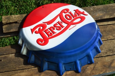
The 1940s brought about one of the most pivotal changes in Pepsi’s branding history—the introduction of the red, white, and blue color scheme.
During World War II, in an effort to showcase patriotism and support for the American troops, Pepsi redesigned its bottle cap with red, white, and blue colors—symbolizing the American flag. This wasn’t just a design change; it was a cultural move. It positioned Pepsi as an American product in tune with national sentiment.
1943 Logo Update:
- The classic script remained
- Introduced the tri-color bottle cap background
- Helped Pepsi gain more traction among young soldiers and families
By 1950:
The bottle cap design was fully integrated into the logo, with the Pepsi-Cola script superimposed on a cap featuring red, white, and blue. This marked the beginning of a departure from traditional branding and a move toward modern marketing strategies.
1962: The Wordmark Simplification – “Pepsi” Without the Cola
![]()
The 1960s marked a significant cultural shift—modernism, minimalism, and mass media advertising were taking over. Pepsi responded accordingly.
In 1962, Pepsi dropped the word “Cola” from its brand name in its logo, simplifying it to just “Pepsi.” The move coincided with a complete shift in the brand’s marketing tone, focusing on the youth of the era with slogans like “Now It’s Pepsi, For Those Who Think Young.”
The 1962 Logo:
- A minimalist sans-serif wordmark
- Positioned next to a flat bottle cap symbol
- Red, white, and blue colors remained
This was a strategic rebrand to target a younger, trendier generation. The simplified name gave Pepsi a distinct identity away from Coca-Cola.
1973: The Horizontal Pepsi Globe
![]()
In 1973, the Pepsi Globe was born. This was a complete redesign of the brand’s logo, with the word “Pepsi” in bold, block letters placed next to a circular icon that resembled a bottle cap but also looked like a planetary symbol—a nod to the brand’s growing international reach.
Key Characteristics:
- Blue bold sans-serif font
- Circular red, white, and blue emblem
- Clean, symmetrical design
This version of the logo was modern, abstract, and globally appealing. It stayed with the brand for over a decade, used on cans, bottles, vending machines, and advertisements worldwide.
1991–1998: The Wordmark Inside the Globe
![]()
In 1991, Pepsi placed its bold wordmark inside the globe for the first time, giving the logo a more cohesive look. The globe also featured a shiny, 3D gradient, which was trendy at the time. This era also saw the brand taking on new slogan campaigns like “The Choice of a New Generation.”
By 1998, the logo evolved again, with more depth and shading added to the globe to make it appear more realistic and dimensional. Pepsi’s identity was becoming more digital-friendly and reflective of the design aesthetics of the early internet era.
2003: Hyper-Realism and Pepsi Twist
![]()
In 2003, Pepsi introduced a glossy, hyper-realistic version of the globe with reflective surfaces, gradients, and shadows—representing the rise of digital art and 3D effects in branding. This was used for product variants like Pepsi Twist and Pepsi Blue, showing how the globe could adapt to sub-brands.
2008: The Modern Pepsi Globe – The Arnell Redesign
![]()
One of the most controversial and talked-about logo changes came in 2008 when the Arnell Group undertook a major Pepsi rebranding initiative.
Key Features:
- The globe retained its red, white, and blue pattern but introduced a “smile” curve in the white space
- The wordmark became lowercase and rounded, signaling friendliness and modernity
- The new globe had asymmetrical wave patterns to symbolize dynamic energy
Controversy:
- The redesign cost Pepsi millions of dollars
- The design document leaked online, describing deep symbolic meanings (like gravitational pull and the Mona Lisa’s smile), which many found over-the-top
Despite the backlash, the new logo stuck and defined the brand’s identity in the 2010s. It became more mobile- and web-friendly, appealing to a younger digital audience.
2023–2024: Return to Roots with a Modern Touch

In March 2023, Pepsi announced its most recent logo update, which began rolling out in 2024 for its 125th anniversary. This logo was widely praised for blending nostalgia with modern aesthetics.
Key Elements:
- Return to bold uppercase letters for the word “PEPSI”
- The wordmark was moved inside the globe for the first time since 1991
- Flat, high-contrast design suitable for digital screens
- Darker navy blue replaced the previous bright blue
This rebrand was all about connecting the past with the future—capturing the essence of Pepsi’s long-standing heritage while making it relevant to a new generation of consumers.
Pepsi Logo Evolution Timeline (Visual Reference)
(Here, insert a timeline image or collage showcasing key logos from 1905, 1943, 1962, 1973, 1991, 2008, and 2023)
Cultural and Branding Significance of Pepsi’s Logo Evolution
Pepsi’s logo changes weren’t just design choices—they reflected broader cultural shifts, technological trends, and consumer behavior changes.
- 1900s–1940s: Emphasized craftsmanship and American identity.
- 1960s–1980s: Aligned with youth, rebellion, and minimalist trends.
- 1990s–2000s: Embraced digital realism, global branding.
- 2010s–2020s: Focused on simplicity, versatility, and emotional connection.
Lessons from Pepsi’s Logo Evolution:
- Adaptability is essential in branding.
- Consistency in color and shape builds brand memory.
- A logo must evolve without losing its core identity.
- Strategic branding aligns with cultural and generational shifts.
Case Study: The Evolution of the Pepsi Logo – Reinventing an Iconic Brand Identity
Overview
Pepsi, one of the world’s most recognized beverage brands, has undergone numerous logo transformations since its inception in 1898. The evolution of its logo offers a compelling case study in brand identity, adaptability, and cultural relevance. From ornate script fonts to a bold, minimalist globe, Pepsi’s visual journey reflects broader shifts in consumer behavior, design trends, and competitive branding strategies.
Challenge
Pepsi faced a unique challenge that spanned decades: how to remain visually relevant and appealing across generations, while standing apart from its fiercest rival—Coca-Cola—whose logo has remained largely unchanged.
Pepsi needed to:
- Modernize its image without losing brand recognition
- Compete effectively in global markets
- Stay culturally relevant to younger demographics
- Adapt to digital platforms and packaging design
Strategy
Pepsi adopted a phased logo evolution strategy, rather than a complete overhaul all at once. Key strategic moments include:
- 1905–1940s: Brand establishment using Coca-Cola-inspired script to gain early recognition
- 1943: Introduction of the red, white, and blue bottle cap design to evoke American patriotism during WWII
- 1962: Dropped “Cola” to become simply Pepsi, signaling a youthful, modern brand
- 1973–1990s: Created the Pepsi Globe, a symbol of modernity and global reach
- 2008: Launched a controversial but future-forward rebrand with a new smiling globe and lowercase typography
- 2023: Returned to bold uppercase lettering inside a flatter globe, merging legacy and modernity for its 125th anniversary
Each redesign considered:
- Consumer psychology
- Visual trends (e.g., minimalism, 3D, flat design)
- Technological shifts (e.g., digital readability, mobile usability)
- Cultural context (e.g., war, youth rebellion, sustainability)
Execution
In 2008, Pepsi hired the Arnell Group for a major rebrand. The new asymmetric globe and lowercase typography marked a radical shift—intended to reflect “dynamic energy” and optimism. Despite some backlash, the design helped Pepsi reassert itself as a modern brand.
By 2023, Pepsi responded to growing nostalgia by unveiling a reimagined logo that reinstated the wordmark inside the globe, used bolder typography, and returned to a darker shade of blue, making it more digitally versatile and reminiscent of its classic roots.
Results
- Pepsi maintained brand recognition through consistent use of red, white, and blue across every iteration
- The logo adaptations enabled Pepsi to target new generations, particularly through campaigns like “Pepsi Generation” and “For the Love of It”
- The 2023 redesign received positive reception for merging legacy aesthetics with modern design, reaffirming Pepsi’s adaptability
Key Takeaways
- Logo evolution should be strategic, not reactive. Pepsi updated its logo in alignment with cultural and generational shifts.
- Color consistency (red, white, blue) created long-term brand recall, even when form and typography changed.
- Bold redesigns (e.g., 2008) can face criticism but also lead to renewed brand energy.
- The 2023 redesign proves the value of bridging the past and present to maintain relevance in a saturated market.
Conclusion
From its early 20th-century decorative script to its bold, modern Pepsi Globe, the Pepsi logo has been a visual mirror of American culture, design trends, and consumer expectations. With each redesign, Pepsi has managed to balance innovation with brand familiarity, proving that effective logo evolution is not just about aesthetics—but also about relevance, resonance, and timeless appeal.
As Pepsi continues into its next century, its logo stands as a testament to the power of thoughtful design and brand reinvention—a true icon of visual identity in a changing world.