
The logo of a brand isn’t just a design; it’s a statement of identity, values, and evolution. In the realm of global fast-food giants, Pizza Hut has one of the most instantly recognizable logo designs, anchored by its iconic red roof. Over the decades, the Pizza Hut logo has seen significant transformations, adapting to changing times, technologies, and tastes. From its humble beginnings in Wichita, Kansas, to becoming a symbol of family dining and international expansion, Pizza Hut’s visual identity is a fascinating study in branding evolution.
In this article, we’ll take a comprehensive look at the history of the Pizza Hut logo, exploring how it started, the changes it went through, and how it embraced modern logo design trends while staying true to its legacy.
Origins of Pizza Hut: The Birth of a Brand (1958)
![]()
The story of Pizza Hut began in 1958 when brothers Dan and Frank Carney, students at Wichita State University, borrowed $600 from their mother to open a pizza parlor. They named it Pizza Hut because their sign could only accommodate eight letters. The name would soon become iconic, and with it, the visual branding would evolve to represent comfort, tradition, and affordability.
At the time, the logo was simple and text-based, mostly typographic, and reflected the modest nature of the business. There was no iconic red roof yet—just a straightforward black or red serif wordmark with the words “Pizza Hut.”
1967: Introduction of the Iconic Red Roof

The real visual identity of Pizza Hut began taking shape in the mid-1960s, particularly in 1967, when the famous red roof design was introduced. This design change was closely tied to the architectural structure of Pizza Hut restaurants, which featured a distinctive trapezoid-shaped red roof that soon became a physical and visual signature of the brand.
Key Features of the 1967 Logo:
- A stylized drawing of a hut-shaped roof
- “Pizza Hut” written beneath it in a bold, serif typeface
- Emphasis on warmth, familiarity, and homestyle dining
This logo reflected the dining experience Pizza Hut was promoting—a place that felt like home, ideal for family meals and casual dining. It also reinforced brand consistency, as the roof image could be easily associated with both physical buildings and visual media.
1970s–1980s: Refinement and Global Expansion

In the 1970s and 1980s, Pizza Hut grew rapidly across the United States and internationally. To support its growth, the brand worked on refining its image while retaining its recognizable red roof logo.
During these decades:
- The roof illustration was stylized further—smoother lines, more uniformity
- The wordmark “Pizza Hut” was refined, with better kerning and font consistency
- Marketing materials began to emphasize the roof as the central symbol
This period was crucial as Pizza Hut established itself as a global pizza chain, and the logo became an asset in reinforcing brand familiarity across diverse markets.
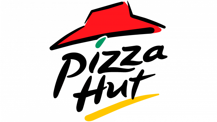
1995: The Swirling Roof and “Dot of Sauce”
In 1995, Pizza Hut underwent a major logo redesign to modernize its image for a new generation of customers. This logo was both artistic and energetic, reflecting a livelier brand personality.
Key Changes:
- The red roof became more abstract, with a wavy, brushstroke-like texture
- A yellow line was added beneath the wordmark to resemble a pizza crust or underline
- A green dot over the “i” in “Pizza” symbolized a fresh herb or dot of sauce
This logo marked a departure from the precise architecture-inspired design, embracing hand-drawn aesthetics and a more playful, expressive brand image. It was a bold move that matched the pop-culture-heavy, youth-oriented marketing campaigns of the late ’90s.
1999–2008: Bolder, Edgier Pizza Hut
In 1999, Pizza Hut introduced a sharper, more graphic version of the logo. While it retained the swirling red roof, the wordmark was italicized and bolded to signify speed, energy, and modern appeal.
Key Elements:
- The red roof design remained stylized and angular
- The yellow stroke became more prominent, resembling melted cheese
- The typography became bolder, slanted, and edgy
This version aimed to reflect a fast-casual dining experience and aligned with the rapid service and delivery focus Pizza Hut was moving toward. It also made the logo more prominent on digital screens and packaging.
2009–2014: Flattened and Simplified
As flat design trends took over branding in the early 2010s, Pizza Hut responded by slightly modifying its logo again.
- The roof and text were simplified
- Gradients and shading were removed
- The design was cleaner and more digital-friendly
While subtle, these changes helped the brand maintain relevance in an increasingly online and mobile-first world. However, this version didn’t stray too far from its core identity—it kept the red roof and yellow underline but toned down the vibrancy.
2014: The Modern Minimalist Rebrand – Pizza Hut Emblem
![]()
In 2014, Pizza Hut went through a complete rebranding effort that gave birth to a very different, minimalist logo.
Key Features:
- The iconic roof was removed from the primary logo
- Introduced a pizza sauce-red circle background
- The Pizza Hut wordmark appeared in white, using a custom sans-serif typeface
- It resembled a pizza with sauce and appeared on menus, websites, and apps
This version embraced flat design, simplicity, and versatility—ideal for mobile and app usage. However, this logo received mixed reviews because it discarded the iconic red roof that had become synonymous with the brand for over five decades.
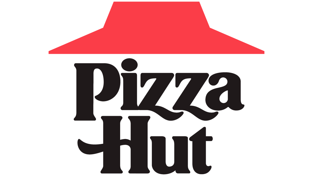
2019: Return to the Classic Red Roof

Recognizing the value of nostalgia and brand heritage, Pizza Hut in 2019 brought back the classic red roof logo—a nod to its original 1967 design, albeit modernized.
Characteristics of the 2019 Logo:
- A bold, blocky red roof sits above the wordmark
- Clean typography reminiscent of earlier designs
- Refined and flat, without gradients
This reintroduction of the red roof coincided with campaigns like “No One OutPizzas the Hut”, a return to traditional values and the sit-down restaurant experience.
It represented a strategic pivot: while the 2014 minimalist logo appealed to digital convenience, the new version aimed to reconnect emotionally with consumers through brand heritage and authenticity.
2023–2024: Dual Logo Strategy
As of 2023–2024, Pizza Hut maintains a dual branding strategy:
- A modern emblem (red circle + wordmark) for digital platforms, apps, and delivery branding
- The classic red roof logo for storefronts, merchandise, and traditional advertising
This approach acknowledges the diversity of brand touchpoints today. By using different logos based on context, Pizza Hut manages to:
- Appeal to younger audiences with minimalist design
- Reassure longtime customers with legacy branding
- Maintain consistency in color palette (red, black, white)
Visual Timeline of Pizza Hut Logos
(Insert a visual timeline here featuring logos from 1958, 1967, 1995, 1999, 2014, and 2019)
Each phase in Pizza Hut’s logo journey reflects broader design movements and consumer expectations, from decorative roots to flat UI aesthetics.
Branding Lessons from Pizza Hut’s Logo Evolution
1. Nostalgia Matters
Pizza Hut learned that even in a fast-moving digital world, consumers still crave the emotional connection tied to legacy visuals.
2. Contextual Branding Works
By using different logos for different platforms, Pizza Hut creates a flexible brand system that adjusts to media environments.
3. Simplicity = Modern Relevance
The flat, circular logo introduced in 2014 may have departed from tradition, but it proved useful in mobile-first platforms like apps and social media.
4. Consistency in Color
Throughout every redesign, the brand consistently uses red, reinforcing familiarity even during dramatic visual shifts.
Case Study: Pizza Hut Logo History – From Red Roof to Digital Simplicity
Overview
Pizza Hut, founded in 1958 in Wichita, Kansas, is one of the most recognizable global pizza brands. Its logo evolution is a powerful example of how a company can balance brand heritage with modern design trends to stay relevant. Over more than six decades, Pizza Hut’s logo has transformed from a basic wordmark to a cultural icon anchored by its famous red roof, and later adapted into a flat, digital-friendly identity.
Challenge
As consumer behaviors shifted and design trends evolved, Pizza Hut needed to:
- Modernize its image for digital platforms
- Maintain brand recognition across global markets
- Compete with rising fast-casual and app-based food delivery services
- Evoke nostalgia among longtime customers while attracting younger audiences
Strategy
Pizza Hut’s strategy focused on evolving its visual identity in phases, using iconic elements—like the red roof—to maintain brand equity, while experimenting with minimalist design in the digital era.
Key Milestones:
- 1967: Introduction of the red roof symbol, inspired by the restaurant architecture
- 1995–1999: Stylized, brushstroke roof and bolder typography for a youthful, energetic feel
- 2014: Shift to a minimalist red circle logo—symbolizing pizza sauce and simplicity
- 2019: Reintroduced the classic red roof logo in a modernized form for brand nostalgia
- 2023–2024: Dual-logo strategy—red roof for legacy branding, red circle for digital platforms
Execution
- The 1990s logos were designed with movement and personality, targeting younger demographics through vibrant marketing campaigns.
- The 2014 rebrand leaned into flat design, perfect for apps and mobile ordering, aligning with modern UX/UI principles.
- The 2019 refresh re-embraced the classic red roof to spark emotional connection and heritage storytelling.
- Recent branding maintains both logos, deploying them contextually based on the channel (e.g., traditional advertising vs mobile app).
Results
- Brand recognition increased with the return of the red roof
- Improved cross-generational appeal, blending tradition with tech-savviness
- Strengthened visual consistency across platforms through color and typography
- Reasserted brand identity in a competitive, fast-evolving market
Key Takeaways
- Iconic elements (like the red roof) anchor brand memory—even as styles change
- Minimalism isn’t always the answer; legacy can be a powerful marketing tool
- Context-based logo deployment is a smart strategy in multi-platform environments
- Periodic brand refreshes help keep even long-standing companies visually relevant
Conclusion
The evolution of the Pizza Hut logo is not just a story of visual design—it’s a reflection of how a brand can grow, modernize, and still stay rooted in its identity. From the classic red roof that became an architectural and cultural symbol, to the flat, minimalist icon designed for the digital age, Pizza Hut has demonstrated remarkable branding agility.
As the company continues to innovate in product offerings, delivery models, and dining experiences, its logo evolution will likely continue to evolve. But one thing is certain: whether it’s the nostalgic roof or a sauce-red circle, Pizza Hut’s logo remains a powerful emblem of comfort, flavor, and global familiarity.