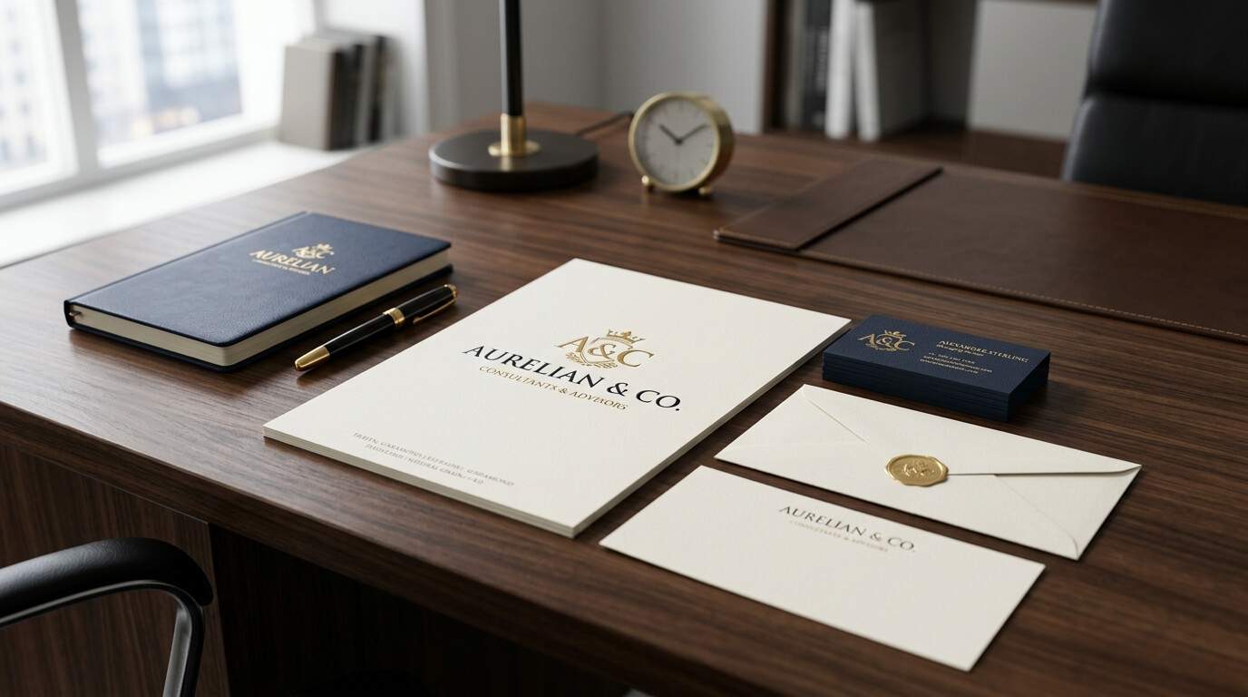
A letterhead is often one of the first physical pieces of communication a client, customer, investor, or business partner sees from a company. While the logo, typography, colors, and layout create the foundation of a professional letterhead, the finishing techniques applied to the printed material can take the design to another level. Premium letterhead finishes add texture, shine, depth, and character, helping ordinary business stationery feel more refined and memorable.
In a world where so much business communication happens digitally, professionally printed stationery can have an unexpected impact. A beautifully finished letterhead can communicate attention to detail before the recipient even reads the message. The paper feels different, the logo may catch the light, and subtle textures can make the entire document appear more sophisticated. These details can be especially valuable for businesses operating in industries where presentation and trust matter, including law, finance, real estate, consulting, luxury retail, hospitality, architecture, and creative services.
Premium finishes do not necessarily mean adding every available printing technique. The most effective letterhead designs usually use one or two carefully selected finishes that complement the brand. The goal is not simply to make the stationery look expensive. It is to create a physical experience that reinforces the company’s identity and makes communication feel intentional.
What Makes a Letterhead Finish Premium?
A premium finish is more than an attractive visual effect. It refers to a post-printing or specialized printing treatment that changes the appearance, texture, or physical character of the letterhead. Some finishes create a glossy appearance, while others introduce a tactile quality that can be felt when the paper is handled. Certain techniques emphasize specific elements such as logos, borders, names, or headings rather than covering the entire page.
The choice of paper also plays an important role. A sophisticated finish applied to poor-quality stock may not produce the desired result. Likewise, a beautifully textured paper may already have enough visual personality that additional effects become unnecessary. Premium stationery is therefore a combination of paper selection, printing method, finishing technique, typography, color, and overall design.
Why Finishing Matters in Business Communication
Printed materials create a different kind of interaction from digital communication. When someone receives a physical letter, proposal, certificate, invoice, or formal document, the quality of the stationery contributes to the overall impression. A well-produced letterhead can suggest organization, professionalism, and care.
This does not mean that expensive printing automatically makes a company appear more credible. The finish needs to make sense for the brand and purpose of the document. A highly reflective finish might suit a luxury fashion company but feel inappropriate for a traditional legal practice. In contrast, subtle embossing or high-quality uncoated paper may work beautifully in a professional corporate environment.
Embossing for a Sophisticated Tactile Effect
Embossing is one of the most recognizable premium letterhead finishes. It creates a raised design by pressing the paper between specially prepared dies. The result is a three-dimensional effect that can be seen from different angles and, more importantly, felt by touch.
A company logo is often an excellent candidate for embossing because it creates a subtle focal point without requiring additional color. The raised surface can make a simple logo feel more distinctive while preserving a clean and professional appearance. Embossed company names, monograms, borders, and decorative elements can also work effectively when used carefully.
Choosing What to Emboss
Not every element of a letterhead should be embossed. Large areas can become visually overwhelming and may increase production costs. Small but meaningful elements generally produce better results. A logo positioned near the top of the page, for example, can create a refined signature for the stationery.
Embossing also works particularly well with minimalist designs. When the page contains limited graphics and generous white space, a raised logo can become the primary visual detail. This approach can be especially effective for businesses that want their stationery to communicate understated sophistication rather than obvious luxury.
Debossing for Subtle Depth
Debossing is closely related to embossing, but instead of raising the design, it presses the design into the paper. The result is a recessed impression that provides texture and depth without creating a raised surface.
This finish can be particularly attractive on thick, high-quality paper. A deeply pressed logo on substantial stock can create a tactile experience that feels elegant and deliberate. Because the effect is generally more understated than glossy treatments, debossing can work well for corporate stationery, professional services, premium packaging companies, and brands with minimalist visual identities.
Embossing and Debossing Together
In some designs, embossing and debossing can be combined to create more complex dimensional effects. However, restraint is important. Letterhead is still a functional business document, so excessive texture can interfere with readability or make the page feel more like promotional packaging.
The strongest approach is often to reserve dimensional effects for branding elements while keeping the actual communication area simple. This allows the letterhead to remain practical while still providing a premium visual and tactile experience.
Foil Stamping for Metallic Impact
Foil stamping is another popular premium finish. It applies a metallic or specialty foil to selected areas of the letterhead using heat and pressure. Gold and silver are traditional choices, but modern printing can offer a wide variety of metallic and specialty foil effects.
Gold foil can create an association with luxury and prestige, while silver can produce a cooler, contemporary appearance. Other metallic shades can be used when they complement the company’s established brand colors.
Where Foil Works Best
Foil stamping is particularly effective for logos, company names, initials, or small decorative details. A metallic logo against a matte or uncoated background can create a strong contrast without requiring a complicated layout.
The finish should generally support the existing identity rather than compete with it. If the brand already uses metallic colors, foil can strengthen consistency between the digital and physical brand experience. If metallic colors are not part of the identity, a restrained accent may still work, but it should be considered within the broader design system.
Spot UV for Contrast and Shine
Spot UV is a coating technique that applies a glossy finish only to selected areas of a printed design. Instead of making the entire sheet shiny, the printer can highlight specific elements while leaving the rest of the paper matte or uncoated.
This contrast can create a sophisticated visual effect. For example, a company logo can have a glossy finish while the surrounding letterhead remains matte. When the document moves under light, the selected area becomes noticeable without appearing excessively decorative.
Creating Subtle Visual Hierarchy
Spot UV is useful when a designer wants to create visual hierarchy without adding more colors. A glossy logo can naturally attract attention, while matte typography remains easy to read. The effect is particularly noticeable on dark or richly colored paper, although it can also work on lighter designs.
Because spot UV depends on light reflection, it is important to consider how the finished letterhead will look in normal office environments. The effect should remain subtle enough that the document continues to look professional under different lighting conditions.
Soft-Touch Lamination for a Smooth Feel
Soft-touch lamination adds a smooth, velvety coating to the surface of printed material. The finish changes the tactile experience significantly, making the paper feel softer and more refined.
Although lamination is more common for business cards, folders, brochures, and presentation materials, it can also be considered for certain letterhead applications. It can provide a protective surface while creating a distinctive texture.
When Soft-Touch Works Well
Soft-touch finishes are particularly suitable for premium brands that want their physical materials to feel modern and luxurious. A company that uses soft-touch business cards and presentation folders, for example, may use related finishes on selected stationery to create consistency.
However, lamination can affect how easily certain pens write on the surface. If a letterhead is intended to be printed on and then handwritten, the paper and coating need to be tested before production. Functional requirements should always take priority over appearance.
Edge Finishing and Special Paper Treatments
Premium letterhead does not always need a dramatic surface coating. Sometimes the paper itself creates the premium effect. Thick cotton papers, textured stocks, laid papers, linen-style papers, and specialty uncoated materials can introduce visual and tactile qualities without requiring heavy post-printing treatments.
A textured paper can give a traditional law firm a sense of heritage, while a smooth heavyweight stock may feel more contemporary. Cotton-based papers are often associated with high-quality correspondence because of their substantial feel and refined surface.
Colored and Painted Edges
For particularly distinctive stationery, colored or painted edges can provide another level of customization. Although this treatment is more commonly associated with luxury business cards and invitations, it can be incorporated into specialized stationery systems.
The edge color can match an established brand color or introduce a subtle accent. Because the effect is visible primarily when the paper is stacked or viewed from an angle, it remains relatively understated while still adding character.
Letterpress for Traditional Craftsmanship
Letterpress printing creates an impression in the paper as ink is pressed into the stock. The technique is associated with traditional craftsmanship and can produce a tactile, elegant result.
Letterpress is especially effective for businesses that want their stationery to feel established and carefully crafted. The process works beautifully with minimalist typography, monograms, logos, and limited-color designs.
One of the advantages of letterpress is that the impression itself becomes part of the design. Instead of relying on a glossy coating or metallic surface, the paper communicates quality through depth and texture.
Choosing the Right Finish for Your Brand
The right finish depends on the company’s identity, audience, industry, document purpose, and budget. A premium real estate company might use foil stamping and heavyweight stock to reinforce a luxury positioning, while a technology company might prefer spot UV or a clean soft-touch finish for a more contemporary aesthetic.
Professional service businesses often benefit from subtle finishes. Embossing, debossing, or carefully selected paper textures can add distinction without making formal documents appear overly decorative.
The following table provides a general comparison of popular options.
| Letterhead Finish | Main Effect | Best For | Overall Character |
| Embossing | Raised texture | Logos and monograms | Elegant and tactile |
| Debossing | Recessed texture | Minimalist branding | Subtle and sophisticated |
| Foil Stamping | Metallic detail | Luxury branding | Premium and striking |
| Spot UV | Selective gloss | Logos and accents | Modern and polished |
| Soft-Touch | Velvety surface | Contemporary brands | Smooth and luxurious |
| Letterpress | Pressed ink and texture | Traditional brands | Crafted and refined |
| Textured Paper | Natural tactile quality | Professional stationery | Classic and understated |
| Colored Edges | Visible edge accent | Specialty stationery | Distinctive and creative |
Combining Finishes Without Overdoing Them
One of the biggest mistakes in premium stationery design is assuming that more finishing techniques automatically create a better result. Combining several effects can quickly make a letterhead look busy. The purpose of premium finishing is to create intentional detail, not visual noise.
A restrained combination can be highly effective. For example, a heavyweight uncoated stock with a blind debossed logo can create a refined result without using additional colors. Alternatively, a matte surface with a small foil logo can introduce contrast while preserving a clean layout.
The design should determine the finish rather than the other way around. If the logo already contains intricate details, a simple finish may be more appropriate. If the design is minimalist, texture or metallic detailing may provide just enough visual interest.
Matching Finishes With Paper Weight
Paper thickness has a major influence on how premium finishes appear. Dimensional techniques such as embossing and debossing generally require suitable stock to produce clean results. Very thin paper may not provide enough depth or stability for certain effects.
Heavyweight paper can also improve the overall handling experience. When someone picks up a substantial sheet of stationery, the physical weight can contribute to a perception of quality. This is particularly relevant for formal correspondence, certificates, executive communications, proposals, and presentation documents.
The finish and paper should therefore be selected as a complete system. A printer can often recommend appropriate combinations based on the desired effect, printing process, and intended use.
Premium Finishes and Brand Consistency
A letterhead should not feel disconnected from the company’s other marketing materials. The finish should support the wider visual identity across business cards, envelopes, folders, presentation materials, packaging, and digital branding.
Consistency does not necessarily mean using exactly the same finish everywhere. Instead, it means maintaining recognizable visual characteristics. A company might use gold foil on its business cards and a subtle gold-ink accent on letterhead. Another business might use embossed branding across several printed materials while keeping digital assets flat and minimal.
The objective is to create a recognizable brand experience regardless of where customers encounter the company.
Balancing Cost and Perceived Value
Premium finishes can increase printing costs, so businesses should consider where they will have the greatest impact. A company that sends hundreds of routine letters every month may prefer a high-quality paper stock and standard printing, while using specialty finishes for executive correspondence, proposals, certificates, or important client presentations.
Cost should also be evaluated in relation to the purpose of the stationery. A finish that looks impressive but provides little value to the recipient may not justify its expense. On the other hand, a carefully chosen finish on important correspondence can make the physical document feel more intentional and memorable.
Working with a professional printer is valuable at this stage because finishing prices can vary according to quantity, material, complexity, setup requirements, and production method.
Designing Letterhead That Still Looks Professional
Premium finishing should never compromise readability. The primary function of letterhead is still to provide a clear and professional framework for communication. Contact information, company details, dates, addresses, body text, and other necessary information must remain easy to read.
Typography should therefore remain clean and appropriately sized. Decorative finishes are best reserved for branding elements rather than essential text. White space is equally important because it allows premium details to breathe.
A well-designed letterhead often appears simple at first glance. The premium quality becomes more apparent when the recipient looks closer, touches the paper, or sees the design under changing light.
The Role of Professional Printing
Choosing a finish is only one part of the process. The quality of production determines whether the final result matches the original design. Registration, color accuracy, paper handling, coating consistency, and finishing precision can all affect the outcome.
A professional printer can also provide proofs or samples before a large production run. This is particularly important for embossed, debossed, foil, spot UV, and specialty paper applications because the physical result can differ from how the design appears on a screen.
Testing is especially useful when several elements are being combined. A small sample can reveal whether the foil is too dominant, whether the embossing is deep enough, or whether the paper feels appropriate for the intended audience.
Conclusion
Premium letterhead finishes can transform ordinary business stationery into a memorable physical representation of a brand. Techniques such as embossing, debossing, foil stamping, spot UV, soft-touch lamination, letterpress, and specialty paper treatments each offer different ways to introduce texture, contrast, depth, and sophistication.
The most effective premium letterhead is not necessarily the one with the most elaborate finishing. Instead, it is the one where paper, printing, design, and finishing work together naturally. A carefully selected finish can reinforce brand identity, improve the tactile experience, and make professional communication feel more intentional. When used with restraint, premium finishing can help a simple sheet of paper make a lasting impression.
FAQ
Q. What is the most popular premium letterhead finish?
Embossing, foil stamping, spot UV, and specialty textured papers are among the commonly considered premium options. The best choice depends on the brand’s visual identity and the intended use of the letterhead.
Q. Is foil stamping suitable for corporate letterhead?
Yes. Foil stamping can work well on corporate stationery when used selectively. Applying foil to a logo, company name, or small accent can create a polished appearance without overwhelming the document.
Q. Does embossing make letterhead more expensive?
Embossing generally adds production costs because it requires specialized tooling and additional finishing. The final cost depends on factors such as quantity, paper type, design complexity, and the printer’s production process.
Q. Can premium finishes be combined?
Yes, but restraint is important. Combinations such as heavyweight textured paper with embossing or matte stock with foil can create an attractive result. Using too many finishes can make the letterhead visually crowded.
Q. What paper is best for premium letterhead?
There is no single best paper for every application. Heavyweight uncoated, cotton, textured, and specialty stocks are often considered for premium stationery. The paper should be selected according to the desired finish, printing method, writing requirements, and overall brand style.