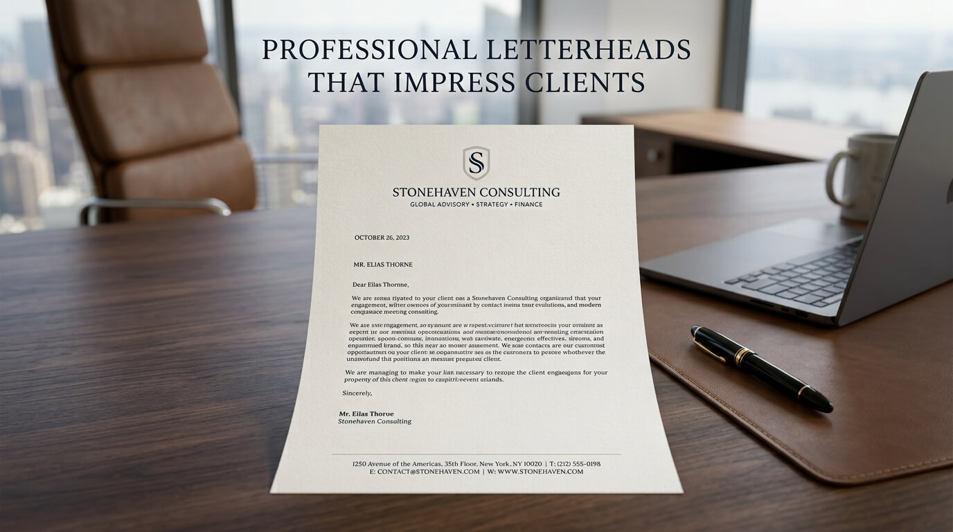
A professional letterhead is much more than a piece of paper with a company name at the top. It is a visual representation of a business, often appearing at important moments when trust, credibility, and attention to detail matter most. Whether it is used for a client proposal, business agreement, invoice, formal announcement, recommendation letter, or printed correspondence, a well-designed letterhead can reinforce the impression a company wants to make.
In an increasingly digital business environment, physical and digital documents still play an important role in professional communication. A carefully designed letterhead can make an ordinary document feel official, organized, and trustworthy. It gives recipients immediate information about who sent the document while creating consistency with other branded materials such as business cards, envelopes, presentations, websites, and email signatures.
The most effective professional letterheads do not depend on excessive decoration. Instead, they combine thoughtful typography, balanced spacing, brand colors, appropriate paper choices, and clear contact information. The goal is to create a design that supports the content rather than competing with it. When clients receive a document that looks polished and intentional, the presentation itself can contribute to their perception of the business.
Why Professional Letterheads Matter to Clients
Creating a Strong First Impression
Clients often form an opinion about a business before they carefully read every word of a document. The visual presentation provides an immediate indication of how seriously a company approaches its work. A clean, professional letterhead can establish a sense of order and credibility before the recipient reaches the main message.
This is particularly important when businesses communicate with prospective clients, investors, suppliers, partners, or other professional organizations. A document that appears carefully prepared suggests that the company pays attention to details. While a letterhead cannot replace quality service or strong communication, it can support the overall professional experience.
A poorly designed document can have the opposite effect. Overcrowded layouts, inconsistent fonts, low-resolution logos, excessive colors, or missing contact information can make even well-written communication appear less polished. Professional letterhead design therefore becomes part of the broader customer experience.
Reinforcing Brand Identity
A letterhead provides another opportunity for a business to communicate its identity consistently. When the logo, colors, typography, and overall visual language match the company’s other branded materials, clients begin to recognize a unified identity across different communication channels.
Brand consistency is especially valuable for businesses that send documents frequently. A client might encounter a company through its website, receive an email from its sales team, see a proposal, and later receive a printed contract. When these materials share a recognizable design language, the business feels more established and organized.
The letterhead should therefore be considered part of the company’s complete visual identity rather than an isolated design project. It should work naturally alongside business cards, envelopes, presentations, invoices, reports, and digital documents.
Essential Elements of an Impressive Letterhead
A Clear and Professional Logo
The logo is usually one of the most recognizable elements on a letterhead. It should be placed where it is visible without overwhelming the document. Many professional designs position the logo in the upper-left or upper-right corner, although centered layouts can also work when they suit the brand.
The quality of the logo is particularly important for printed documents. A low-resolution image can look blurry or pixelated when printed, which can immediately reduce the professional appearance of the document. Businesses should use an appropriate high-resolution or vector version of their logo whenever possible.
The logo should also have enough surrounding space. Crowding it against the edge of the page or placing other information too close to it can make the entire header feel cramped.
Accurate Contact Information
A professional letterhead should make it easy for clients to identify and contact the business. Depending on the organization’s needs, this information can include the company address, phone number, email address, website, and other relevant details.
However, including every possible contact channel is not always necessary. A letterhead becomes less effective when the footer or header is overloaded with information. The most useful details should be prioritized and presented in a readable way.
Contact information should also be checked regularly. An outdated phone number, old office address, or inactive website can create confusion and make the business appear careless. Letterhead templates should therefore be reviewed whenever major company information changes.
Professional Typography
Typography has a major influence on how a letterhead feels. The font should be easy to read and appropriate for the company’s personality. A legal firm may prefer a traditional and authoritative typeface, while a creative agency may use a more contemporary typographic approach.
Using too many fonts can make a design look inconsistent. A strong letterhead generally relies on a limited combination of typefaces, with hierarchy created through differences in size, weight, and placement.
The body of the letter should remain highly readable. Decorative typography may work for a logo or small brand element, but the primary communication should use a typeface that remains comfortable to read in both printed and digital formats.
Choosing the Right Letterhead Layout
Creating Visual Hierarchy
A good letterhead directs the reader’s attention naturally. The company name and logo should establish the identity of the sender, while the actual document content should remain the main focus once the reader begins reading.
Visual hierarchy can be created through size, spacing, alignment, typography, and color. A company logo might be slightly larger than the supporting contact information, while the body text occupies the largest usable area of the page.
The design should avoid competing with the message. If the header consumes too much space, there may not be enough room for important correspondence. Similarly, an oversized footer can make the document feel visually heavy.
Using White Space Effectively
White space is one of the most important elements in professional letterhead design. Empty space gives individual elements room to breathe and prevents the page from looking crowded.
Many inexperienced designs attempt to fill every available area with logos, graphics, taglines, social media icons, addresses, and decorative patterns. Professional design usually takes the opposite approach. It carefully determines what needs to appear and allows sufficient space around those elements.
A balanced page often feels more premium because the design appears intentional rather than overloaded. White space can also make the actual message easier to read, which is especially important for letters containing several paragraphs.
Choosing Appropriate Alignment
Alignment creates structure. A letterhead can use left alignment, centered alignment, right alignment, or a combination of these approaches, but the choice should feel deliberate.
Left-aligned layouts are often practical because they provide a strong reading path. Centered layouts can create a more formal or elegant appearance when used carefully. Asymmetrical designs may be appropriate for creative or contemporary brands.
Regardless of the chosen style, consistency is essential. Logos, contact information, headings, and document text should relate to a clear underlying grid so the finished page does not feel randomly assembled.
Choosing Colors That Impress Without Distracting
Color is a powerful part of branding, but professional letterheads rarely need a large palette. One or two primary brand colors supported by neutral tones can create a sophisticated appearance.
A corporate company may use navy, charcoal, gray, or another restrained color combination. A creative company might use brighter colors, but those colors should still be controlled so that the document remains professional.
Contrast is also important. Text must remain easy to read against the background, particularly when the document is printed on standard white paper. Light gray text or very pale brand colors may look attractive on a screen but become difficult to read in print.
Color should support brand recognition rather than become the main attraction. The strongest letterheads usually make the company’s identity noticeable without allowing the visual design to overpower the written communication.
Professional Letterhead Design for Different Business Documents
Client Proposals
Client proposals benefit from a letterhead that feels polished but leaves plenty of room for detailed information. The branding should establish credibility while allowing headings, project details, pricing information, and explanations to remain prominent.
For proposals, businesses may also use related branded page layouts so that additional pages feel connected to the first page without repeating a large header unnecessarily.
Formal Business Letters
Formal correspondence often benefits from a traditional and uncluttered letterhead. The recipient should immediately understand who sent the document and how to contact the organization.
Because formal letters can contain substantial written content, the design should preserve a generous area for the message. A simple header and restrained footer can often create a more professional impression than a heavily decorated page.
Contracts and Agreements
Legal and contractual documents require clarity above all else. A professional letterhead can establish the identity of the organization, but it should never interfere with the readability of the agreement.
Important legal content should remain easy to locate and review. Businesses should also ensure that branding elements do not create ambiguity about where official terms, signatures, or other required information appear.
Invoices and Official Documents
Invoices and official documents can use a letterhead-inspired identity while incorporating additional information specific to the document. The branding should create consistency without making financial or administrative details difficult to find.
This is another situation where typography and spacing are particularly important. Clients should be able to distinguish company information from transaction details quickly.
Printed vs Digital Professional Letterheads
Modern businesses often need letterheads for both physical and digital documents. These versions should share the same visual identity but may require slightly different technical considerations.
A printed letterhead must account for paper quality, ink or toner reproduction, margins, trimming, and color accuracy. A digital letterhead must work well in formats such as PDF and should remain readable across different screens and devices.
A design that looks excellent on a monitor may not reproduce exactly the same way on paper. Likewise, extremely large background graphics can increase digital file sizes without providing meaningful value. Designing separate but visually consistent versions can help businesses maintain quality in both environments.
| Letterhead Element | Printed Documents | Digital Documents | Key Consideration |
| Logo | High-resolution or vector | High-resolution digital file | Maintain clarity |
| Colors | Consider print reproduction | Consider screen appearance | Keep branding consistent |
| Typography | Ensure print readability | Ensure screen readability | Use accessible fonts |
| Contact Information | Clear and readable | Clickable where appropriate | Keep details current |
| Margins | Account for printer limitations | Maintain clean page spacing | Protect readability |
| Footer | Keep visually balanced | Avoid unnecessary clutter | Use essential details |
| File Format | Print-ready PDF or suitable artwork | PDF or document template | Preserve layout |
Selecting the Right Paper for a Professional Letterhead
Paper quality can influence the physical experience of receiving a business document. Standard office paper may be appropriate for everyday correspondence, while premium stationery can be useful for proposals, formal letters, certificates, or high-value client communications.
Paper weight, texture, brightness, and finish can all affect the final result. A heavier stock can feel more substantial, while a textured paper can create a distinctive tactile impression. However, the paper should always suit the company’s brand and the purpose of the document.
A sophisticated letterhead does not necessarily require expensive paper. The important factor is coordination between the paper and the overall brand identity. A simple, high-quality design printed clearly on appropriate stock can often create a stronger impression than an elaborate design printed on unsuitable material.
Common Letterhead Mistakes That Reduce Professionalism
Overloading the Design
One of the most common mistakes is trying to communicate too much through the letterhead itself. Excessive logos, icons, patterns, slogans, colors, and contact details can make the page feel cluttered.
The letterhead should provide context, not compete with the message. Removing unnecessary elements often makes a design feel more sophisticated.
Using Poor-Quality Graphics
A stretched or pixelated logo can immediately undermine an otherwise professional document. Businesses should prepare their visual assets carefully and use appropriate files for both digital and print applications.
Ignoring the Second Page
Long documents often extend beyond the first page. If a company uses a highly elaborate first-page header but does not consider how subsequent pages should appear, the document can feel inconsistent.
A well-developed stationery system can include a more subtle design treatment for additional pages. This preserves branding while giving readers more room for content.
Failing to Update Business Details
Outdated contact information is more than a minor inconvenience. It can make clients question whether the document is current and whether the organization maintains its communication materials carefully.
Businesses should periodically review their letterhead templates and replace outdated information immediately.
How Letterheads Build Client Trust
Trust is built through many small interactions rather than a single design element. A letterhead cannot guarantee that a client will trust a business, but it can contribute to an organized and consistent communication experience.
When every formal document uses consistent branding, accurate information, readable typography, and thoughtful formatting, clients receive a clear visual signal that the organization has established processes. This consistency can be particularly useful for professional service providers where documents are a major part of client interaction.
A strong letterhead also communicates authenticity. When a formal proposal or business letter includes recognizable company information and consistent branding, the document feels connected to the organization rather than appearing generic or improvised.
Making Professional Letterheads Work With Your Entire Brand
The best letterheads are created as part of a larger branding system. The same colors and typography can be carried into business cards, envelopes, email signatures, presentations, reports, invoices, packaging, and digital communications.
This creates a unified experience across different touchpoints. Clients may not consciously identify every matching detail, but consistency can make the organization appear more cohesive.
Businesses should therefore avoid designing letterheads independently from the rest of their visual identity. The letterhead should feel like a natural extension of the brand.
When to Refresh Your Letterhead Design
A letterhead may need to be redesigned when a company changes its logo, updates its brand identity, relocates, changes its contact information, or moves toward a more modern communication style.
Even without a major rebrand, older stationery can eventually become visually inconsistent with a company’s website and other marketing materials. A redesign provides an opportunity to simplify the layout, improve readability, update technical files, and create versions for both print and digital use.
The objective should not be to follow every passing design trend. A professional letterhead should remain useful and recognizable for years. Timeless structure combined with appropriate contemporary details often provides greater value than an overly trendy design.
Final Thoughts
Professional letterheads are small but meaningful components of business communication. When thoughtfully designed, they establish brand identity, improve document presentation, support credibility, and create a more consistent experience for clients. The most effective designs focus on clarity, balance, typography, accurate information, appropriate color, and purposeful use of space.
A letterhead should never overpower the message it introduces. Instead, it should quietly reinforce the identity and professionalism of the organization behind the document. Whether used for a formal letter, client proposal, contract, invoice, or digital PDF, a well-designed letterhead can turn routine communication into a polished brand experience.
FAQ
Q1. What makes a letterhead look professional?
A professional letterhead typically combines a clear logo, readable typography, accurate contact information, balanced spacing, appropriate colors, and a clean layout. The design should support the document’s purpose without overwhelming the written content.
Q2. What information should a business letterhead include?
Most business letterheads include the company name or logo, address, phone number, email address, and website. The exact information depends on the company’s communication needs and the type of documents being created.
Q3. Should a professional letterhead be colorful?
A letterhead can use color, but it does not need to be highly colorful to appear professional. A restrained palette that matches the company’s brand identity can create a polished and recognizable appearance.
Q4. Is a digital letterhead different from a printed letterhead?
The visual identity can remain the same, but digital and printed versions may require different technical preparation. Printed stationery needs to account for paper, margins, and color reproduction, while digital versions should be optimized for screen viewing and document formats such as PDF.
Q5. How often should a company update its letterhead?
A company should update its letterhead whenever its branding, contact information, address, logo, or other important business details change. It can also be reviewed during a broader brand refresh to ensure that the stationery remains consistent with the company’s current identity.