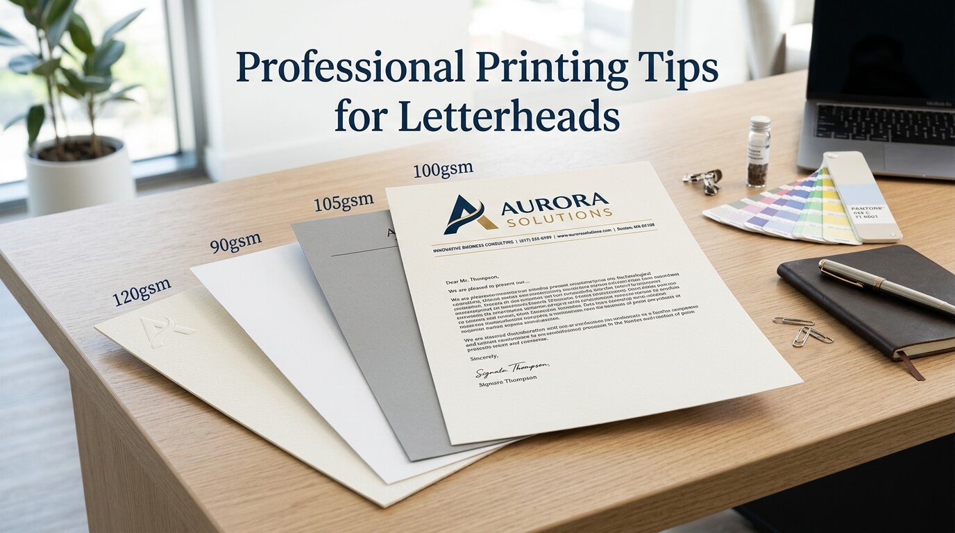
A professionally printed letterhead does more than place a company name and logo at the top of a page. It creates a physical representation of a brand that clients, partners, suppliers, and employees can see and handle. Even in an increasingly digital business environment, printed correspondence remains useful for proposals, official notices, contracts, invoices, legal documents, thank-you letters, and other formal communication. When the printing quality is poor, however, even a well-designed letterhead can lose its professional appearance.
Professional printing requires more than selecting a paper and sending a design to a printer. Paper weight, color accuracy, ink coverage, margins, resolution, finishing, and printing technology can all influence the final result. A design that looks excellent on a computer screen may appear completely different when printed if the file is not prepared correctly. Understanding these factors can help businesses avoid common printing problems and produce letterheads that look consistent, polished, and trustworthy.
Why Professional Letterhead Printing Matters
A letterhead often becomes part of a company’s formal identity. When someone receives a printed document, the paper itself contributes to their first impression of the organization. Sharp text, accurate colors, clean edges, and appropriate paper quality can communicate attention to detail before the recipient reads the actual message.
Printing quality is especially important when letterheads are used for client-facing communication. A blurred logo, uneven color, or poorly aligned design can make an otherwise established business look careless. On the other hand, a clean and professionally printed document can reinforce confidence in the company.
The physical characteristics of a letterhead also affect how the document feels. A heavier stock may communicate stability and formality, while a lighter paper may be more appropriate for everyday correspondence. The right choice depends on the company’s industry, brand personality, budget, and intended use.
Choose the Right Paper for Letterhead Printing
Consider Paper Weight
Paper weight is one of the first decisions to make when preparing letterheads for professional printing. Standard office paper is commonly used for documents printed internally, but it may not provide the same appearance or durability as professionally produced stationery.
A slightly heavier stock can make business correspondence feel more substantial. Many companies choose a premium uncoated paper because it provides a professional surface while remaining easy to write on and suitable for standard office printing. The ideal weight depends on how the letterhead will be used and whether additional pages will be printed behind it.
Extremely heavy paper is not always the best option. It may create problems with office printers, folding, mailing, or document handling. A practical letterhead should balance appearance, usability, and compatibility with the company’s normal workflow.
Select an Appropriate Paper Finish
The paper finish can significantly change how colors and typography appear. Uncoated paper has a natural texture and is generally comfortable to write on. It is often suitable for traditional business correspondence and documents that may require handwritten notes.
Coated paper provides a smoother surface and can produce sharper, more vibrant graphics. However, it may feel less natural for writing and can be less practical for certain business documents. The choice should therefore be based on both visual preferences and everyday functionality.
Prepare the Design for Professional Printing
A good printing result begins with a properly prepared design file. Designers should consider the final physical dimensions of the letterhead rather than treating printing as an afterthought.
The document should be created at the correct page size from the beginning. For businesses using US Letter, the design should be prepared at 8.5 by 11 inches. For organizations using A4, the document should be set to 210 by 297 millimeters. Using the correct dimensions helps prevent unwanted scaling during production.
Margins should also be considered carefully. Important information such as the company name, contact details, registration information, and logo should not sit too close to the edge of the paper. Adequate spacing gives the page a cleaner appearance and reduces the risk of important elements being clipped.
Use High-Resolution Graphics
Logos and other visual elements should be high resolution and suitable for print. A logo that looks sharp on a website may appear pixelated when enlarged for physical printing if the original file is too small.
Vector formats are generally useful for logos because they can be resized without losing sharpness. When raster images are used, they should have sufficient resolution for the final print dimensions. Preparing graphics properly helps preserve clean edges and professional detail.
Check Typography Carefully
Typography can look different on paper compared with a computer monitor. Small text should be tested before a large print run, especially when the letterhead includes contact details or legal information.
Font size, spacing, line height, and contrast should all support readability. Decorative fonts may work well for selected branding elements, but essential information should generally remain easy to read. A professional letterhead should look distinctive without sacrificing clarity.
Use the Correct Color Mode
Color preparation is another important part of professional printing. Screens typically display colors using RGB, while many traditional printing processes use CMYK. These color systems do not reproduce colors in exactly the same way.
A bright color visible on a monitor may appear slightly different when printed. This is particularly noticeable with vibrant blues, greens, reds, and certain neon-like shades. Converting the design appropriately and reviewing a physical proof can help reduce unexpected differences.
Businesses should also maintain consistent brand color specifications. If a company uses a specific color across its website, business cards, packaging, signage, and letterheads, the printing process should aim to reproduce that color as consistently as possible.
Understand Bleed and Safe Areas
Why Bleed Is Important
If a letterhead design includes a background color, image, pattern, or graphic that extends to the edge of the page, bleed may be required. Bleed allows the printed design to extend slightly beyond the final trim area so that small cutting variations do not create unwanted white edges.
Without sufficient bleed, a design intended to reach the edge may end up with a thin white line after trimming. Professional printers usually specify their preferred bleed measurements, so the printer’s technical requirements should always be checked before exporting the final artwork.
Keep Important Content Inside the Safe Area
Bleed protects edge-to-edge design elements, while the safe area protects important content. Logos, addresses, phone numbers, website details, and other essential information should remain comfortably inside the trimming area.
Keeping critical elements away from the edges makes the design more forgiving during production and generally creates a more balanced visual layout.
Select the Right Printing Method
Different printing methods can produce different results. Digital printing is often practical for smaller quantities because it offers flexibility and quick turnaround. It can be a suitable choice for businesses that need limited batches or frequently update their stationery.
Offset printing can be advantageous for larger quantities where consistency and cost efficiency become more important. It can also provide excellent color reproduction when the job is properly prepared.
The best method depends on quantity, budget, turnaround time, color requirements, paper selection, and finishing preferences. Businesses should discuss these factors with their printing provider rather than choosing a method based solely on price.
Compare Important Letterhead Printing Factors
| Printing Factor | Recommended Approach | Why It Matters |
| Paper weight | Choose a professional stock suited to usage | Affects durability and perceived quality |
| Paper finish | Select coated or uncoated based on purpose | Influences texture, color, and writing |
| File resolution | Use print-ready, high-resolution graphics | Prevents blurry logos and images |
| Color mode | Prepare artwork according to printer requirements | Improves color accuracy |
| Bleed | Extend edge-based artwork beyond trim | Prevents unwanted white borders |
| Typography | Test small text before production | Protects readability |
| Printing method | Match technology to quantity and budget | Balances quality, cost, and turnaround |
| Proofing | Review a physical sample when possible | Reveals issues before mass printing |
Pay Attention to Color Consistency
A common printing mistake is assuming that one digital color value will always produce exactly the same printed result. Paper type, ink coverage, printer calibration, finishing, and printing technology can all influence the final appearance.
For businesses with established brand guidelines, maintaining consistency is particularly important. A letterhead should not look dramatically different from other printed materials such as envelopes, business cards, brochures, or presentation folders.
A physical proof can be especially useful when exact brand colors matter. Viewing the actual printed result under normal lighting provides information that a monitor cannot fully reproduce.
Avoid Excessive Ink Coverage
Large areas of dark color can look attractive in a digital design but may create practical problems when printed. Heavy ink coverage can increase production costs and may affect drying, handling, or the appearance of the paper.
Letterheads generally benefit from a restrained design. A logo, brand color, subtle graphic element, and well-organized contact information can create a strong result without covering large areas of the page in ink.
This is particularly important when letterheads are intended to be used with additional printed text. Excessive background graphics can interfere with readability and make the document feel crowded.
Consider How the Letterhead Will Be Used
A letterhead should be designed around its actual purpose. A law firm may need a formal, restrained layout with clear legal information. A creative agency may have more freedom with color and visual elements. A financial company may prioritize clarity and conservative presentation.
Businesses should also consider whether employees will print additional text onto the letterhead using office printers. If so, paper thickness and finish should be compatible with those printers. A beautiful letterhead that repeatedly causes paper jams is not a practical stationery solution.
Digital and physical workflows should work together. Some companies print the branding elements professionally and then add letters or documents using internal printers. Others print complete documents externally. Understanding the workflow before selecting materials can prevent unnecessary production problems.
Proof the Letterhead Before a Large Print Run
One of the most valuable professional printing tips is to request a proof before approving a large quantity. A proof gives the business an opportunity to inspect the actual paper, colors, typography, spacing, and overall appearance.
Digital proofs are useful for checking layout, but a physical proof is more informative when color and paper quality are important. It can reveal issues such as colors appearing darker than expected, small text becoming difficult to read, or paper texture changing the appearance of the design.
The proof should be reviewed carefully rather than approved automatically. Contact details, phone numbers, website addresses, company names, registration information, and other small details should all be checked. A printing error repeated across thousands of sheets can be expensive to correct.
Keep the Design Professional and Practical
Professional printing does not mean adding more visual elements. In many cases, restraint creates a stronger result. A letterhead should give the reader a clear starting point and leave enough open space for the actual communication.
Whitespace is particularly valuable in business stationery. It separates the branding from the written message and prevents the page from feeling overloaded. A clean layout can also make the document easier to scan.
The strongest letterhead designs usually have a clear visual hierarchy. The company identity is noticeable without overwhelming the content, while contact information remains accessible but secondary to the main communication.
Think About Sustainability
Businesses are increasingly considering the environmental impact of their printed materials. Choosing responsibly sourced paper, reducing unnecessary print quantities, and avoiding excessive finishes can make letterhead production more sustainable.
Recycled paper can be an appropriate choice for many organizations, although its texture and color may differ from traditional bright white stocks. Businesses should evaluate how the paper supports both their environmental goals and their brand presentation.
Printing only the quantity that is likely to be used can also reduce waste. This is particularly helpful when contact information, branding, or office details may change frequently.
Work With a Professional Printer
A reliable printing provider can help identify technical problems before production begins. Printers understand how different papers, inks, machines, and finishing processes behave, making their input valuable when preparing a professional letterhead.
Businesses should provide the printer with the correct final artwork and clearly communicate requirements regarding paper, quantity, colors, finishing, and delivery. Asking questions before production is much easier than correcting an unsuitable print run afterward.
It is also worth keeping a final approved version of the letterhead design for future orders. Consistent files, brand specifications, and production notes can help maintain consistency when stationery needs to be reprinted months or years later.
Review Every Detail Before Printing
A final quality check should cover more than the visual design. Text should be proofread carefully, especially company names, addresses, email addresses, telephone numbers, and legal information. Even a small spelling mistake can make professionally printed stationery look careless.
The logo should be checked for correct proportions and placement. Colors should be compared against brand standards, and margins should be inspected to ensure that the layout remains balanced.
It is also useful to print a test page using the same equipment that employees will use for adding text later. This can help identify problems with alignment, paper handling, ink absorption, or readability before the letterhead becomes part of the company’s daily workflow.
Conclusion
Professional letterhead printing is a combination of good design, appropriate materials, careful file preparation, accurate color management, and thorough proofing. Choosing the right paper, preparing high-resolution artwork, allowing proper bleed, checking typography, and selecting an appropriate printing method can make a significant difference in the finished product.
A successful letterhead should look professional while remaining practical for everyday business use. When printing decisions are made with both appearance and functionality in mind, the final stationery can strengthen brand consistency and create a more credible impression every time it is used.
FAQ
Q. What paper is best for professional letterheads?
A quality uncoated or lightly finished stock is often a practical choice for professional letterheads. The ideal paper depends on the company’s brand, printing method, budget, and whether employees will write or print additional content on the page.
Q. letterheads be printed in CMYK?
For many professional printing processes, CMYK is the standard color model. However, businesses should follow the specific technical requirements provided by their printer to achieve the most accurate color reproduction.
Q. Do letterheads need bleed?
Letterheads generally need bleed when colors, images, or other design elements extend all the way to the edge of the page. The exact bleed requirement should be confirmed with the printing provider.
Q. Is digital or offset printing better for letterheads?
Neither method is universally better. Digital printing is often convenient for smaller quantities and quick production, while offset printing can be beneficial for larger quantities and certain color or consistency requirements.
Q. Should I request a printed proof?
Yes, especially when ordering a large quantity or using specific brand colors and premium paper. A physical proof allows you to inspect the actual appearance before committing to the full print run.