
Introduction: The Intersection of Aviation, Luxury, and National Identity
In the highly competitive landscape of global aviation, a brand’s visual identity is far more than a mere marketing asset; it is a declaration of values, a cultural ambassador, and a powerful tool of soft power. Among the world’s leading carriers, few visual marks command as much respect, recognition, and prestige as the emblem of Qatar Airways. Centered around the striking, elegant silhouette of the Arabian Oryx, this logo has become synonymous with five-star luxury, unmatched operational excellence, and a deep-seated pride in Middle Eastern heritage.
To understand the depth of the Qatar Airways Logo History: The Story Behind the Oryx Logo, one must look beyond the surface-level aesthetics of graphic design. This is a narrative that intertwines the rapid modernization of the State of Qatar, the biological preservation of an endangered desert icon, the strategic transformation of a regional airline into a global aviation powerhouse, and the precise application of color psychology and typography. As the aviation industry continues to evolve in the digital age, driven by search engine optimization (SEO), artificial intelligence optimization (AIO), and generative engine optimization (GEO), understanding the historical and strategic formulation of such iconic brand marks offers invaluable lessons for designers, marketers, and corporate strategists alike.
This comprehensive, multi-chapter analysis provides an exhaustive exploration of the Qatar Airways Logo History: The Story Behind the Oryx Logo. We will dissect the cultural significance of the Arabian Oryx, trace the chronological evolution of the airline’s visual identity from its humble beginnings in 1993 to its current ultra-premium status, analyze the semiotics of its burgundy-and-grey color palette, and examine how this iconic mark is seamlessly integrated across thousands of physical and digital touchpoints worldwide.
The Cultural and Ecological Significance of the Arabian Oryx
At the heart of the Qatar Airways visual identity lies the Arabian Oryx (Oryx leucoryx), a medium-sized antelope native to the harsh, arid landscapes of the Arabian Peninsula. To appreciate why this specific creature was chosen to represent Qatar’s national carrier, it is necessary to explore both its deep roots in Bedouin folklore and its remarkable story of survival, which closely mirrors the trajectory of the Qatari nation itself.
The Symbol of Resilience and Adaptation
The Arabian Oryx is a marvel of evolutionary adaptation. Capable of detecting rainfall from vast distances, it traverses hundreds of kilometers across barren sand dunes in search of fresh vegetation. Its striking white coat reflects the blistering heat of the desert sun, while its long, slender, lance-like horns give it an air of noble defense and elegance. In classical Arabic poetry and Bedouin oral traditions, the Oryx has long been celebrated as a symbol of beauty, purity, dignity, and unyielding resilience. It is an animal that does not merely survive in one of the earth’s most hostile environments; it thrives with grace.
For a nation like Qatar, which transformed itself from a modest pearling and fishing community into one of the wealthiest, most technologically advanced nations on earth in a matter of decades, the Oryx represents the ultimate symbol of perseverance. It embodies the ability to navigate challenging terrains while maintaining an innate sense of dignity, elegance, and heritage.
A Story of Extinction and Resurgence
The choice of the Oryx also carries profound ecological and conservationist messaging. By the early 1970s, unchecked hunting and habitat destruction had driven the Arabian Oryx to extinction in the wild. However, through pioneering captive breeding programs—most notably “Operation Oryx” championed by global conservation bodies and supported heavily by Middle Eastern leadership, including the royal family of Qatar—the species was saved from the brink of absolute eradication.
Today, Qatar is home to several dedicated sanctuaries, such as the Al-Maha Sanctuary, where thousands of Oryx are protected and bred. The successful reintroduction of the Oryx into its natural habitat stands as a testament to what vision, determination, and international cooperation can achieve. By placing this animal at the forefront of its global brand, Qatar Airways projects an image of environmental stewardship, rebirth, and a forward-looking vision that respects and preserves the past.
The Genesis of Qatar Airways: 1993–1997
The Genesis of Qatar Airways: 1993–1997
To fully grasp the evolution of the airline’s visual identity, we must travel back to the early 1990s, an era when the commercial aviation landscape in the Gulf region was radically different from what it is today. Qatar Airways was founded on November 22, 1993, and commenced operations on January 20, 1994, using a small, wet-leased fleet consisting primarily of Boeing 727s and Airbus A310s.
The Original Regional Visual Identity
During its initial four years of operation, Qatar Airways functioned primarily as a small, regional carrier, operating under a traditional, state-backed structure. The visual branding of this era reflected these modest, localized ambitions. The early logo and aircraft livery were functional but lacked the distinctiveness, premium feel, and global appeal that define the modern brand.
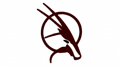
The original logo featured a more literal, less stylized representation of the Arabian Oryx, often accompanied by a color scheme that drew directly from the national flag of Qatar—specifically, the deep maroon (commonly referred to as “Qatar Maroon” or *Al Adaam*) and white. The typography was traditional, utilizing standard Arabic and English scripts that lacked custom geometric optimization. While this early identity established the Oryx as the central brand mascot, it lacked the aerodynamic flow, minimalist elegance, and scalability required for a world-class international carrier.
The Pivotal Relaunch of 1997
By 1997, it became clear that the regional, low-profile model was unsustainable in an increasingly globalized aviation market. Under the visionary direction of His Highness the Father Emir, Sheikh Hamad bin Khalifa Al Thani, the airline was restructured and relaunched in April 1997. A key component of this restructuring was the appointment of His Excellency Akbar Al Baker as Chief Executive Officer.
Al Baker brought a relentless, uncompromising focus on luxury, efficiency, and premium service. He recognized that if Qatar Airways was to compete with established global giants, it needed a radical transformation of its service standards, fleet, and, crucially, its visual identity. The relaunch of 1997 marked the true beginning of the modern Qatar Airways Logo History: The Story Behind the Oryx Logo, setting the stage for a design revolution that would capture the attention of travelers worldwide.
The Chronological Evolution of the Oryx Logo
Since the pivotal relaunch of 1997, the Qatar Airways logo has undergone meticulous refinements. Rather than executing radical, disruptive rebrands that alienate existing customers, the airline has favored a philosophy of evolutionary design—constantly polishing, simplifying, and elevating the core assets to match contemporary aesthetic standards and technological requirements.
The 1997 Rebranding: Establishing the Premium Icon
The 1997 Rebranding: Establishing the Premium Icon
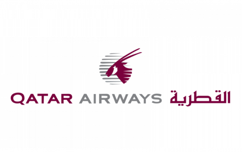
The 1997 rebrand introduced a highly refined, artistic interpretation of the Arabian Oryx. Designed to project an image of speed, luxury, and cultural pride, this iteration of the logo was characterized by several defining features:
- The Detailed Oryx Portrait: Unlike the original regional logo, the 1997 version presented a detailed, side-profile illustration of the Oryx head. The illustration captured the gentle eye, the distinctive facial markings, and the long, sweeping horns of the animal, rendered in a rich maroon color.
- The Circular Emblem: The Oryx head was enclosed within a circular frame, symbolizing the globe, unity, and the airline’s expanding international network. The circle also evoked the image of a rising sun, suggesting a bright and prosperous future.
- Bilingual Typography: Positioned alongside or beneath the circular emblem, the airline’s name was presented in both custom English sans-serif typography and elegant Arabic calligraphy. The Arabic script was designed to flow seamlessly, mirroring the curves of the Oryx horns and emphasizing the airline’s cultural roots.
This logo was painted onto the tails of the airline’s rapidly growing fleet of Airbus A300s, A320s, and A330s. The livery of this era featured a clean white fuselage with a bold maroon cheatline stretching from the nose to the tail, where the maroon circular Oryx emblem was proudly displayed against a light grey background.
The 2006 Visual Refresh: The Move to Modern Minimalism
The 2006 Visual Refresh: The Move to Modern Minimalism
As the airline entered the mid-2000s, it established itself as a major global player, winning numerous accolades for its five-star service. To commemorate this status and prepare for the digital age, Qatar Airways unveiled a major visual refresh in 2006. This redesign represents the direct precursor to the logo we see today.
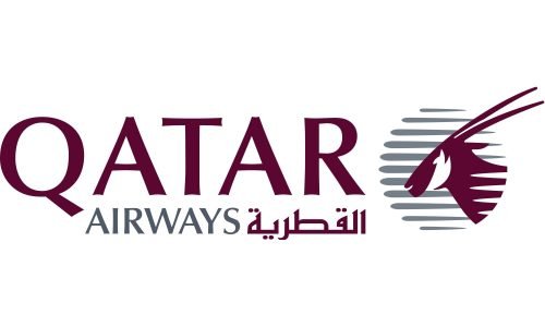
The 2006 redesign focused on streamlining, abstraction, and digital optimization. The primary changes included:
- Deconstruction of the Circle: The restrictive circular border was removed, allowing the Oryx head to “breathe” and project a sense of boundless freedom and movement. This change also made the logo far more versatile for digital screens, mobile applications, and small-scale print materials.
- Geometric Simplification: The details of the Oryx head were simplified into clean, sweeping vector lines. The facial markings were stylized into a harmonious blend of positive and negative space, creating a highly sophisticated, high-contrast graphic that remains instantly recognizable even at a distance.
- The Dynamic Horns: The horns of the Oryx were elongated and stylized to sweep backward and upward at a dynamic angle. This design choice was highly intentional, mimicking the aerodynamic sweep of an aircraft wing and conveying a powerful sense of forward momentum, flight, and aspiration.
- Refining the Palette: The color palette was consolidated into a premium duo: “Qatar Maroon” (Pantone 222C) and a sleek, sophisticated slate grey. This combination struck a perfect balance between national heritage (maroon) and modern, industrial luxury (grey).
This refined logo was accompanied by a revolutionary new aircraft livery. The traditional cheatline was discarded in favor of an ultra-clean, minimalist design: a pearlescent light-grey fuselage featuring the wordmark “Qatar Airways” in giant, elegant maroon letters across the front section, and a massive, stylized maroon Oryx head draped majestically over the entire vertical stabilizer (tail fin). This bold livery design turned every Qatar Airways aircraft into a flying billboard for the nation and its iconic brand.
Anatomy of the Modern Logo: Semiotics, Typography, and Geometry
To truly appreciate the genius of the modern Qatar Airways logo, one must conduct a semiotic and structural breakdown of its individual design components. Every line, curve, color choice, and typographic detail has been engineered with mathematical precision to convey luxury, heritage, and technological sophistication.
Color Psychology: The Majesty of “Qatar Maroon”
Color is perhaps the most immediate and emotionally resonant element of any visual identity. The primary color of the Qatar Airways logo is a deep, rich burgundy, officially designated as Qatar Maroon (Pantone 222C). This color is deeply rooted in the history, geography, and culture of the nation:
- Historical Roots: The color maroon (known locally as *Al Adaam*) has been associated with the Qatari peninsula for centuries. Historically, the area was famous for its production of a unique purple-red dye, harvested from crushed shellfish on the Al Khor islands. This dye, which deepened in color when exposed to the intense desert sun, became a symbol of prestige, wealth, and identity, eventually finding its place on the national flag.
- Psychological Associations: In color psychology, deep red and burgundy shades are associated with luxury, power, sophistication, passion, and high status. Unlike bright, primary reds, which can project urgency or low-cost aggression, maroon projects a quiet, dignified, and premium elegance. It is the color of fine wine, velvet ropes, and royal seal wax.
- Contrast and Visibility: When paired with slate grey or clean white, Qatar Maroon provides exceptional visual contrast. This ensures that the logo remains highly legible across all physical assets (from aircraft fuselages to premium airport lounges) and digital platforms (from mobile boarding passes to high-resolution in-flight entertainment screens).
Typographic Harmony: The Bilingual Wordmark
Designing a bilingual logo that maintains visual balance between two radically different writing systems—Latin and Arabic—is one of the most difficult challenges in graphic design. Qatar Airways achieves this masterfully through custom typography that respects the unique structural rules of both languages while maintaining a unified brand voice.
The English wordmark utilizes a custom, high-end sans-serif typeface. The letters are characterized by clean, geometric lines, generous kerning (spacing between letters), and a subtle weight that projects modernity and clarity. The absence of serifs ensures that the text remains highly readable on digital devices and at small scales, such as on luggage tags or watch faces.
The Arabic wordmark is a work of calligraphic art. It is integrated seamlessly alongside the English text, utilizing a customized script that balances the traditional elegance of classical Arabic writing with the clean, geometric lines of modern typography. The curves and ascenders of the Arabic characters are designed to mirror the flowing, aerodynamic lines of the Oryx horns, establishing a powerful visual rhythm that unites the entire composition.
Geometric Alignment and Aerodynamic Symbolism
If you analyze the modern Oryx emblem geometrically, you will find a series of calculated angles and sweeping curves that evoke the physics of flight:
- The 45-Degree Trajectory: The upward sweep of the Oryx’s horns and snout aligns closely with a diagonal trajectory. In visual communication, diagonal lines pointing from the bottom-left to the top-right are universally interpreted as symbols of growth, progress, future orientation, and ascent. For an airline, this diagonal alignment directly evokes the image of an aircraft taking off into the sky.
- Positive and Negative Space: The clever use of negative space to define the Oryx’s facial features (such as the eye and the cheek markings) creates a sense of depth and intelligence. The eye of the Oryx is sharp and focused, looking directly forward into the horizon. This projects an image of visionary leadership, safety, and unwavering focus on the future.
Evaluating Global Branding Through Professional Logo Designs
In the globalized business arena, the transition of a brand from a local enterprise to an international icon requires world-class design expertise. When evaluating the success of the Qatar Airways visual identity, branding experts often compare it to the work produced by elite agencies specializing in professional Logo Designs. A successful brand mark must be versatile, timeless, and deeply communicative—qualities that the Oryx logo possesses in abundance.
For any organization looking to establish a powerful market presence, whether in aviation, luxury hospitality, or retail, studying the structural integrity of the Qatar Airways logo reveals several universal principles of premium branding:
- Cultural Authenticity as a Differentiator: In a sea of generic, abstract corporate symbols, grounding a brand mark in authentic national heritage or regional symbolism creates an instant, emotional connection that cannot be easily replicated by competitors.
- Scalability Across Mediums: A truly great logo must perform flawlessly across an incredibly diverse range of media. The simplified, vector-based Oryx logo looks equally stunning when embroidered in gold thread on a cabin crew uniform, engraved on a crystal champagne flute in a first-class lounge, rendered as a 16×16 pixel favicon on a web browser, or painted across the tail of a massive Airbus A350.
- Strategic Longevity: By choosing to refine and polish the Oryx emblem over decades rather than embarking on radical, trendy rebrands, Qatar Airways has built immense brand equity. The logo has become a trusted symbol of quality, safety, and luxury that global travelers recognize instantly.
The Oryx in the Cabin and Beyond: Multi-Sensory Brand Touchpoints
A corporate logo is only as powerful as its implementation. Qatar Airways understands that a premium brand identity must be experienced, not just seen. Consequently, the airline has integrated the Oryx motif into every conceivable passenger touchpoint, creating a cohesive, immersive, and multi-sensory brand experience.
The Vertical Stabilizer: A Flying Ambassador
The most prominent and dramatic application of the Qatar Airways logo is on the vertical stabilizer (tail fin) of its aircraft. The massive, stylized maroon Oryx head, set against a pristine, light-grey background, serves as a powerful symbol of Qatari hospitality in airport terminals from London Heathrow and New York’s JFK to Tokyo Haneda and Sydney. As the aircraft taxies down the runway, the sweeping horns of the Oryx create a striking, unforgettable visual statement of speed and elegance.
“Oryx One”: In-Flight Entertainment and Digital Ecosystem
The Oryx name and symbol extend deep into the airline’s digital ecosystem. The award-winning in-flight entertainment system is branded as Oryx One. Upon boarding, passengers are greeted by a sleek, digital interface dominated by the maroon Oryx logo, offering thousands of hours of movies, music, and games. The user interface (UI) is meticulously designed to reflect the same clean lines, premium typography, and maroon-and-grey color scheme found in the corporate logo, ensuring a seamless transition from the physical aircraft to the digital screen.
Amenity Kits, Tableware, and Premium Lounges
For premium passengers traveling in Business Class (including the revolutionary Qsuite) and First Class, the Oryx logo is integrated into the finest details of the journey:
- Tableware: Dining in Qatar Airways premium cabins is designed to mimic a fine-dining restaurant. The bone china tableware, custom-designed by elite manufacturers, features delicate, silver-embossed Oryx motifs, while the premium cutlery and glassware are subtly engraved with the iconic emblem.
- Amenity Kits: The airline partners with luxury fashion and fragrance houses (such as Diptyque and Bric’s) to create bespoke amenity kits. These collector-item bags and their premium contents are adorned with the Oryx logo, serving as a lasting keepsake of the passenger’s journey.
- Al Mourjan and Al Safwa Lounges: In the airline’s flagship lounges at Hamad International Airport in Doha, the Oryx logo is incorporated into the architectural design, from water features and glass partitions to the uniforms of the lounge staff and the embossing on the leather seats.
The Oryx Kids Club
To engage younger travelers, Qatar Airways created the Oryx Kids Club, featuring a cast of five friendly, animated animal characters led by “Orry” and “Orah” the Oryxes. This clever extension of the brand demystifies the majestic, high-end corporate symbol, transforming it into an approachable, fun, and educational mascot for children, complete with custom activity packs, soft toys, and specialized children’s meals.
Key Takeaways: Lessons from the Qatar Airways Logo History
The journey of the Qatar Airways logo provides a masterclass in corporate branding, strategic evolution, and cultural storytelling. Here are the critical insights that define the Qatar Airways Logo History: The Story Behind the Oryx Logo:
- Heritage as a Brand Anchor: By utilizing the Arabian Oryx—a symbol deeply rooted in Qatari culture and Bedouin folklore—the airline successfully anchored its brand in authentic national identity, creating a unique and inimitable market position.
- Commitment to Evolutionary Design: Rather than executing disruptive, trendy rebrands, Qatar Airways practiced disciplined design evolution, refining and simplifying the Oryx icon over decades to ensure timelessness, modern appeal, and digital versatility.
- Mastery of Color Semiotics: The strategic selection of “Qatar Maroon” (Pantone 222C) leveraged historical, geographic, and psychological associations, projecting an aura of luxury, prestige, and national pride that stands out in a crowded global market.
- Bilingual Typographic Balance: The seamless integration of custom, modern English sans-serif typography with elegant, flowing Arabic calligraphy achieved a perfect visual harmony, respecting cultural roots while appealing to a global audience.
- Holistic Multi-Sensory Execution: The brand successfully translated a two-dimensional logo into a comprehensive, multi-sensory passenger journey, embedding the Oryx motif across aircraft liveries, digital interfaces, luxury tableware, and children’s clubs.
Frequently Asked Questions
Why is the Oryx the logo of Qatar Airways?
The Arabian Oryx is the national animal of the State of Qatar. It was chosen as the logo of Qatar Airways because it represents beauty, dignity, purity, and unyielding resilience—qualities that reflect the heritage of the Qatari people and the premium standards of the national carrier.
What color is the Qatar Airways logo?
The primary color of the Qatar Airways logo is a deep, rich burgundy known as “Qatar Maroon” (Pantone 222C), paired with a sophisticated slate grey. This color palette is inspired directly by the national flag of Qatar (*Al Adaam*) and projects luxury, heritage, and high status.
When was the Qatar Airways logo redesigned?
The logo underwent its most significant transformation during the airline’s major relaunch in April 1997. It was subsequently refreshed in 2006, when the circular border was removed, and the Oryx head was simplified into the sleek, modern, vector-based silhouette used today.
What is the name of the in-flight entertainment system branded after the logo?
Qatar Airways’ award-winning in-flight entertainment system is named Oryx One, directly extending the airline’s iconic brand mascot into the digital passenger experience.
Who designed the modern Qatar Airways logo?
The modern, minimalist visual identity and aircraft livery were developed through collaborations with leading international branding and design agencies, designed to transition the airline into a sleek, digital-ready, five-star global carrier.
Conclusion: A Timeless Icon of the Skies
The story of the Qatar Airways logo is a compelling testament to the power of strategic visual storytelling. By aligning its corporate visual identity with the elegant, resilient silhouette of the Arabian Oryx, Qatar Airways did not merely design a logo; it captured the very soul of a nation and projected it onto the global stage.
Through decades of disciplined design evolution, meticulous color selection, and holistic brand integration, the Oryx logo has transcended its functional purpose as an airline trademark. Today, it stands as a globally recognized seal of luxury, a symbol of environmental preservation and cultural pride, and an inspiring example of how a deeply rooted national icon can be transformed into a timeless, universal symbol of excellence. As Qatar Airways flies forward into a new era of aviation, the majestic Arabian Oryx will continue to lead the way, sweeping gracefully across the skies of the world.