The Evolution of an Icon: A Deep Dive into the Renault Logo History
In the high-stakes world of automotive manufacturing, a brand’s visual identity is as crucial as the engineering under the hood. Few emblems are as instantly recognizable as the Renault diamond. However, this geometric shape was not always the face of the French automotive giant. The Renault Logo History: Design Changes and Automotive Branding is a fascinating journey through more than a century of industrial evolution, art movements, and shifting corporate strategies. From Art Nouveau medallions to military tanks, and finally to the sleek optical art of the modern era, Renault’s visual identity tells the story of the car itself.
For graphic designers, brand strategists, and automotive enthusiasts, understanding the metamorphosis of the Renault symbol offers profound insights into how a legacy brand adapts to the times while maintaining its core heritage. This article provides a comprehensive analysis of the logo’s evolution, examining the socio-economic factors and design trends that dictated each change.
The Pre-Diamond Era: 1900 – 1923
Before the iconic lozenge shape became synonymous with French motoring, Renault experimented with several distinct visual identities. These early designs were less about brand abstraction and more about personal identity, industrial might, and national pride. To truly understand the Renault Logo History: Design Changes and Automotive Branding, one must look at the foundation laid by the Renault brothers.
1900: The Art Nouveau Medallion
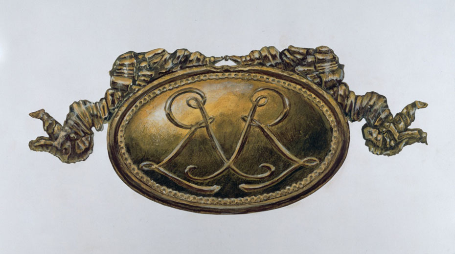
The very first emblem, introduced in 1900, was a product of its time. Designed in the ornate Art Nouveau style, it did not feature the word “Renault” in a bold typeface as we see today. Instead, it was an intricate medallion featuring the intertwined initials of the three founding brothers: Louis, Marcel, and Fernand Renault.
This logo was never intended for the front grille of the car; rather, it was used on internal documents and the hubs of the wheels. It represented a family crest more than a corporate logo, symbolizing the intimate, family-run nature of the business in its infancy.
1906: The Gear and the Industry
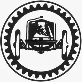
By 1906, the company had shifted focus. The Renault brothers were no longer just assembling cars; they were building an industrial empire. The logo changed to reflect this mechanical prowess. The new design featured the front end of a car enclosed within a gear wheel. This was a direct communication of mechanical precision and industrial capability. It moved away from the personal initials of the founders and toward the product itself, signaling a shift from a family workshop to a mass manufacturer.
1919: The Tank and World War I
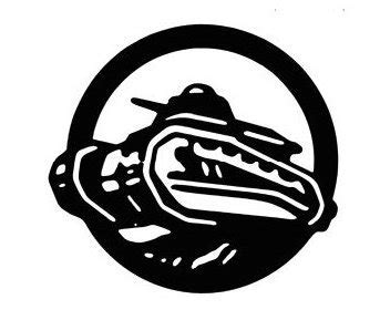
Perhaps the most unusual deviation in automotive branding history occurred in 1919. During World War I, Renault contributed significantly to the French war effort, most notably by manufacturing the revolutionary FT-17 light tank. This tank was instrumental in the Allied victory.
To honor this contribution, Renault replaced the car imagery with a detailed illustration of the FT-17 tank. This was a bold move, associating a consumer vehicle brand with military hardware. However, in the context of post-war France, the tank symbolized strength, reliability, and victory. It was a patriotic statement that solidified Renault’s status as a pillar of the French nation.
The Birth of the Diamond: 1923 – 1959
The transition to the geometric shape we know today was driven not just by aesthetics, but by engineering necessity. The 1920s marked the era where the logo moved from paper and wheel hubs to the most prominent position on the vehicle: the front grille.
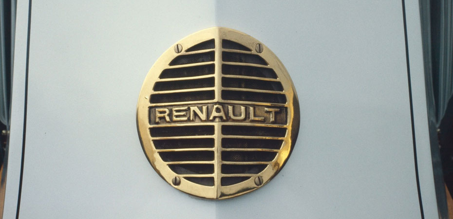
1923: The Grille and the Circle
In 1923, Renault introduced a circular grille badge with the name “Renault” in the center. However, this design was short-lived. The front of the cars at the time featured a horn outlet that needed to be covered by a grille. The circular logo did not aesthetically or physically fit the angular, split-hood designs of the era.
1925: The First Lozenge
To accommodate the “Alligator” hood design, which consisted of two angled planes meeting in the center, a diamond (or lozenge) shape was geometrically superior to a circle. In 1925, the round logo was angularized into the first iteration of the famous diamond. This is a classic example of form following function. The diamond shape allowed the logo to sit flush against the center line of the hood.
This version included the name “Renault” across the center and established the geometric foundation that would define the brand for the next century. It signified a modernization of the brand, moving away from illustrative literalism (like the tank) to geometric abstraction.
1946: Regie Nationale
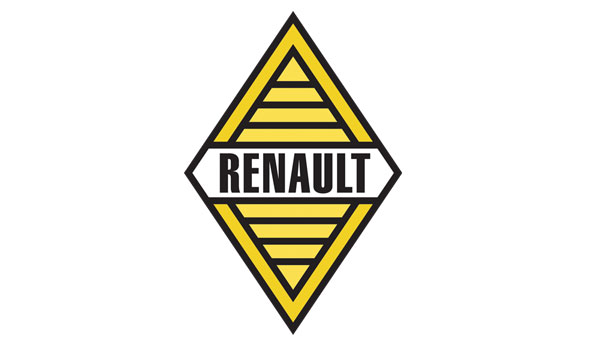
Following World War II, the company was nationalized by the French government, becoming the Régie Nationale des Usines Renault (RNUR). The logo was updated to reflect this change. While the diamond shape remained, the interior text was altered to include “Regie Nationale.” The color yellow was also introduced into the brand’s visual identity during this period, symbolizing joy, light, and optimism as Europe rebuilt itself.
The Vasarely Era: 1972 – 1992
If 1925 was the birth of the shape, 1972 was the birth of the icon. This era represents the most significant artistic leap in the Renault Logo History: Design Changes and Automotive Branding. The company sought to modernize its image to reflect technological advancement and global expansion.
The Father of Op Art
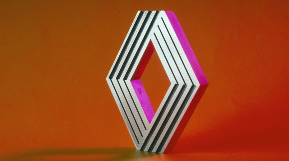
In 1972, Renault commissioned the world-renowned Hungarian-French artist Victor Vasarely to redesign the logo. Vasarely, known as the father of Optical Art (Op Art), created a masterpiece of corporate identity. He stripped away the text entirely, relying on the strength of the symbol alone.
The Interlocking Lines
Vasarely’s design was not a flat shape but a dynamic, three-dimensional structure created through parallel lines. It featured a series of angular stripes that folded over one another, creating an impossible geometric figure (like a Möbius strip) that possessed depth and motion.
Why this design mattered:
- Scalability: The clean lines were easily reproducible across various mediums, from small steering wheel badges to massive factory signage.
- Modernity: The Op Art style felt futuristic and technical, perfectly aligning with the launch of the Renault 5, a car that would redefine the supermini category.
- Brand Confidence: By removing the name, Renault asserted that its symbol was recognizable enough to stand on its own, a trait shared only by the world’s most powerful brands (like Nike or Apple).
The Era of Volume and Chrome: 1992 – 2015
As the 1990s approached, design trends shifted toward realism and 3D rendering. The digital age was beginning, and brands wanted logos that looked tangible and engineered.
1992: Industrial Strength
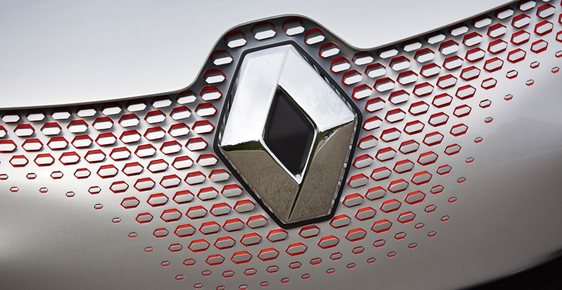
In 1992, the Vasarely stripes were retired in favor of a solid, three-dimensional chrome diamond. This redesign was handled by the Style Marque agency. The new logo looked like a polished piece of metal hardware. It was robust, simple, and exuded quality.
This change aligned with Renault’s push for higher build quality and reliability. The chrome finish symbolized durability and precision engineering. The name “Renault” returned, usually placed below the diamond in a custom serif typeface, reinforcing the brand’s authority.
2004 and 2007: Subtle Refinements
Throughout the 2000s, the logo underwent minor tweaks. In 2004, the diamond was placed inside a yellow square, cementing the yellow-silver-black color palette. The typography became slightly more modern, but the core 3D chrome aesthetic remained the dominant visual language. This era focused on consistency and global recognition as Renault solidified its alliance with Nissan.
The “Passion for Life”: 2015 – 2021
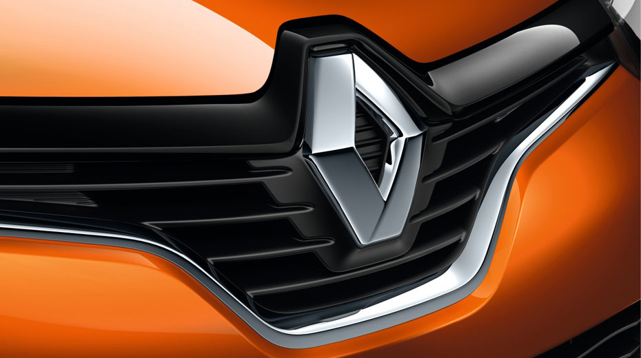
In 2015, Renault updated its identity to coincide with the launch of a new lineup of vehicles (including the Kadjar and the new Megane). The tagline “Passion for Life” was introduced, and the visual identity was softened.
The chrome diamond became larger and more imposing on the vehicle grilles, serving as a focal point for the car’s design language. In print and digital media, the logo featured a softer, more luminous shine, moving away from the hard, cold steel look of the 1990s. The typography was updated to a custom font designed to be robust yet fluid, echoing the aerodynamic lines of the modern cars.
The “Nouvelle Vague” and Flat Design: 2021 – Present
The most recent chapter in the Renault Logo History: Design Changes and Automotive Branding occurred in 2021. As the automotive industry pivoted toward electrification and digitization, the heavy, chrome, 3D logos of the past began to feel outdated. They were difficult to render cleanly on smartphone screens and digital dashboards.
The “Renaulution”
Under the strategic plan dubbed “Renaulution,” Renault unveiled a new logo that pays homage to the 1972 Vasarely design while embracing modern “flat design” principles. This new emblem is composed of two interlaced geometric lines that form the classic diamond shape.
Why the Return to 2D?
This shift is not unique to Renault (Volkswagen, BMW, and Nissan have done similar things), but Renault’s execution is particularly noteworthy.
- Digital First: A flat, monochromatic logo creates no pixelation issues and animates beautifully on screens, which is essential for modern infotainment systems and mobile apps.
- Electrification: The open, airy lines of the new logo symbolize the clean, emission-free nature of electric vehicles. It feels lighter and more agile than the solid chrome block of the previous era.
- Heritage and Future: By referencing the Vasarely lines, Renault bridges its glorious past with its electric future. It suggests that the innovative spirit of the 1970s is alive and well in the 2020s.
Psychology of the Lozenge: A Branding Analysis
The longevity of the Renault diamond offers a masterclass in brand psychology. Why has this shape survived for nearly a century while others have faltered? The answer lies in the semiotics of the shape itself.
Geometric Symbolism
The diamond (or rhombus) is a dynamic shape. Unlike a square, which sits flat and static, a diamond balances on a point. This implies kinetic energy, precarious balance, and forward motion. It is an arrow pointing up and forward. In the context of Renault Logo History: Design Changes and Automotive Branding, this shape communicates that the company is always moving, never stagnant.
The Role of Yellow
While the badge on the car is chrome or white, the corporate brand is inextricably linked to Renault Yellow. In color psychology, yellow represents energy, happiness, and intellect. In the automotive world, it is also the color of warning signs and high visibility. For Renault, it serves as a differentiator. While competitors use corporate blues (Ford, VW, BMW) or reds (Toyota, Honda), Renault owns a distinct space in the color spectrum, making it instantly recognizable on the racetrack and the showroom floor.
Key Takeaways
- Form Follows Function: The diamond shape was originally adopted in 1923 not for artistic reasons, but to fit the mechanical design of the car’s horn outlet and hood.
- Artistic Collaboration: The 1972 logo designed by Victor Vasarely is a landmark in corporate design, utilizing Op Art to create a logo that felt technical and futuristic.
- The Tank Era: Renault is one of the few car companies to have successfully used a weapon of war (the FT-17 tank) as a consumer logo to signify national pride and reliability.
- Cyclical Trends: The 2021 redesign proves that design trends are cyclical. The return to flat, interlaced lines pays tribute to the 1970s while solving modern digital challenges.
- Brand Consistency: Despite radical changes in execution (medallion, tank, 3D, flat), the core identity has remained anchored to the diamond shape for nearly 100 years, building immense brand equity.
Frequently Asked Questions (FAQ)
Why does Renault use a diamond logo?
Originally, the diamond shape was chosen in 1925 because it fit the angular “Alligator” hood design of the vehicles better than the previous circular badge. Over time, it came to represent the brand’s dynamic nature and precision.
Who designed the famous 1972 Renault logo?
The 1972 logo was designed by the Hungarian-French artist Victor Vasarely. He is considered the grandfather of the Optical Art movement. His design featured parallel lines that created a 3D effect within a 2D graphic.
When did Renault change its logo to the current flat design?
Renault unveiled its current “Nouvelle Vague” logo in early 2021. It was first showcased on the Renault 5 Prototype before being rolled out across the entire vehicle range and corporate communications.
What does the Renault yellow symbolize?
Renault introduced yellow into its branding in 1946. It symbolizes optimism, energy, light, and distinctive visibility. It helps the brand stand out against the blue and red dominant color schemes of other automotive manufacturers.
Conclusion
The Renault Logo History: Design Changes and Automotive Branding is more than a timeline of graphics; it is a mirror reflecting the industrial history of France and the evolution of the automobile itself. From the intricate Art Nouveau initials of the founding brothers to the tank that helped win a war, and from the optical illusions of the 1970s to the digital-first simplicity of the electric age, the Renault diamond has stood the test of time.
For design professionals and automotive historians, Renault’s visual identity serves as a powerful case study in adaptability. The brand has successfully navigated the tension between heritage and modernity, proving that a logo can change drastically in style while retaining its essential soul. As Renault moves into a future defined by software and electrification, the interlaced diamond stands as a beacon of a company that respects its past while aggressively pursuing the future.