Introduction
Stationery design plays an important role in how customers, clients, employees, and business partners perceive a brand. Although digital communication has become a major part of everyday business operations, printed materials such as letterheads, business cards, envelopes, notepads, and presentation folders continue to influence professional relationships. These materials often represent a company’s identity in meetings, formal correspondence, client presentations, and business transactions. When designed thoughtfully, stationery communicates professionalism, consistency, and attention to detail. However, when design choices are poorly planned, even a well-established business can create an inconsistent or unprofessional impression.
Many businesses underestimate the impact of stationery design because individual items may seem relatively insignificant compared with websites, advertising campaigns, and social media profiles. In reality, every branded material contributes to the overall customer experience. A business card with unreadable text, a letterhead with outdated contact information, or an envelope that does not match the company’s visual identity can weaken the impression a business wants to establish. These mistakes may not immediately lead to lost customers, but they can create uncertainty about the company’s credibility and attention to quality.
Understanding common stationery design mistakes helps businesses make informed decisions about their visual identity. By addressing problems with typography, color, layout, printing, branding consistency, and information accuracy, companies can create stationery that supports their reputation rather than damaging it. The following sections explore the most common mistakes businesses should avoid and explain how better design decisions can strengthen brand recognition.
Why Stationery Design Matters for Brand Identity
Business stationery is more than a collection of printed office supplies. It is a physical extension of a company’s visual identity, helping customers recognize the organization across different communication channels. When business cards, letterheads, envelopes, and other materials share consistent design elements, they create a recognizable appearance that reinforces the brand’s personality.
For example, a financial consulting firm may use clean typography, restrained colors, and a structured layout to communicate reliability and professionalism. A creative agency might choose more expressive colors and contemporary typography to reflect its innovative approach. Neither style is automatically better than the other. The effectiveness of a design depends on whether it reflects the business’s values, audience, and market position.
Problems arise when stationery fails to communicate the intended identity. Inconsistent colors, unrelated fonts, low-quality printing, and cluttered layouts can make a company appear disorganized. Customers may not consciously identify every design flaw, but the combined impression can influence their perception of the business.
Stationery also supports brand recognition through repeated exposure. When clients regularly encounter consistent visual elements on correspondence and printed materials, those elements become easier to associate with the company. Poor design interrupts that recognition and makes the brand appear less cohesive.
1. Using Inconsistent Branding Across Stationery
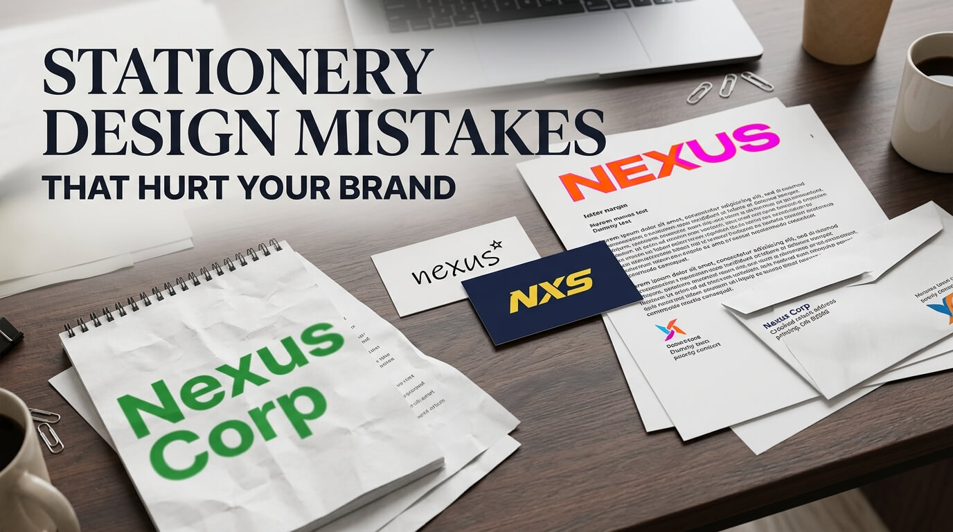
One of the most damaging stationery design mistakes is failing to maintain a consistent visual identity. A company might have a carefully designed website and an attractive logo but use different colors, fonts, and layouts across its printed materials. This inconsistency makes it harder for customers to recognize the brand and creates the impression that different departments are working without a shared design direction.
Ignoring Established Brand Guidelines
Brand guidelines provide instructions for using logos, colors, typography, spacing, and other visual elements. When businesses overlook these guidelines during stationery design, individual items may look acceptable on their own but fail to work together as a collection.
For example, a business card might use a dark blue logo, while the company’s letterhead uses a lighter shade and its envelopes feature a different typeface. These differences may appear minor, yet they reduce visual consistency across customer touchpoints.
Businesses should establish a clear stationery design system that follows their existing brand guidelines. Every item should use approved logo variations, consistent color values, and compatible typography. This approach makes it easier to maintain a recognizable identity, especially when stationery is produced by different designers or printing companies.
Changing the Logo Without a Clear Reason
A logo is one of the most recognizable parts of a brand. Stretching it, changing its proportions, adding unnecessary effects, or placing it against an unsuitable background can weaken its appearance. Using several unofficial versions of the same logo across business stationery creates further confusion.
The solution is to use approved logo files and follow the specified rules for sizing, placement, and background contrast. If a business updates its visual identity, the new design should be introduced consistently across all relevant stationery rather than appearing randomly on selected materials.
2. Choosing the Wrong Fonts
Typography influences how customers read and interpret business communication. The wrong font can make stationery difficult to read, visually unbalanced, or inconsistent with the company’s personality. While decorative typefaces may appear attractive during the design process, they can become impractical when used for addresses, telephone numbers, formal correspondence, and other essential information.
Prioritizing Style Over Readability
Some businesses select elaborate fonts because they want their stationery to look distinctive. However, highly decorative lettering can reduce readability, particularly when printed at small sizes. Thin letterforms may also lose clarity on certain paper stocks or during lower-quality printing.
Business stationery should prioritize clear, legible typography. A professional typeface with well-defined characters makes contact details easier to read and supports a polished appearance. Decorative fonts can still be effective when used selectively, such as in a logo or a short heading, but they should not dominate the design.
Using Too Many Font Families
Combining several unrelated typefaces creates unnecessary visual competition. A business card with one font for the company name, another for the employee’s name, a third for contact information, and additional styles for decorative elements may look crowded rather than sophisticated.
A more effective approach is to use one or two complementary font families throughout the stationery collection. Differences in font weight, size, and spacing can create a clear hierarchy without introducing too many visual styles. The result is easier to read and more consistent across business materials.
3. Overcrowding the Layout With Too Much Information
A common mistake is attempting to include every possible detail on a single stationery item. Businesses may want to display their logo, slogan, full address, multiple phone numbers, email addresses, social media accounts, website, list of services, and promotional messages on a small business card.
Although the intention is to provide useful information, the result often feels cluttered. Important details compete for attention, whitespace disappears, and the overall design becomes difficult to understand.
Failing to Establish Visual Hierarchy
Visual hierarchy determines which elements readers notice first and how their attention moves through the design. On a business card, the company or individual’s name should usually be easy to identify, followed by relevant contact information. On a letterhead, the logo and company identity should be visible without distracting readers from the letter itself.
When every element uses the same visual weight, readers have no clear starting point. Large slogans may overpower contact details, while decorative graphics can compete with the company name.
Designers should organize information according to its importance. Larger text, contrasting weights, appropriate spacing, and thoughtful positioning can help establish a natural reading order. Each stationery item should serve a specific purpose rather than attempting to communicate everything about the business.
Treating Whitespace as Wasted Space
Whitespace, also known as negative space, is the area around text, images, and other design elements. Some businesses try to fill every empty area because they believe a full layout provides better value. In practice, excessive content can make stationery look less professional.
Whitespace allows important information to stand out and gives the design room to breathe. It can also communicate simplicity, confidence, and organization. A well-designed letterhead, for instance, leaves sufficient space for the body of a letter instead of surrounding the writing area with large decorative graphics.
4. Selecting Colors That Do Not Suit the Brand
Color is an important part of brand recognition because it influences how visual materials are perceived. Choosing unsuitable colors or using too many shades can weaken the connection between stationery and the wider brand identity.
Using Too Many Colors
A stationery design may become visually distracting when it includes several unrelated colors without a clear purpose. Bright backgrounds, contrasting text, colorful icons, and multiple accent shades can compete for attention, especially on small printed items.
Businesses should establish a controlled color palette that reflects their brand personality. Primary colors can support the logo and key design elements, while secondary shades provide contrast and variation. The goal is not to eliminate color but to use it deliberately.
Ignoring Contrast and Print Differences
A color combination that looks attractive on a computer screen may not remain equally clear when printed. Light gray text on a white background, for example, can become difficult to read after printing. Certain shades may also reproduce differently depending on the printer, paper, and color settings.
Designers should evaluate color contrast before finalizing stationery and review physical proofs whenever possible. Using appropriate print color specifications, such as CMYK values for conventional commercial printing, can help improve consistency. Special colors, including Pantone spot colors, may be useful when precise brand color matching is important.
5. Using Low-Quality Images and Logo Files
Visual quality affects how stationery represents a business. Blurry logos, pixelated graphics, poorly cropped photographs, and low-resolution images can make even a strong design look unfinished.
This problem often occurs when businesses reuse images downloaded from websites or copy logos from screenshots. These files may appear acceptable at small sizes on a screen but lose sharpness when enlarged for printing.
Choosing the Wrong File Format
Raster images, such as JPEG and PNG files, contain pixels and can become blurry when enlarged beyond their intended resolution. Vector formats, such as SVG, EPS, and vector-based PDF files, preserve clean edges when resized, making them particularly useful for logos and other scalable graphics.
For printed stationery, designers should obtain the highest-quality approved logo files available. Photographic images should generally be prepared at an appropriate resolution, often around 300 pixels per inch at the final print size. Selecting suitable files helps maintain sharp details and gives the finished stationery a more professional appearance.
6. Forgetting the Purpose of Each Stationery Item
Another common mistake is applying the same layout to every stationery product without considering how each item will be used. Although stationery should share a consistent visual identity, different materials have different functional requirements.
Using the Same Design for Letterheads and Business Cards
A business card has limited space and needs to communicate essential identity and contact details quickly. A letterhead serves a different purpose. It must provide enough room for formal correspondence while displaying company information in an organized way.
Copying the business card layout directly onto a letterhead may result in oversized logos, crowded margins, or insufficient writing space. Similarly, using a letterhead’s minimal design on a business card may leave the card without the contact details customers need.
Each item should be designed according to its dimensions, reading habits, and practical use. The logo, typography, and colors can remain consistent while the layout changes to accommodate the format.
Ignoring Digital and Printed Use Cases
Some stationery items are printed, while others are distributed electronically. A letterhead used for printed correspondence may need different preparation from a digital PDF sent through email. A design with excessive decorative elements may also appear awkward when viewed on a mobile screen.
Businesses should consider how each item will be shared, displayed, printed, and stored. Digital stationery should remain readable on different screen sizes, while print versions should be prepared with the appropriate dimensions, resolution, and production specifications.
7. Using Incorrect or Outdated Business Information
Even an attractive stationery design can damage a brand if it contains incorrect information. An outdated telephone number, old office address, inactive website, or misspelled email address can prevent customers from contacting the business.
These mistakes may appear administrative rather than creative, but they have direct practical consequences. A potential client might abandon an inquiry because a phone number does not work, while an envelope with an outdated address could delay important correspondence.
Failing to Proofread Before Printing
Printing hundreds or thousands of stationery items before checking the content can lead to unnecessary replacement costs. Spelling errors, incorrect job titles, inconsistent capitalization, and outdated contact details may remain in circulation long after the design is completed.
Businesses should review every item carefully before approving production. The review should include names, addresses, telephone numbers, email addresses, website URLs, legal company details where relevant, and any other information displayed. A second person should ideally check the final proof because fresh eyes can identify errors that the original designer or writer may overlook.
8. Compromising on Paper Quality and Printing
Stationery design does not end when the digital layout is complete. Paper quality, printing accuracy, cutting, finishing, and material selection all influence the final result. A well-designed business card printed on unsuitable stock may feel flimsy, while a letterhead printed with faded colors can weaken the visual identity.
Choosing Paper Without Considering the Brand
Paper communicates through its texture, thickness, finish, and appearance. Heavy cardstock may suit a premium consultancy, while a simple uncoated stock may be more practical for businesses that produce large quantities of everyday correspondence.
The best choice depends on the intended use, brand positioning, budget, and environmental considerations. Glossy finishes can make certain colors appear more vibrant, but they may not be suitable for every formal document. Uncoated paper often provides a traditional appearance and can be easier to write on, which is useful for notepads and forms.
Businesses should evaluate paper samples before committing to a large order. The material should support both the visual design and the practical needs of the people using it.
Ignoring Printing Specifications
Incorrect bleed settings, insufficient margins, low-resolution graphics, and unsuitable color settings can cause problems during production. Text placed too close to the edge may be cut off, while designs without sufficient bleed can develop unwanted white borders after trimming.
Working with the printer during the design stage can prevent many of these issues. Designers should confirm the required file format, dimensions, bleed, safe area, paper options, and color specifications before preparing final artwork. A physical proof is particularly useful for checking alignment, readability, and color reproduction before the full order is printed.
9. Following Trends Without Considering Brand Personality
Design trends can provide inspiration, but following them without considering the company’s identity may produce stationery that feels disconnected from its audience. A highly minimalist design might suit a technology company but fail to communicate the warmth expected from a traditional hospitality business. Similarly, elaborate decorative elements may not fit a brand that values efficiency and simplicity.
Prioritizing Popular Styles Over Practical Needs
Businesses sometimes choose fashionable typefaces, unusual layouts, or striking color combinations simply because they appear frequently in design examples. However, a trend is useful only when it supports the brand’s communication goals.
Stationery should reflect the company’s positioning and audience rather than imitate another organization’s appearance. Designers can incorporate contemporary elements while maintaining a consistent visual identity. This balance helps the materials remain relevant without requiring frequent redesigns.
Neglecting Long-Term Usability
Stationery often remains in use for months or years. A design that depends heavily on a short-lived trend may become dated quickly, leading to additional printing expenses.
A more practical approach is to build the design around lasting principles such as readability, proportion, consistency, and appropriate material selection. Small decorative details can change over time, but the main visual identity should remain recognizable.
10. Ignoring Accessibility and Inclusive Design
Accessibility is another important consideration in stationery design. Business materials should be easy to read and understand for people with different visual abilities, levels of familiarity, and communication needs.
Very small text, weak contrast, thin fonts, and information communicated through color alone can make stationery less usable. For example, pale text on a light background may be difficult to read for many people, even when the design looks elegant on a screen.
Designers should use readable type sizes, strong contrast, clear spacing, and straightforward information structures. Essential contact information should not be hidden inside decorative graphics. When digital stationery is distributed as a PDF, businesses should also consider selectable text, logical reading order, and document accessibility where appropriate.
Inclusive design does not require sacrificing visual appeal. In many cases, the same decisions that improve accessibility also make stationery clearer, more practical, and more professional for everyone.
Common Stationery Design Mistakes and Their Solutions
The following table summarizes frequent problems, their potential effects on brand perception, and practical ways to address them.
| Design mistake | Potential impact | Recommended solution |
| Inconsistent brand colors | Weak brand recognition | Follow approved brand guidelines |
| Too many fonts | Confusing visual hierarchy | Use one or two complementary font families |
| Cluttered layouts | Difficult-to-read information | Prioritize essential content and whitespace |
| Poor color contrast | Reduced readability | Test contrast and review printed proofs |
| Low-resolution logos | Blurry or unprofessional appearance | Use high-quality vector artwork |
| Outdated contact details | Missed inquiries and confusion | Verify information before printing |
| Unsuitable paper stock | Poor physical impression | Match paper quality to purpose and brand |
| Incorrect print settings | Cropped text and production errors | Confirm bleed, margins, and file specifications |
| Trend-driven design | Inconsistent brand personality | Prioritize long-term identity and usability |
| Inaccessible typography | Difficult reading experience | Use clear type, suitable sizes, and strong contrast |
How to Create Professional Stationery That Protects Your Brand
Avoiding common design mistakes begins with a clear understanding of the company’s identity. Before developing stationery, businesses should identify the qualities they want customers to associate with their brand. These may include reliability, creativity, sophistication, affordability, or technical expertise. The design should communicate these qualities through appropriate typography, color, spacing, and material choices.
The next step is to develop a consistent stationery system. Rather than designing business cards, letterheads, envelopes, and presentation folders independently, businesses should establish shared visual rules for the entire collection. This creates continuity while allowing each item to meet its specific requirements.
Professional review is equally important. Designers should assess both the visual appearance and the practical functionality of each item. Text should be readable, contact information should be accurate, and the layout should support the intended use. Businesses should also consider whether the stationery works in both digital and printed formats.
Finally, printing decisions should receive the same attention as design decisions. Choosing suitable paper, checking color accuracy, confirming production specifications, and reviewing a physical proof can prevent costly mistakes. For companies that regularly update contact information or brand assets, maintaining organized master files also makes future revisions easier.
Conclusion
Stationery design mistakes can affect how customers perceive a business, from inconsistent branding and cluttered layouts to poor printing quality and inaccurate contact details. Although these issues may seem small individually, they can collectively weaken a company’s professional image and reduce brand recognition.
Businesses can avoid these problems by maintaining consistent visual guidelines, prioritizing readability, choosing suitable materials, proofreading carefully, and testing designs before printing. Effective stationery combines visual appeal with practical functionality, ensuring that every business card, letterhead, envelope, and printed document supports a recognizable and trustworthy brand identity.
Frequently Asked Questions
Q1. What are the most common stationery design mistakes?
The most common mistakes include inconsistent branding, excessive fonts, cluttered layouts, poor color contrast, low-resolution logos, incorrect contact information, and unsuitable paper quality.
Q2. How does poor stationery design affect a brand?
Poor stationery design can make a business appear inconsistent, careless, or less professional. It may also reduce brand recognition and make important information difficult to find.
Q3. Which colors are best for professional business stationery?
The best colors depend on the company’s existing brand identity, industry, and target audience. Businesses should use a consistent color palette with sufficient contrast to keep information readable.
Q4. Why is paper quality important in stationery design?
Paper quality influences the appearance, durability, and physical feel of printed materials. Suitable paper helps stationery reflect the brand’s positioning while meeting its practical requirements.
Q5. How can businesses ensure their stationery design looks professional?
Businesses should follow established brand guidelines, use readable typography, maintain clear layouts, verify contact information, choose appropriate printing materials, and review proofs before approving a full print run.