Introduction
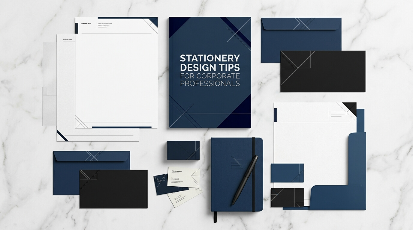
In the corporate world, professionalism is reflected in more than business meetings, presentations, and client relationships. The materials a company uses to communicate also contribute to its overall image. Business cards, letterheads, envelopes, folders, notepads, and other stationery items help establish a consistent visual identity and communicate the values of an organization. When designed thoughtfully, these materials can make everyday business interactions feel more organized, credible, and professional.
Stationery design is often overlooked because businesses concentrate heavily on digital marketing, website development, and social media presence. However, printed and digital stationery continue to play an important role in corporate communication. A well-designed letterhead can make an official document look more credible, while a professionally printed business card can help create a memorable impression during a networking event. Similarly, coordinated stationery can reinforce brand recognition whenever employees communicate with clients, partners, suppliers, or colleagues.
For corporate professionals, the goal is not simply to make stationery attractive. Effective stationery should combine visual appeal, functionality, brand consistency, and readability. Every design decision, from choosing colors to selecting paper quality, should support the company’s professional image and practical requirements.
This guide explores essential stationery design tips for corporate professionals, explaining how to create business materials that look polished, communicate clearly, and maintain a consistent brand identity.
Why Stationery Design Matters in the Corporate Environment
Corporate stationery is an extension of a company’s identity. Every document, envelope, business card, and presentation folder provides an opportunity to communicate professionalism. When these materials follow a consistent design approach, they help customers recognize the business and understand the standards it represents.
A company that uses coordinated stationery demonstrates attention to detail. Clients may not consciously analyze the typography or spacing on a letterhead, but they can still notice whether the document looks organized and credible. In contrast, inconsistent logos, mismatched colors, or poorly formatted contact information can make a business appear less established.
Stationery also supports internal communication. Employees who use standardized templates can prepare proposals, reports, letters, and meeting documents more efficiently. A consistent visual structure reduces unnecessary formatting decisions and helps ensure that company communications look professional regardless of who creates them.
Another important benefit is brand recognition. When the same colors, logo placement, typography, and design elements appear across multiple materials, they gradually become associated with the organization. This consistency helps create a recognizable corporate identity that extends beyond digital channels.
Understand Your Corporate Brand Before Designing Stationery
Define the Brand Personality
Before selecting colors, fonts, or layouts, corporate professionals should understand what their stationery needs to communicate. A financial consulting firm may want to convey stability, trust, and precision, while a creative agency may prefer a more contemporary and expressive appearance. A law firm might benefit from a restrained design that emphasizes clarity and authority, whereas a technology company may choose a cleaner, more modern visual style.
The stationery should reflect these characteristics without becoming overly decorative. Corporate materials generally need to remain functional and professional, even when the company operates in a creative industry. The best designs translate brand personality into subtle visual decisions rather than relying on excessive graphics or complicated layouts.
Consider the audience as well. Materials prepared for senior executives, corporate clients, investors, or government institutions may require a more formal presentation than stationery used for informal internal communication. Understanding these expectations helps designers choose an appropriate balance between creativity and professionalism.
Maintain Brand Consistency
Consistency is one of the most important principles of corporate stationery design. The logo, brand colors, typography, and overall visual language should remain recognizable across business cards, letterheads, envelopes, folders, and digital documents.
This does not mean every item must look identical. A business card has different space limitations from a letterhead, and a presentation folder serves a different purpose from an envelope. Instead, each item should use the same underlying design system while adapting to its particular function.
For example, a company may use a dark blue logo, a specific sans-serif font, and a thin geometric line across its stationery. The business card might emphasize the employee’s name and contact details, while the letterhead gives more space to written communication. Despite these differences, the shared visual elements create a unified appearance.
Developing a basic stationery style guide can make this process easier. It should establish approved logo versions, color codes, font choices, spacing rules, and guidelines for positioning contact information. Employees and designers can then use the same standards when creating new materials.
Choose Colors That Communicate Professionalism
Use a Controlled Color Palette
Color influences how people perceive a brand, making it an important part of stationery design. Corporate organizations often use colors that communicate reliability, confidence, sophistication, or innovation. Navy blue, for instance, is frequently associated with stability, while green may suggest growth or sustainability. Neutral colors such as white, gray, and black can create a clean and understated appearance.
However, color selection should depend on the company’s existing identity rather than following general associations alone. If a brand already uses orange or purple as its primary color, stationery should reinforce that identity instead of introducing unrelated shades.
A practical approach is to select one primary brand color, one or two supporting colors, and a neutral background. This creates enough visual variety without making the design feel crowded. The primary color can appear in the logo or a small design accent, while neutral shades preserve readability and balance.
Consider Printing and Digital Display
Colors can look different on a computer screen than they do on printed paper. Screen displays use light, whereas printed materials rely on ink or toner, so a shade that looks vibrant digitally may appear darker or less saturated in print.
Corporate professionals should review physical proofs before approving large printing orders. This is particularly important when stationery needs to match existing marketing materials or when a specific brand color is central to the company’s identity.
Digital stationery requires similar attention. Letterhead templates, electronic proposals, and PDF documents should display consistently across common screens and printers. Designs that depend on subtle color differences may lose their impact when viewed on older displays or reproduced using standard office equipment.
Select Professional Typography for Better Readability
Prioritize Clear and Appropriate Fonts
Typography influences both the appearance and usability of corporate stationery. A suitable font should reflect the brand’s personality while remaining easy to read in different sizes and formats.
Sans-serif fonts often work well for contemporary corporate identities because of their clean appearance. Serif fonts can also be effective, particularly for organizations seeking a traditional, formal, or editorial style. Neither category is automatically more professional than the other. The important factors are readability, consistency, and suitability for the company’s communication needs.
Using too many fonts can make stationery appear disorganized. A simple system with one font for headings or names and another for supporting information is often sufficient. In some cases, a single font family with different weights can create a polished hierarchy without introducing unnecessary variation.
Decorative scripts and elaborate display fonts should be used cautiously. They may look attractive in a logo, but they can become difficult to read when applied to contact information, formal correspondence, or small business card text.
Create a Clear Visual Hierarchy
Visual hierarchy helps readers identify the most important information quickly. On a business card, the employee’s name and professional title may deserve the greatest emphasis, followed by the company name and contact details. On a letterhead, the logo and organization name should be recognizable without overpowering the main body of the letter.
Font size, weight, spacing, and placement can establish this hierarchy naturally. A name can appear in a larger or bolder typeface, while phone numbers and email addresses use a smaller but still readable size. Consistent alignment helps the information feel organized.
Designers should also leave enough space between different information groups. When every element is crowded together, even good typography becomes difficult to navigate. White space gives the content room to breathe and makes the overall design feel more refined.
Focus on Simplicity and Strategic White Space
One of the most effective stationery design tips is to avoid unnecessary decoration. Corporate stationery has a practical purpose, and the design should support that purpose rather than compete with it.
Too many icons, background patterns, borders, slogans, and decorative shapes can make a document feel cluttered. They may also reduce the amount of usable space available for written content. A clean layout allows the company logo and essential information to remain visible without distracting the reader.
White space, which refers to the unoccupied areas surrounding design elements, is especially valuable. It separates information, improves readability, and creates a sense of order. White space does not necessarily mean the stationery must have a white background. It simply refers to the breathing room between elements, whether the design uses white, cream, light gray, or another background color.
For example, a letterhead with a small logo in the upper-left corner, carefully positioned contact information, and a generous central writing area can appear more professional than a page filled with oversized branding elements. The restrained design also makes the stationery easier to use for different types of correspondence.
Simplicity should not be confused with a lack of personality. A distinctive logo, a subtle colored line, an unusual but readable typeface, or a carefully considered layout can make stationery memorable without overwhelming its practical function.
Design Each Stationery Item for Its Intended Purpose
Corporate stationery includes several materials, and each serves a different communication need. A unified design system should account for these differences rather than applying the same layout to every item.
Business Cards
Business cards remain useful during conferences, meetings, networking events, and client introductions. Their limited space makes careful information selection essential. A professional card generally includes the employee’s name, title, company name, phone number, email address, and website when relevant.
The logo should be clearly visible, but it should not consume so much space that the contact details become cramped. Readable type, balanced margins, and a logical information order make the card easier to use.
The reverse side can accommodate a simplified logo, a brand message, or a QR code linking to a professional profile or company website. Any additional feature should offer practical value rather than being included merely for decoration.
Letterheads and Envelopes
Letterheads are important for proposals, formal correspondence, reports, notices, and business documentation. They should communicate the company’s identity while leaving sufficient room for the actual message.
Place the logo and essential business information where they are easy to find. Contact details, company address, website, and registration information can be positioned in the header or footer, depending on the organization’s requirements. Avoid placing heavy graphics behind the writing area because they can make text harder to read and increase printing costs.
Envelopes should follow the same visual system while respecting postal requirements. The company logo and return address should be legible, and the design must leave adequate space for recipient details, postage, and machine-readable postal markings.
Presentation Folders and Notepads
Presentation folders are useful for client proposals, sales meetings, training materials, and corporate events. They can provide a more organized way to deliver documents while reinforcing brand identity. A simple cover design, consistent colors, and carefully placed logo can make the folder look professional without unnecessary visual complexity.
Notepads and internal stationery can use more restrained branding because their primary purpose is practical use. Paper quality, writing comfort, and sufficient space for notes matter just as much as appearance. For organizations that distribute stationery frequently, these everyday items can also provide repeated exposure to the brand.
Choose Paper Quality and Finishes Carefully
The physical quality of printed stationery affects how it feels and how long it lasts. Paper that is too thin may appear inexpensive or allow ink to show through, while a suitable weight can make documents feel more substantial and easier to handle.
The best paper depends on the intended use. Business cards often benefit from thicker cardstock, whereas letterheads need paper that feeds reliably through standard office printers. Presentation folders may require heavier stock to maintain their shape during transport and repeated handling.
Finishes can also influence the final appearance. Matte finishes generally create a restrained, low-glare surface that works well for formal corporate materials. Gloss finishes can make colors appear more vivid, although they may introduce glare. Textured or uncoated papers can offer a distinctive tactile quality, particularly for brands that want their stationery to feel understated or premium.
Special finishes such as embossing, debossing, foil stamping, and spot UV can add visual interest to selected items. However, they should be used selectively. Adding several expensive finishes to every stationery product can increase costs without significantly improving functionality.
The following table summarizes practical choices for common corporate stationery items.
| Stationery item | Recommended design approach | Important material consideration |
| Business cards | Clear hierarchy and compact branding | Durable, thick cardstock |
| Letterheads | Minimal header with a spacious writing area | Printer-friendly paper |
| Envelopes | Consistent logo and readable return address | Appropriate size and postal compatibility |
| Presentation folders | Strong cover design with restrained graphics | Sturdy paperboard or heavy stock |
| Notepads | Simple branding and generous writing space | Smooth paper suitable for everyday writing |
| Digital letterheads | Clean layout with consistent brand colors | Screen readability and printer compatibility |
These recommendations should be adapted to the organization’s budget, communication habits, and printing requirements. Testing a small batch before ordering large quantities can help identify problems with color, paper handling, legibility, or finishing.
Make Digital Stationery Part of the Design Strategy
Corporate stationery is no longer limited to printed materials. Digital letterheads, electronic proposal templates, branded invoices, and reusable document layouts are equally important for organizations that communicate primarily through email and online collaboration tools.
Digital stationery should preserve the same visual identity as printed materials while adapting to the requirements of electronic documents. Logos need to remain sharp at different sizes, fonts should display consistently, and contact information must remain readable on common screens.
Editable templates can help employees produce professional documents without needing advanced design skills. A standardized letterhead template in a commonly used word-processing application, for example, allows staff to prepare correspondence while maintaining consistent logo placement, spacing, and typography.
Compatibility is particularly important. A document that looks correct on one computer may shift when opened in another application or operating system. Using standard fonts, fixed layout guidance, and widely supported file formats can reduce these problems. PDF versions are useful when the layout must remain consistent for final distribution, while editable templates are better suited to documents that require regular changes.
Digital stationery should also be accessible. Text should have sufficient contrast against its background, information should not be communicated through color alone, and documents should use appropriate text structures where supported. Logos and decorative elements should not make the actual content difficult to read.
Keep Contact Information Accurate and Consistent
Even the most attractive stationery design loses credibility when it contains outdated or incorrect information. A business card with an old phone number, a letterhead showing a former address, or a presentation folder containing an obsolete website can confuse customers and create unnecessary administrative work.
Before approving a stationery design, corporate professionals should verify all contact information. This includes the official company name, department details, employee titles, telephone numbers, email addresses, website addresses, and any legally required business information.
Companies with several offices or departments may need different versions of the same stationery template. These versions should follow a consistent design system while providing the correct information for each location or business unit.
It is also useful to assign responsibility for stationery updates. When branding or contact details change, a designated employee or team can review the relevant templates and arrange the replacement of outdated materials. Digital stationery can usually be updated quickly, while printed stock may need to be used carefully or replaced according to the company’s policies.
Accuracy is a practical design consideration because stationery is often used for formal communication. Clear, current information supports smooth business interactions and reinforces the impression that the organization is attentive to detail.
Balance Creativity with Corporate Professionalism
Corporate stationery does not have to look generic. Distinctive design elements can help a company stand apart from competitors, particularly in industries where many organizations use similar visual styles. The challenge is to introduce creativity without reducing clarity or compromising the company’s professional identity.
A brand might use an unusual layout, a subtle geometric pattern, a distinctive paper texture, or a restrained accent color to create visual interest. These choices can make stationery recognizable while keeping it suitable for formal communication.
Creativity should be guided by the audience and context. A design intended for an architectural studio may use expressive layouts and more experimental typography, while a financial advisory firm may prefer a more conservative approach. Both can be effective when the design aligns with the company’s positioning and the expectations of its clients.
Trends should also be approached thoughtfully. Minimalism, muted colors, recycled paper, and premium finishes can all influence contemporary stationery design, but adopting a trend simply because it is popular may cause the materials to feel outdated later. A more sustainable approach is to choose design features that reflect the company’s identity and can remain useful for several years.
Corporate stationery should ultimately support recognition rather than compete for attention. The strongest designs often combine a distinctive visual feature with a clear layout, practical materials, and consistent branding.
Consider Sustainability and Long-Term Value
Sustainability has become an important consideration for businesses evaluating their purchasing and communication practices. Stationery offers several opportunities to reduce waste without sacrificing quality or professionalism.
Companies can begin by selecting paper from responsibly managed sources or considering recycled paper where suitable. They can also reduce unnecessary printing by using digital templates for routine communication and reserving printed materials for situations where physical documents provide a clear benefit.
Print quantities deserve attention as well. Ordering excessive stationery can lead to waste when employees leave, contact information changes, or the brand identity is updated. Smaller print runs may have a higher unit cost, but they can reduce the risk of disposing of large quantities of outdated materials.
Durability is another aspect of sustainability. A well-made business card or presentation folder may remain useful for longer, while a thoughtfully designed template can be reused across many documents. The aim is to balance material quality, purchasing costs, and expected usage.
Sustainable stationery should still meet professional standards. Paper must be appropriate for its purpose, printing should remain legible, and the overall design should accurately represent the organization. Responsible material choices are most effective when they form part of a broader, consistent approach to business operations.
Common Stationery Design Mistakes to Avoid
One frequent mistake is overcrowding stationery with too much information. Companies sometimes attempt to include every service, social media account, slogan, and contact method on a single item. This can make the design difficult to scan and weaken the visual hierarchy. Selecting only the information relevant to the item’s purpose usually produces a cleaner result.
Another common problem is inconsistent branding. Using different logo versions, unapproved colors, or unrelated fonts across materials can make the organization appear fragmented. A shared design guide and reusable templates help prevent these differences.
Poor readability can also undermine otherwise attractive stationery. Very small text, low contrast, decorative fonts, and insufficient spacing may look acceptable on a large computer monitor but become difficult to read when printed. Designs should be evaluated at their actual size rather than only when enlarged on screen.
Ignoring practical requirements is equally problematic. Letterheads must leave enough room for correspondence, envelopes must accommodate postal information, and business cards must fit standard storage formats when required. Visual appeal should never come at the expense of usability.
Finally, companies should avoid approving large printing orders without reviewing a proof. A physical sample can reveal color differences, paper issues, alignment problems, and finishing defects before they affect an entire batch. This simple quality-control step can save both time and money.
Conclusion
Stationery design is an important part of maintaining a professional corporate identity. From business cards and letterheads to presentation folders and digital templates, each item contributes to the way an organization communicates with its audience. Effective stationery combines consistent branding, readable typography, balanced colors, thoughtful spacing, suitable materials, and accurate information.
Corporate professionals should begin by understanding their brand identity and the purpose of each stationery item. They should then focus on simplicity, functionality, quality, and consistency while considering digital compatibility and sustainable purchasing practices. With careful planning and regular quality checks, stationery can become a practical communication tool that reinforces credibility, supports everyday business activities, and creates a lasting professional impression.
Frequently Asked Questions
Q1. What makes stationery design professional?
Professional stationery combines consistent branding, readable typography, balanced spacing, appropriate colors, and accurate contact information. Its design should look polished while remaining practical for everyday business use.
Q2. Which stationery items are most important for corporate professionals?
Business cards, letterheads, envelopes, presentation folders, and digital document templates are among the most useful items. The right selection depends on how frequently the company communicates with clients, partners, employees, and other stakeholders.
Q3. Which colors work best for corporate stationery?
The best colors are those that align with the company’s brand identity. Navy, gray, black, white, and other restrained shades can create a professional appearance, but established brand colors should generally guide the final palette.
Q4. Is digital stationery as important as printed stationery?
Yes. Digital letterheads, branded invoices, and document templates help businesses maintain a consistent appearance in electronic communication. Printed stationery remains valuable for networking, formal correspondence, events, and physical client presentations.
Q5. How can a business reduce stationery design costs?
Businesses can control costs by using a consistent design system, selecting practical materials, ordering quantities based on actual demand, and using reusable digital templates. Reviewing print proofs before approving large orders can also prevent costly mistakes.