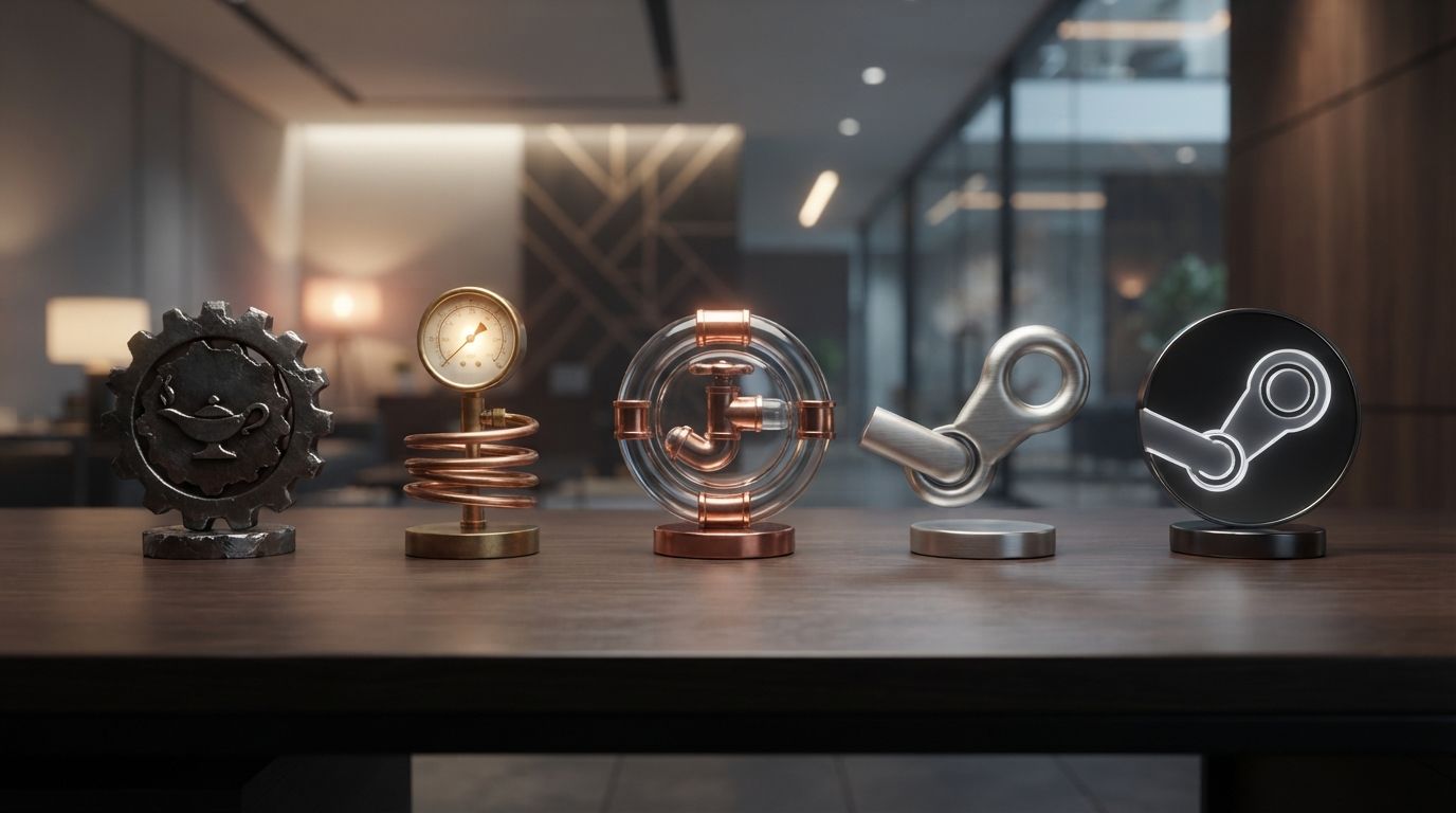
Introduction
In the rapidly evolving landscape of digital entertainment, few platforms have exerted as profound an influence as Steam. Launched by Valve Corporation in 2003, Steam transformed PC gaming from a fragmented ecosystem of physical discs and manual patches into a streamlined, multi-billion-dollar global digital empire. Today, Steam is the undisputed backbone of PC gaming, hosting tens of thousands of games, serving millions of concurrent users daily, and fostering a massive global community of players and developers. Yet, behind this monumental technological success lies a fascinating visual narrative: the Steam Logo History: The Story Behind Valve’s Gaming Platform.
A brand’s visual identity is its silent ambassador. For Steam, its logo has had to carry the weight of a platform that represents cutting-edge technology, mechanical reliability, and a vast playground for digital communities. From its early days as an unstable, mandatory utility for launching Counter-Strike updates to its modern role as a sleek, cross-platform storefront and operating system, Steam’s visual branding has undergone a remarkable metamorphosis. This comprehensive exploration dives deep into the Steam Logo History: The Story Behind Valve’s Gaming Platform, analyzing the mechanical metaphors, design principles, color psychology, and cultural shifts that shaped one of the most recognizable icons in the history of interactive media.
To understand the Steam logo, one must first understand the unique corporate culture of Valve Corporation. Founded by ex-Microsoft employees Gabe Newell and Mike Harrington in 1996, Valve has always operated under an unconventional, flat organizational structure. This philosophy of self-direction, mechanical precision, and disruptive innovation is deeply embedded in their brand naming conventions and visual assets. By examining the evolution of the Steam logo, we gain a clearer picture of how a simple industrial metaphor became a global symbol of digital gaming culture.
The Genesis of Valve and the Industrial Metaphor
To fully appreciate the Steam Logo History: The Story Behind Valve’s Gaming Platform, we must trace our steps back to the late 1990s. When Valve Corporation burst onto the scene with the genre-defining first-person shooter Half-Life in 1998, they established an aesthetic identity deeply rooted in industrial engineering, physical mechanics, and scientific experimentation. The name “Valve” itself was a deliberate choice, evoking control, regulation, and the release of creative pressure.
The Industrial Nomenclature: Valve, Steam, and Pipeline
Valve’s corporate naming strategy is a masterclass in cohesive thematic branding. The company established a mechanical ecosystem through its naming conventions:
- Valve: The controlling mechanism that regulates the flow of creative energy and technological innovation.
- Steam: The highly pressurized gas generated by heating water—the raw energy, power, and momentum that drives the engine of the gaming industry.
- Pipeline: The system of conduits that distributes the product to the consumer (which eventually became the underlying framework of the Steam distribution network).
- Greenlight: The permission mechanism allowing independent developers to enter the pipeline.
By choosing “Steam” as the name for their digital distribution client, Valve was drawing a direct parallel to the Industrial Revolution. Just as steam power revolutionized manufacturing, transportation, and societal infrastructure in the 19th century, Valve’s Steam platform was designed to revolutionize the distribution, updating, and social integration of video games in the 21st century.
The Visual Aesthetics of Early Valve
Before Steam was even a concept, Valve’s corporate branding featured heavy, gritty, and industrial imagery. The famous “Open Your Mind” and “Open Your Eyes” logo animations—featuring a bald man with a physical brass valve attached to the back of his head or his eye socket—cemented the company’s affinity for biomechanical and industrial themes. When the time came to design a logo for their new digital distribution platform, it was only natural that the design team looked to mechanical components for inspiration. The goal was to create a visual mark that felt tangible, functional, and immensely powerful.
The Original Steam Logo (2002 – 2003): The Literal Valve
The first chapter in the official Steam Logo History: The Story Behind Valve’s Gaming Platform begins in 2002, during the closed and open beta testing phases of the Steam client. At this time, Valve was facing a massive logistical challenge: updating multiplayer games like Counter-Strike, Team Fortress Classic, and Day of Defeat was a highly fragmented process. Players had to manually download patches from third-party websites, leading to broken installations and mismatched game versions. Valve’s solution was a centralized client that would automatically push updates to players.
Anatomy of the Literal Valve Logo
The very first Steam logo was highly literal, reflecting a direct, physical translation of the platform’s name. The icon featured a detailed, three-dimensional illustration of a mechanical pipe fitting with a prominent, round valve wheel or handwheel. This design was rendered in a utilitarian, military-grade olive green and dark gray color palette.
The visual elements of this initial design included:
- The Handwheel: A classic circular manual valve handle, complete with spokes, designed to look like something you would find in an industrial boiler room or a submarine.
- The Pipe Joint: A heavy, T-shaped pipe junction that suggested the flow of data through a physical network.
- The Skeuomorphic Texturing: The logo utilized gradients, shadows, and highlights to mimic the texture of cast iron and painted steel, aligning with the dominant graphic design trends of the early 2000s.
The Cultural Reception and Usability Challenges
In 2002, the logo was met with mixed feelings, largely because the Steam client itself was highly controversial upon launch. The software was resource-heavy, prone to crashes, and required an active internet connection—a luxury for many gamers in the era of dial-up and early broadband. The literal valve logo, while highly thematic, was visually complex and did not scale down well to small desktop icon resolutions (such as 16×16 or 32×32 pixels). The intricate spokes of the handwheel and the gradients of the pipe joint became a blurry, illegible green smudge on lower-resolution monitors. Valve quickly realized that as their digital storefront expanded, they needed a more versatile, scalable, and abstract visual mark.
The Transition to the Locomotive Linkage (2003 – 2014)
In September 2003, Steam officially launched out of beta alongside the highly anticipated release of Half-Life 2. This milestone marked a dramatic shift in the Steam Logo History: The Story Behind Valve’s Gaming Platform. Valve abandoned the literal pipe-and-valve illustration in favor of an abstract, mechanical design that would become one of the most iconic symbols in digital gaming: the locomotive crankshaft linkage.
The Anatomy of the Crankshaft Linkage
The 2003 redesign introduced a clean, monochromatic icon representing a mechanical joint from a steam locomotive. Specifically, the logo depicts a crank-slider mechanism or a driving-wheel linkage. This mechanism is responsible for converting the linear motion of a steam-driven piston into the rotary motion that turns the train’s wheels, propelling the locomotive forward.
The design consisted of:
- The Crank Arm (Connecting Rod): A diagonal metal bar that transmits force.
- The Pivot Points (Joints): Two circular bolts or pins that allow the joint to rotate and slide.
- The Sleek Geometry: The design was simplified into bold, flat shapes with subtle gradients, moving away from the gritty, hyper-detailed skeuomorphism of the 2002 version.
Symbolism of the Locomotive Joint
This design choice was brilliant on multiple levels. By using a locomotive linkage, Valve tapped into the ultimate symbol of the Steam Age. The steam train represents relentless forward momentum, industrial power, connectivity across vast distances, and the bridging of communities. For Steam, the linkage symbolized the connection between the developer and the gamer, the hardware and the software, and the individual players within the global network. It was no longer just about regulating flow (the valve); it was about driving the entire industry forward (the engine).
The Iconic Army Green and Dark Gray Era
For over a decade, this logo was rendered in a distinct, dark olive-green color scheme, often set against a dark gray or black background. This specific shade of green became synonymous with the early Steam user interface. The UI of the Steam client from 2003 to 2010 was famously utilitarian, resembling a piece of military tactical software rather than a modern entertainment hub. Despite its aesthetic austerity, this logo and its color palette built immense brand equity. It was during this golden era that Steam introduced the Steam Community, the Steam Workshop, and the legendary Steam Summer Sales, cementing the locomotive linkage in the minds of tens of millions of gamers worldwide.
The Flat Design Era and Modern Refinements (2014 – Present)
As the tech industry moved into the 2010s, design aesthetics underwent a massive paradigm shift. Skeuomorphism, drop shadows, and complex gradients fell out of favor, replaced by “flat design”—a philosophy emphasizing clean lines, minimalism, high readability, and adaptability across diverse digital screens. Steam, which was now expanding into hardware (including the Steam Controller, Steam Link, and early prototypes of the Steam Machine), required a modern visual identity that could scale effortlessly from a tiny smartphone app icon to a massive 4K TV screen in a living room. This ushered in the next major phase of the Steam Logo History: The Story Behind Valve’s Gaming Platform.
The 2014 Minimalist Overhaul
In 2014, Valve introduced a major update to the Steam client’s user interface, accompanied by a modernized version of the locomotive linkage logo. The redesign stripped away the remaining 3D-like gradients, outer glows, and industrial textures. The logo was flattened into a clean, two-dimensional vector shape.
Key changes in the 2014 redesign included:
- Removal of the Outline: The thick borders surrounding the mechanical joint were removed, creating a sleeker silhouette.
- Refined Proportions: The angles of the crank arm and the sizes of the circular pivot points were mathematically balanced to ensure perfect symmetry and visual harmony.
- The Shift to Blue: Perhaps the most significant change was the abandonment of the classic army green. Valve introduced a deep, rich gradient of blue, indigo, and dark violet.
The Psychology of the Blue Color Palette
The transition from green to blue was a strategic branding decision. While the original green evoked an industrial, military, and somewhat niche PC-gaming subculture, the new blue palette represented something entirely different:
- Trust and Reliability: In color psychology, blue is universally associated with stability, trust, security, and professionalism—vital traits for a platform handling millions of financial transactions daily.
- Modern Technology: Dark blues and indigos evoke a sense of advanced technology, digital connectivity, and the limitless expanse of the cosmos or the virtual world.
- Inclusivity: Blue is a highly accessible color that appeals to a broader, mainstream demographic, reflecting Steam’s transition from a hardcore PC platform to a universally accessible gaming ecosystem.
Geometric Precision and Multi-Platform Adaptability
The modern Steam logo is a triumph of geometric design. It consists of two circles of unequal sizes connected by a diagonal arm that tapers slightly. The larger circle representing the main drive wheel axle sits at the bottom left, while the smaller pivot joint sits at the top right. This diagonal orientation creates an inherent sense of upward, forward movement, suggesting progress and future-oriented technology.
This minimalist geometry makes the logo incredibly versatile. It remains perfectly legible whether it is stamped on the physical trackpads of the Steam Deck, glowing as a white LED on the Steam Controller, displayed as a tiny favicon in a web browser, or animated in high-definition as the boot-up sequence for SteamOS.
The Role of Professional Logo Designs in Establishing Digital Brands
When analyzing the success of the Steam logo, it becomes clear that iconic visual branding is not a matter of coincidence; it is the result of deliberate artistic strategy and deep industry insights. In the modern digital marketplace, where consumer attention spans are shorter than ever, a brand’s logo must communicate its core values, industry authority, and technological readiness in a fraction of a second. This is why businesses across all sectors rely on professional Logo Designs to craft visual assets that stand the test of time.
Valve’s transition from a highly complex, literal illustration of a pipe valve to an abstract, mathematically precise locomotive linkage demonstrates the exact evolution that professional designers guide brands through. A great logo must be:
- Scalable: Performing flawlessly across digital screens, physical merchandise, and print media.
- Memorable: Distilling a complex corporate identity into a simple, recognizable silhouette.
- Timeless: Avoiding short-lived design trends in favor of enduring geometric principles.
- Metaphorically Rich: Telling a deeper story about the company’s mission without relying on explicit text.
Just as Valve created an enduring legacy through strategic visual evolution, modern enterprises leverage professional design agencies to establish their own visual authority, ensuring their logos remain relevant, impactful, and resonant with their target audience for decades to come.
Deciphering the Mechanical Metaphor: Why the Crankshaft Matters
To truly appreciate the genius of the modern Steam logo, we must conduct a deep dive into the engineering principles behind the crankshaft linkage and analyze why this specific mechanical metaphor continues to resonate so deeply in the digital age.
The Physics of the Crank-Slider Mechanism
In mechanical engineering, a crank-slider linkage is a direct translation of energy. When coal is burned in a locomotive’s boiler, it heats water to produce highly pressurized steam. This steam is directed into a cylinder, where it forces a piston to move back and forth in a linear, reciprocating motion. However, linear motion is highly inefficient for transportation; to move a train forward, that back-and-forth energy must be converted into circular, rotational motion. This is where the crankshaft linkage—the exact mechanism depicted in the Steam logo—comes into play.
By connecting the moving piston rod to a offset pin on the wheel, the linkage translates the violent, linear bursts of steam pressure into smooth, continuous rotational force. It is the vital link that turns raw, chaotic energy into controlled, productive work.
The Digital Translation
When applied to Valve’s gaming platform, this physical translation of energy serves as a profound metaphor for the software development cycle and the gaming experience:
| Mechanical Component | Physical Function | Digital Platform Equivalent |
|---|---|---|
| Steam (Raw Energy) | Pressurized gas generated by heat. | The raw creativity, code, and passion of game developers. |
| The Piston (Linear Force) | Direct, back-and-forth movement. | The rigorous, structured work of coding, debugging, and compiling. |
| The Linkage (Steam Logo) | Converts linear motion to rotation. | The Steam Platform, which packages, updates, and delivers the code. |
| The Wheel (Rotational Motion) | Drives the locomotive forward. | The global gaming community, playing, sharing, and advancing the medium. |
Without the mechanical linkage, the locomotive cannot move, and the steam’s energy is wasted. Similarly, without Steam’s unified platform, the incredible creative energy of game developers would struggle to reach, connect with, and mobilize the global gaming audience. The logo is a celebration of this vital, transformative connection.
The Evolution of Steam’s Visual Ecosystem
The Steam Logo History: The Story Behind Valve’s Gaming Platform is not limited to the core client icon alone. Over the past two decades, Steam has expanded into a massive ecosystem of sub-brands, hardware, and community features, each requiring its own cohesive visual integration with the central mechanical identity.
SteamOS and the Big Picture Mode
In 2012, Valve introduced “Big Picture Mode,” a complete overhaul of the Steam user interface designed specifically for television screens and controller navigation. This was followed by the announcement of SteamOS, a Linux-based operating system built to power living-room gaming PCs. To accompany this expansion, the Steam logo was integrated into a circular, glowing blue orb interface. The animation of the crankshaft linkage spinning, expanding, and glowing on startup became a signature visual cue, establishing Steam as a premium console-like experience and paving the visual path for future hardware ventures.
The Steam Deck: A New Era of Portability
With the launch of the Steam Deck in 2022, Valve achieved its long-held dream of bringing high-fidelity PC gaming into a portable, handheld form factor. The Steam Deck’s branding and physical design showcase the ultimate maturity of the Steam logo. The minimalist, flat vector icon of the locomotive linkage is physically debossed onto the back of the device’s chassis and featured prominently on the carrying case. When the device boots up, a high-refresh-rate, stylized neon animation of the logo plays, demonstrating how a mechanical concept from 19th-century steam trains can seamlessly inhabit a cutting-edge, handheld gaming computer in the 2020s.
Steam Community and Steam Workshop Branding
Steam’s sub-brands also utilize modified versions of the mechanical aesthetic. The Steam Workshop—a platform where players upload custom, user-generated content—often features the classic gear icon integrated with the Steam linkage, symbolizing the collaborative, building-block nature of community modding. The Steam Greenlight and Steam Direct programs utilized stylized imagery of green traffic lights and direct pipelines, maintaining the industrial nomenclature and visual themes established by Valve in the late 1990s.
Key Takeaways
- Mechanical Roots: The Steam logo’s history is deeply intertwined with Valve’s corporate love for industrial mechanics, engineering metaphors, and physical science.
- The Metaphorical Shift: The platform transitioned from a literal representation of a water/steam valve (2002) to an abstract, highly symbolic locomotive crankshaft linkage (2003-present).
- The Symbol of Momentum: The crankshaft linkage represents the conversion of raw energy (creative game development) into forward momentum (the advancement of the gaming industry).
- Color Evolution: The brand shifted from a gritty, military-style olive green (evoking the Half-Life era) to a modern, professional, and trustworthy deep blue and indigo gradient.
- Flat Design Adaptation: The modern logo stripped away complex 3D skeuomorphism in favor of a clean, mathematically precise vector geometry, enabling perfect scalability across mobile, PC, TV, and physical hardware.
Frequently Asked Questions
What is the meaning behind the Steam logo?
The Steam logo represents a mechanical crankshaft linkage from a steam locomotive. This component converts the linear motion of a steam-powered piston into the rotational motion that turns the train’s wheels. Metaphorically, it symbolizes converting raw creative energy (game development) into forward industry momentum, as well as connecting developers directly with players.
Why did Valve change the Steam logo from green to blue?
Valve changed the logo color from olive green to deep blue in 2014 to align with modern flat design trends. While green represented the early, utilitarian, and military-inspired aesthetic of the 2000s, blue evokes trust, digital reliability, advanced technology, and a more inclusive, mainstream gaming environment.
Is the Steam logo a key or a pipe?
It is neither. While some users mistake the logo for a key, a pipe, or a bicycle crank, it is officially a mechanical driving-wheel linkage from a steam-powered locomotive train.
Who designed the original Steam logo?
The original visual identity of Valve and Steam was developed in-house by Valve’s creative team, in collaboration with external design consultants and artists who helped shape the company’s early industrial, biomechanical aesthetic.
How does the Steam logo adapt to physical hardware like the Steam Deck?
Due to its clean, geometric, and minimalist design, the modern Steam logo scales perfectly. It is physically embossed onto the plastic shell of the Steam Deck, integrated into the fabric of its carrying case, and animated in high-definition as the digital boot-up sequence of the SteamOS operating system.
Conclusion
The Steam Logo History: The Story Behind Valve’s Gaming Platform is a compelling testament to the power of cohesive, metaphorical brand design. What began as a highly literal, skeuomorphic illustration of a physical industrial valve has matured into a globally recognized symbol of digital innovation, community, and entertainment. By grounding their visual identity in the timeless mechanics of the Industrial Revolution, Valve created a brand mark that transcends temporary design trends.
As Steam continues to push the boundaries of gaming technology through virtual reality, portable hardware, and operating system development, its logo remains a steady, reassuring anchor. It serves as a constant reminder of the platform’s core mission: to convert the raw, passionate energy of creators into a smooth, powerful, and unstoppable force that drives the entire interactive entertainment industry forward. In the high-stakes world of digital storefronts, the locomotive linkage of Steam continues to prove that great design, much like a well-oiled engine, can run indefinitely without ever losing its power.