
Introduction
In the rapidly evolving landscape of financial technology, visual identity is not merely an aesthetic choice; it is a critical instrument of trust, scale, and technological authority. Over the past decade, the global fintech sector has transitioned from fragmented payment gateways to unified global economic infrastructures. At the absolute forefront of this paradigm shift is Stripe. Founded in 2010 by Irish entrepreneurs Patrick and John Collison, Stripe revolutionized how businesses accept payments online. However, their technological triumph was only half the battle. To convince millions of businesses—from solo developers to multinational enterprises like Amazon and Salesforce—to trust them with billions of dollars in transaction volume, Stripe required a visual identity that communicated flawless reliability, forward-looking engineering, and modern simplicity.
Analyzing the Stripe Logo History: Modern Branding Through the Years offers an masterclass in how a tech startup can leverage minimalist design, precise typography, and strategic color theory to build a global brand. Unlike traditional financial institutions that rely on heavy, conservative, serif-dominated emblems (such as shields, eagles, or Roman columns) to project stability, Stripe pioneered an API-first visual language. This article provides an exhaustive, multi-dimensional analysis of Stripe’s branding evolution, tracing its journey from a developer-focused utility to the sleek, omnipresent engine of the internet economy.
Through this deep dive, we will explore the historical context of each design iteration, dissect the technical and typographical choices that guided their evolution, analyze the psychological impact of their iconic color shifts, and understand how modern businesses can apply these world-class design principles to their own brand strategies. Whether you are a startup founder, an experienced UI/UX designer, or a corporate brand strategist, the story of Stripe’s logo evolution offers invaluable insights into the power of modern visual communication.
The Genesis of Stripe: From /dev/payments to a Brand Identity (2010–2011)
To fully appreciate the Stripe Logo History: Modern Branding Through the Years, we must first understand the company’s pre-history. In 2010, the company did not exist under the name “Stripe.” Instead, the Collison brothers launched a service named /dev/payments. This initial name was highly technical, explicitly referencing the Unix directory structure (/dev) to signal that this was a tool built by developers, specifically for developers. It was an era when integrating credit card processing onto a website required weeks of manual setup, bank negotiations, and clunky, insecure merchant accounts. Stripe promised to reduce this process to a simple, seven-line API integration.
The Challenge of the Technical Brand
While “/dev/payments” resonated deeply with the early hacker community on platforms like Hacker News, it presented massive hurdles for long-term scalability. First, state regulators and traditional banking partners found the name confusing and refused to register a business containing a slash. Second, as the founders looked toward the future, they realized that while developers would integrate the tool, chief financial officers, operations managers, and business executives would ultimately sign the contracts. A name that looked like a line of terminal code lacked the corporate gravitas required for broad market adoption.
In mid-2011, the company officially rebranded to “Stripe.” The name was chosen for its clean, neutral, and highly versatile nature. It carried multiple positive connotations: the magnetic stripe on the back of a credit card, a clean line of code, a stripe of light, or a badge of honor. With this new name came the urgent need for a cohesive visual mark that could bridge the gap between technical utility and mainstream commercial trust.
The First Unofficial Logotype
The very first visual representation of the word “Stripe” was a simple, unadorned typographic treatment. It was a functional placeholder rather than a fully realized brand mark. The founders utilized clean, sans-serif letterforms to present the name clearly on their initial landing pages. This period was characterized by rapid software iteration, where the product’s utility—the seamless API—was the primary driver of growth. However, this minimalist phase laid the groundwork for the core design philosophy that would define Stripe for the next decade: elimination of unnecessary ornament, absolute clarity, and a focus on digital-first presentation.
The First Official Wordmark (2011–2014): Establishing Digital Trust
In late 2011, Stripe debuted its first official, professionally designed wordmark. This design marked the company’s transition from a promising silicon valley startup into a legitimate player in the payments industry. The primary objective of this logo was to establish credibility in a space dominated by deeply entrenched legacy players like PayPal, Authorize.Net, and traditional merchant banks.
Typographic Analysis of the 2011 Wordmark
The 2011 Stripe logo was an entirely lowercase wordmark. In the early 2010s, the “Web 2.0” design aesthetic was still highly influential. Tech companies frequently opted for lowercase lettering to appear approachable, democratic, and modern. For Stripe, the lowercase “stripe” communicated that payment processing did not have to be cold, bureaucratic, or intimidating.
The typeface chosen was a highly customized geometric sans-serif. It featured several distinct characteristics:
- The “t” and “r” Connection: One of the most notable design details of this era was the subtle, elegant connection between the lowercase “t” and “r”. The horizontal crossbar of the “t” extended seamlessly into the arm of the “r”. This connection was not merely decorative; it symbolized connectivity, seamless integration, and the smooth flow of data—core tenets of Stripe’s API value proposition.
- Rounded Terminals and Clean Geometry: The letters featured slightly rounded terminals, which softened the overall appearance of the wordmark, making it feel user-friendly and highly accessible to non-technical users.
- The “p” and “e” Balance: The descender of the “p” and the sweeping curve of the “e” provided perfect visual anchors at the beginning and end of the wordmark, ensuring balanced tracking and excellent legibility even at exceptionally small resolutions.
The Introduction of “Stripe Blue”
Color choice is perhaps the most critical element of financial branding. Historically, banks have utilized deep navy blues to convey security, trust, and conservative stability. Stripe’s design team understood the power of blue but wanted to distance the brand from the stale, dark blues of traditional finance. They introduced a bright, vibrant, and slightly desaturated cobalt blue.
This color choice was a masterstroke. It was professional enough to reassure risk-averse corporate executives, yet bright and modern enough to appeal to the vanguard of mobile app developers and e-commerce innovators. This specific blue became synonymous with high-converting checkout flows and modern developer documentation, setting a new industry standard for digital financial aesthetics.
The Refinement Era (2014–2016): Sharpening the Focus
The Refinement Era (2014–2016): Sharpening the Focus
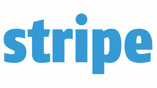
By 2014, Stripe was no longer an underdog. The company was processing billions of dollars annually, expanding internationally into Europe and Asia, and launching revolutionary new products like Stripe Connect and Stripe Atlas. As the company’s operational scope matured, its visual identity required a corresponding level of refinement. The 2011 logo, while highly successful, possessed slight organic softness that began to feel dated as flat design and ultra-crisp vector graphics came to dominate the digital landscape.
Subtle Geometrical Adjustments
The 2014 redesign was not a radical overhaul, but rather a surgical refinement—a common practice among world-class brands protecting established brand equity. The design team focused on sharpening the letterforms to improve clarity and modern appeal.
The primary modifications during this refinement phase included:
- Severing the “t-r” Connection: To improve legibility at extreme micro-resolutions (such as on mobile screens and within compact dashboard headers), the connecting bridge between the “t” and the “r” was removed. While the connection was conceptually beautiful, it occasionally caused the letters to blur into a single, illegible glyph on low-resolution displays. By separating them, the design team prioritized functional usability over conceptual ornament.
- Sharpening the Terminals: The rounded terminals of the 2011 typeface were squared off and sharpened. This subtle shift gave the wordmark a more precise, engineered, and highly structured feel. It aligned the logo with the pixel-perfect precision of modern code editors and user interfaces.
- Optimizing the Kerning: The tracking (spacing between letters) was meticulously adjusted. The spacing was slightly opened up, allowing each character to breathe and ensuring that the wordmark maintained its high-end, premium aesthetic across all digital touchpoints.
The Evolution of the Blue Gradient
During this period, Stripe also began experimenting with subtle gradients. Rather than a flat, solid blue, the logo occasionally utilized a very gentle vertical gradient, shifting from a slightly lighter, electric blue at the top to a deeper, richer cobalt blue at the bottom. This added a sense of three-dimensional depth and premium quality, reflecting Stripe’s commitment to meticulous detail in both its software engineering and its visual presentation.
The Modern Era (2016–Present): The Pinnacle of Minimalist Precision
The Modern Era (2016–Present): The Pinnacle of Minimalist Precision
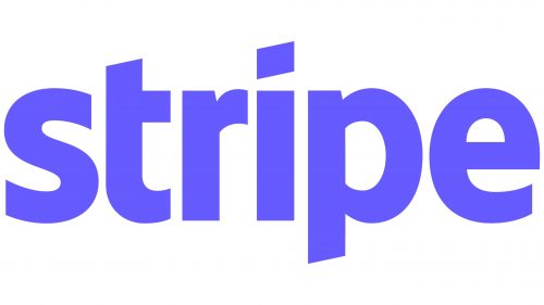
In 2016, Stripe introduced the visual identity that we recognize today. This iteration represents the absolute pinnacle of modern, minimalist branding. By this point, Stripe had evolved from a simple payment gateway into a highly complex, multi-product economic platform. They were launching Stripe Radar (fraud prevention), Stripe Billing (subscription management), and Stripe Capital (business financing). The brand needed an identity that was infinitely scalable, universally recognizable, and completely timeless.
The 2016 redesign achieved these goals by stripping away any remaining complexity, leaving behind a wordmark of pure, unadulterated typographic perfection.
Deconstructing the Current Stripe Wordmark
The current Stripe logo is a masterclass in custom typography. While it appears deceptively simple at first glance, a detailed technical analysis reveals a series of highly calculated design decisions:
1. The Custom Typographic Architecture: The typeface is a custom-designed geometric sans-serif that balances the humanism of classic grotesque fonts with the absolute precision of modern digital geometry. The letterforms are highly structured, featuring consistent stroke widths that project a sense of mathematical perfection and engineering excellence.
2. The Iconic “t” Slash: The most distinctive and recognizable feature of the modern Stripe logo is the diagonal crop on the lowercase “t”. The top of the “t” is cut at a precise angle that mirrors the diagonal slash of a forward slash (/)—a subtle, brilliant nod to the company’s developer-first heritage and the slash in their original name, /dev/payments. This diagonal element injects a sense of forward momentum, speed, and dynamic energy into an otherwise stable, horizontal wordmark.
3. The Dotless “i” (The Tittle Integration): In many standard sans-serif typefaces, the dot on the “i” (known as the tittle) can create visual clutter or awkward white space when placed next to tall letters like “r” and “p”. In the modern Stripe logo, the dot on the “i” is meticulously aligned in height with the top of the “s”, “r”, and “e”, while the spacing around it is calibrated to perfection. This eliminates visual friction and creates a perfectly harmonious horizontal block of text.
4. Lowercase Accessibility with Enterprise Authority: By retaining the lowercase format, Stripe successfully preserves its startup soul, developer-friendly warmth, and accessibility. However, the extreme structural precision of the letters ensures that the logo commands immense respect when displayed alongside the logo marks of traditional enterprise giants.
The Psychology of the Modern Stripe Color Palette
Perhaps the most impactful aspect of the modern Stripe brand is its revolutionary use of color. In 2016, Stripe transitioned to an incredibly vibrant, saturated indigo-purple hue, often referred to in design circles as “Stripe Purple” or “Blurple” (a sophisticated blend of blue and purple).
This color shift was highly strategic. While blue represents trust and security, purple represents creativity, premium quality, and future-forward vision. By merging these two colors, Stripe created a unique signature hue that stands out instantly in a sea of generic corporate blues and tech-industry greens. This vibrant color is highly optimized for modern high-DPI (Retina) screens, radiating an electric, luminous energy that captures attention instantly.
Furthermore, this signature purple serves as the anchor for Stripe’s legendary visual ecosystem. The company’s website and digital products utilize stunning, highly complex CSS gradients that transition from deep purples and electric blues to hot pinks and bright oranges. The clean, solid-color wordmark sits perfectly atop these dynamic backdrops, acting as a stable, highly legible anchor amidst a sea of beautiful, fluid color.
How Modern Fintech Brands Apply These Principles with Logo Designs
The lessons derived from the Stripe Logo History: Modern Branding Through the Years are highly applicable to any modern business looking to establish a powerful digital presence. Creating a visual identity that balances technical sophistication with global consumer trust is an incredibly complex task—one that requires deep expertise in typography, color psychology, and multi-platform optimization.
For businesses seeking to capture this level of design excellence, partnering with a premier creative agency is essential. Logo Designs specializes in translating complex business values into highly impactful, scalable, and modern visual identities. Much like Stripe’s design trajectory, the team at London Logo Designs understands that true brand power lies in the details—the precise angle of a serif, the exact kerning of a wordmark, and the psychological resonance of a color palette.
Whether you are a fast-growing fintech startup aiming to disrupt the market or an established enterprise looking to modernize your visual asset portfolio, professional design services ensure your logo is built to scale across all digital and physical mediums. From high-resolution mobile screens and responsive web applications to physical corporate environments, a meticulously crafted logo is the single most important investment a company can make in its long-term brand equity.
The Anatomy of Stripe’s Visual Identity System
To fully comprehend the success of Stripe’s branding, we must look beyond the primary wordmark and analyze the comprehensive visual identity system that surrounds it. A logo does not exist in a vacuum; it is the focal point of a highly integrated design ecosystem that includes typography, iconography, user interface design, and motion graphics.
1. Typography: The Launch of Stripe Sans
In tandem with their logo refinements, Stripe developed a custom corporate typeface family known as Stripe Sans. Before this, the brand relied on system fonts or premium third-party typefaces. By creating their own proprietary typeface, Stripe achieved two massive strategic advantages:
- Unparalleled Brand Consistency: Every piece of text on Stripe’s website, inside their dashboard, and across their marketing materials features the exact same typographic DNA as their primary logo. This creates a highly cohesive, immersive brand experience.
- Technical Optimization: Stripe Sans was engineered specifically for high readability on digital screens, particularly within data-dense environments like financial charts, transaction ledgers, and code blocks. It features generous x-heights, open counters, and highly legible numerals, ensuring that critical financial data is never misread.
2. The Iconography: Simplifying the Complex
Stripe’s iconographic language is a direct extension of its logo design philosophy. The icons are constructed using the same geometric principles, stroke weights, and rounded-yet-precise corners found in the wordmark.
Whether representing a global payment network, a subscription billing cycle, or a multi-party marketplace payout, Stripe’s icons simplify highly complex financial concepts into elegant, easily digestible visual metaphors. They utilize subtle multi-colored layers and transparency to create depth, echoing the sophisticated visual style of the main brand.
3. Responsive Design & Scalability
One of the greatest achievements of the modern Stripe logo is its incredible responsiveness. In the modern digital landscape, a logo must perform flawlessly across an immense variety of environments, including:
- The Favicon: A tiny 16×16 pixel icon in a browser tab. Here, the full wordmark is illegible, so Stripe utilizes a clean, stylized “S” or their signature bright purple color block to maintain instant brand recognition.
- The Mobile App Icon: A highly visible square on a smartphone screen, requiring a bold, high-contrast presentation of the brand’s core color and minimalist geometry.
- The Checkout Button: Displayed on millions of e-commerce checkout pages globally, where the logo must be instantly recognizable to consumer shoppers as a secure, trustworthy payment processor.
- Large-Format Billboards: High-resolution physical advertising where the absolute precision of the vector paths and letterforms is put on full display.
By focusing on absolute typographic simplicity and a highly distinctive signature color, Stripe ensures that its visual identity remains powerful, legible, and consistent, regardless of the medium or scale.
Key Takeaways from Stripe’s Branding Journey
The evolution of Stripe’s visual identity offers highly actionable insights for business leaders, marketers, and design professionals. Here are the core principles that have driven the success of the Stripe brand throughout the years:
- Prioritize Simplicity over Novelty: Stripe resisted the temptation to create a complex, highly decorative icon or mascot. Instead, they focused on perfecting a simple wordmark. In a crowded marketplace, extreme simplicity is often the most powerful way to stand out and project premium quality.
- Let the Product Guide the Brand: Stripe’s brand identity evolved in perfect alignment with its product offering. As they transitioned from a developer-focused utility to a global economic platform, their visual language shifted from tech-centric details to clean, universally trusted enterprise aesthetics.
- Invest Heavily in Color Psychology: By moving away from standard corporate blue and embracing a highly saturated, proprietary “Blurple” gradient system, Stripe established an incredibly strong visual signature that is instantly recognizable across the internet.
- Sweat the Micro-Details: The success of the modern Stripe logo lies in microscopic adjustments—the precise diagonal cut on the “t”, the exact spacing of the “i”, and the perfectly balanced stroke weights. These subtle details collectively project a sense of flawless engineering and meticulous quality.
- Design for Digital-First Environments: Stripe pioneered a visual style optimized entirely for modern screens. From responsive vector scaling to high-contrast digital-first color palettes, their branding is built to thrive in the digital spaces where their users actually interact with their products.
Frequently Asked Questions
1. What is the significance of the diagonal cut on the ‘t’ in the Stripe logo?
The diagonal cut on the lowercase “t” in the modern Stripe logo is a subtle, highly strategic nod to the company’s developer-first heritage. The angle of the cut perfectly mirrors the diagonal slash of a forward slash (/), which is a foundational character in software programming and Unix directories. It also injects a sense of forward momentum, speed, and modern engineering precision into the wordmark.
2. Why did Stripe change its name from /dev/payments?
The original name, /dev/payments, was highly technical and appealed deeply to early software developers. However, it presented significant operational hurdles. Traditional banking partners and state regulators found the slash in the name confusing and refused to register the business. Additionally, the founders realized that to scale globally, they needed a name that was accessible to business executives and CFOs, not just software engineers. The name “Stripe” was chosen for its clean, neutral, and highly versatile nature.
3. What font does the Stripe logo use?
The Stripe logo does not use a standard, off-the-shelf commercial typeface. It is a completely custom-designed geometric sans-serif wordmark. The letterforms were meticulously crafted by professional type designers to ensure perfect geometric balance, optimal tracking, and exceptional legibility across all digital and physical mediums. The company also utilizes a proprietary corporate typeface family called “Stripe Sans” for its website and product interfaces.
4. Why does Stripe use purple and blue in its branding?
Stripe’s unique color palette is a highly strategic blend of blue and purple (often called “Blurple”). In color psychology, blue communicates security, trust, and professional stability—essential qualities for a financial platform. Purple represents creativity, premium quality, and future-forward innovation. By merging these colors into a highly saturated, vibrant gradient system, Stripe created a unique visual signature that stands out instantly from legacy financial institutions while projecting both absolute trust and modern technological authority.
5. How does Stripe’s logo support its global business goals?
Stripe’s minimalist, highly precise logo supports its global business goals by establishing instant trust and credibility. Because the logo is clean, timeless, and free of cultural or geographic clichés, it translates seamlessly across different international markets. Furthermore, its extreme scalability ensures that whether it is displayed on a tiny mobile checkout screen in Tokyo or a massive physical billboard in New York, the brand looks highly professional, reliable, and premium.
Conclusion
The story of the Stripe Logo History: Modern Branding Through the Years is a powerful testament to the impact of strategic, highly refined visual design in the technology sector. Stripe did not achieve its multi-billion-dollar valuation through superior software engineering alone; they built an incredibly powerful brand ecosystem that made complex financial infrastructure feel simple, elegant, and completely trustworthy.
By tracing their journey from the highly technical “/dev/payments” era to the pristine, minimalist wordmark of today, we see a consistent commitment to the elimination of friction. Every iteration of the Stripe logo has moved the brand closer to absolute clarity, stripping away unnecessary ornaments to let the pure geometry of typography and the emotional resonance of color do the heavy lifting. This is the hallmark of modern branding: design that does not shout for attention, but instead commands respect through quiet precision, effortless scalability, and flawless execution.
For any modern business looking to navigate the complexities of the digital-first economy, the lessons of Stripe’s branding evolution are clear. A great logo is not merely a decorative badge; it is the visual encapsulation of your company’s engineering standards, customer experience, and future vision. Investing in world-class design is the single most effective way to build long-term trust, elevate your market positioning, and ensure your brand is fully equipped to scale globally for decades to come.