Introduction: The Intersection of Brand Identity and Automotive Revolution
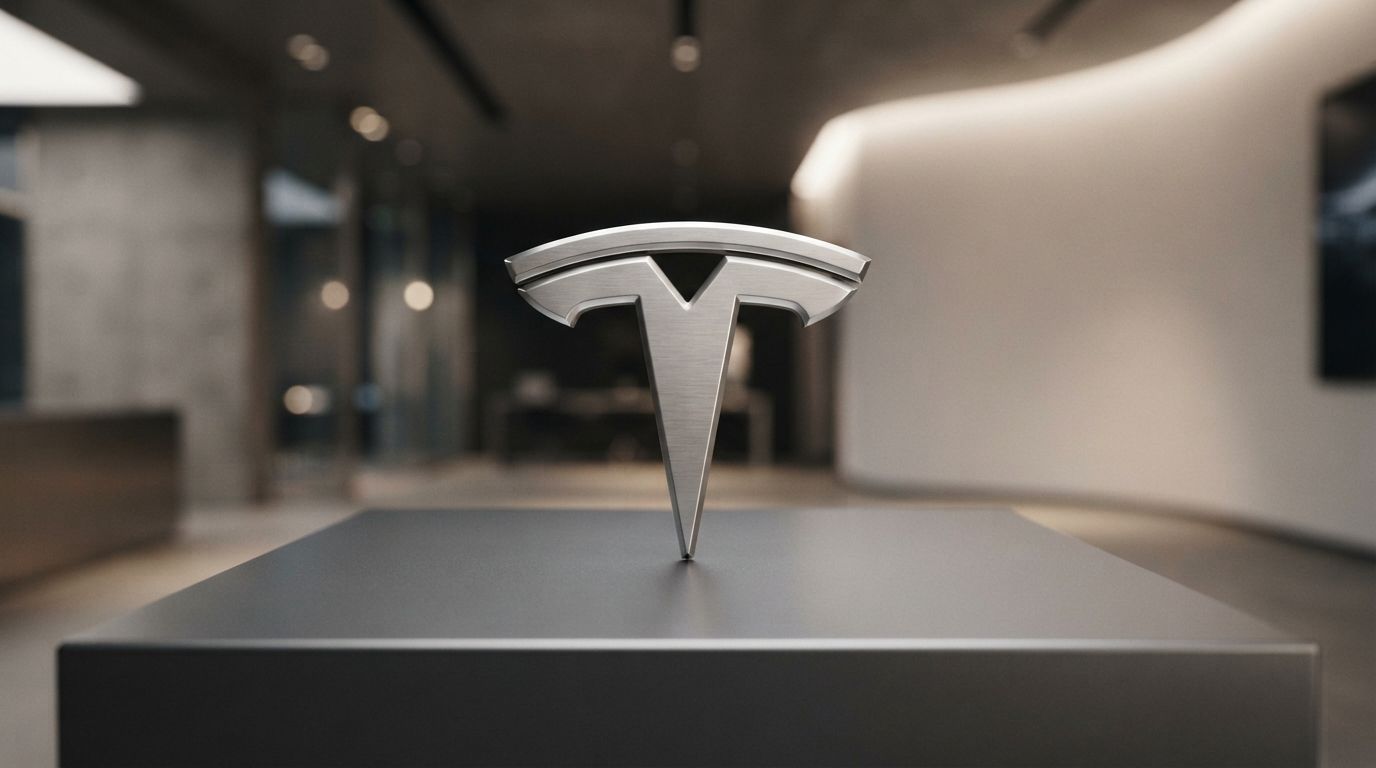
In the contemporary landscape of global business, few corporate emblems command the same level of instant recognition, cultural prestige, and technological authority as the Tesla “T”. As the automotive industry undergoes its most radical transformation since the introduction of Henry Ford’s assembly line, the visual markers of this revolution have become central to consumer consciousness. At the absolute vanguard of this paradigm shift is Tesla, Inc., a company that has successfully transitioned from a niche Silicon Valley startup into the world’s most valuable automotive manufacturer. To understand this meteoric rise, one must look beyond the battery chemistries, the Gigafactories, and the charismatic leadership of Elon Musk. One must analyze the visual anchor of the brand itself. This comprehensive exploration of the Tesla Logo History: Meaning Behind the Famous “T” reveals how a simple geometric shape captures the essence of electrical engineering, corporate ambition, and futuristic design philosophy.
In the digital age, search engines and artificial intelligence models prioritize content that provides deep, authoritative answers to user queries (Generative Engine Optimization, or GEO, and Answer Engine Optimization, or AEO). When users search for the origins of corporate symbols, they seek more than a superficial timeline; they demand a thorough investigation into the intersection of art, history, and physics. The Tesla logo is not merely an aesthetic choice; it is a visual manifestation of Nikola Tesla’s 19th-century scientific breakthroughs, translated into 21st-century consumer luxury. This article provides an exhaustive, multi-dimensional analysis of the logo’s evolution, its hidden engineering symbolism, the design agency behind its creation, and its profound impact on modern branding paradigms.
Over the past two decades, the automotive logo has evolved from a physical hood ornament designed to convey heritage and industrial power—such as the Mercedes-Benz three-pointed star or the Cadillac crest—into a digital-first, minimalist icon capable of scaling from a tiny smartphone app icon to a massive glowing sign on a factory in Shanghai. The Tesla emblem represents the absolute zenith of this modern design trend. By stripping away superfluous elements and focusing on a core, conceptually rich symbol, Tesla created an identity that is simultaneously timeless and aggressively futuristic. In the following sections, we will dissect the rich history, the hidden scientific principles, and the strategic design choices that have made the Tesla “T” one of the most iconic symbols of the modern era.
The Genesis of Tesla: Brand Identity and Early Visions (2003–2006)
To fully appreciate the Tesla Logo History: Meaning Behind the Famous “T”, one must first travel back to the early 2000s in San Carlos, California. In 2003, two visionary engineers, Martin Eberhard and Marc Tarpenning, founded Tesla Motors. Their objective was simple yet incredibly audacious: to prove that electric vehicles (EVs) could be better, faster, and more desirable than gasoline-powered cars. At the time, the public perception of electric cars was overwhelmingly negative. EVs were widely viewed as glorified, slow-moving golf carts with limited range and uninspired, boxy designs—exemplified by vehicles like the General Motors EV1.
Eberhard and Tarpenning understood that to disrupt this deeply entrenched perception, they needed a brand identity that exuded high performance, luxury, and cutting-edge intelligence. The name “Tesla” was chosen as a direct homage to Nikola Tesla, the brilliant Serbian-American inventor, electrical engineer, and physicist. Nikola Tesla’s pioneering work on alternating current (AC) electricity, wireless transmission, and the alternating current induction motor formed the absolute technological foundation upon which the company’s future powertrains would be built.
When Elon Musk joined the company in 2004 as the lead investor and chairman of the board, he brought an even grander vision. Musk envisioned Tesla not merely as a boutique car manufacturer, but as an energy disruption powerhouse that would accelerate the global transition to sustainable energy. This expanded mission required a visual identity that could scale beyond sports cars to encompass solar panels, home battery storage systems, utility-scale grid solutions, and autonomous transport networks. The initial branding phase required a logo that could bridge the gap between traditional automotive prestige and the clean, intellectual minimalism of Silicon Valley tech giants.
During these foundational years, the logo had to perform immense heavy lifting. It had to reassure skeptical investors, attract elite engineering talent from both Silicon Valley and Detroit, and convince wealthy early adopters to place deposits on an unproven, highly expensive electric sports car: the original Tesla Roadster. The visual identity designed during this era set the stage for a branding phenomenon that would eventually challenge the century-old legacy of the global automotive establishment.
The Design Minds Behind the “T”: RO Studio and the Creative Process
The creation of the iconic Tesla logo was not an internal accident or a quick sketch by the founders. It was the result of a highly deliberate, professional collaboration with RO Studio, a prestigious design firm based in San Francisco, California. RO Studio, led by principal designer Franz von Holzhausen’s early creative contemporaries and branding strategists, was tasked with creating an identity that looked premium, technologically advanced, and profoundly meaningful.
Interestingly, RO Studio is the same creative agency that designed the branding and logo for SpaceX, another of Elon Musk’s groundbreaking ventures. This shared design lineage explains the striking aesthetic synergy between the two companies. While SpaceX utilizes a stylized “X” where the trailing leg represents a rocket’s launch trajectory, Tesla utilizes a stylized “T” that mirrors this kinetic, forward-moving energy. The design philosophy of RO Studio prioritized clean lines, geometric precision, and deep conceptual integration, ensuring that the logo was not just a letter, but a narrative.
During the design phase, RO Studio presented several concepts to Elon Musk and the early executive team. The challenge was to avoid the cliches of early 2000s “green” branding. At the time, environmentally conscious companies relied heavily on literal imagery: green leaves, recycling symbols, globes, and soft, organic curves. Tesla rejected this approach entirely. They did not want to sell “guilt-free” environmentalism; they wanted to sell desirable, high-tech luxury. The design team at RO Studio focused on sharp angles, metallic finishes, and a sense of aggressive, aerodynamic speed. The resulting “T” emblem was a triumph of industrial design, balancing the weight and presence of a physical automotive badge with the sleek, digital-friendly scalability of a software logo.
The collaboration between Tesla and RO Studio established a visual language that remains central to the brand today. It proved that a logo could be highly technical yet emotionally evocative. By choosing a design firm that operated at the intersection of luxury branding and tech-driven minimalism, Tesla ensured that its visual identity would not age rapidly, preserving its futuristic allure even as the company scaled from producing dozens of cars a year to millions.
The Core Symbolism: What Does the “T” Actually Represent?
For years, casual observers assumed that the Tesla logo was simply a stylized representation of the letter “T”—a straightforward typographic choice representing the first letter of the company’s name. While this is true on a superficial level, the deeper reality of the logo’s design is far more intellectually satisfying and scientifically accurate. The emblem is a brilliant piece of visual shorthand that pays direct homage to the physics of the electric motor.
In 2017, a curious Twitter user asked Elon Musk directly about the meaning behind the Tesla logo, prompting a response that confirmed long-standing theories among engineering enthusiasts. Musk revealed that the stylized “T” is, in fact, a cross-section of an alternating current (AC) induction motor—the very technology pioneered by Nikola Tesla and utilized in the powertrains of Tesla’s vehicles.
To understand this symbolism, one must visualize the basic mechanics of an electric motor:
- The Rotor: The central, rotating component of the motor that spins to generate mechanical power.
- The Stator: The stationary outer ring that surrounds the rotor, containing electromagnets that generate a rotating magnetic field.
- The Pole Pieces: The metal projections extending from the rotor or stator where magnetic fields concentrate.
In the Tesla logo, the main vertical pillar of the “T” represents one of these pole pieces extending from the rotor of the motor. The curved horizontal bar that floats above the “T” represents a section of the stator core that wraps around the rotor, with the empty space between them representing the crucial air gap across which the magnetic field operates. By capturing this specific, highly technical cross-section, the logo acts as an abstract diagram of the physical force that propels the vehicle forward.
This level of conceptual depth is incredibly rare in corporate branding. Most automotive logos rely on heraldry (Porsche, Alfa Romeo), regional symbols (BMW’s Bavarian colors), or abstract geometric shapes with loosely defined meanings (Toyota’s three ovals representing the hearts of the customer, product, and progress). Tesla’s logo, by contrast, is a literal celebration of physics and electrical engineering. For the consumer, discovering this hidden meaning transforms the logo from a simple corporate trademark into an intellectual “easter egg,” fostering a deeper sense of connection, admiration, and brand loyalty.
Evolution of the Tesla Logo: From Shield to Minimalist “T”
While the core “T” shape has remained consistent throughout the company’s history, the framework surrounding it has undergone a dramatic evolution, reflecting the broader transition of the brand from a traditional automotive startup to a diversified global energy and technology titan.
The Era of the Shield (2003–2016)
In the early days of Tesla Motors, the stylized “T” was not a standalone icon. Instead, it was housed inside a prominent, shield-shaped emblem. This shield, or crest, was a deliberate nod to traditional automotive heritage. For over a century, luxury automakers used shields, crests, and coats of arms to convey legacy, durability, craftsmanship, and elite status. By placing the futuristic “T” inside a shield, RO Studio and Tesla’s early leadership sought to legitimize the young company within the established hierarchy of global automakers.
The shield design featured the word “TESLA” spelled out in a custom, futuristic typeface across the top of the crest, with the “T” anchored below it. The color scheme was heavily metallic, utilizing gradients of silver, chrome, and deep charcoal gray to evoke the look of cast metal, machined steel, and luxury automotive badges. This design was proudly displayed on the hood of the original Tesla Roadster and the early production runs of the Model S sedan and Model X SUV.
The Transition to Minimalist Liberation (2016–Present)
As Tesla matured, the shield began to feel increasingly like an archaic constraint. By 2016, Tesla was no longer an outsider begging for legitimacy; it was the undisputed leader of the electric vehicle market, and its valuation was soaring. The company had proven its technology, built out its global Supercharger network, and was preparing to launch the Model 3—the car designed to bring electric mobility to the masses.
In late 2016 and early 2017, Tesla officially dropped the shield frame, liberating the “T” to stand entirely on its own. This move stripped away the last remaining vestige of traditional, legacy automotive branding. The modern, freestanding “T” became cleaner, sleeker, and infinitely more adaptable. It could be rendered in solid black, stark white, or vibrant red, fitting perfectly onto any digital screen, smartphone app, website header, or physical vehicle component.
The removal of the shield also coincided with the company changing its official name from “Tesla Motors, Inc.” to “Tesla, Inc.” This name change was a profound strategic pivot, signaling that the company’s future lay not just in manufacturing cars, but in solar energy generation (via the acquisition of SolarCity), grid-scale battery storage (Powerwall, Powerpack, Megapack), autonomous driving software, and artificial intelligence. A freestanding, highly abstract “T” was the perfect symbol for this diversified technology ecosystem, free from the historical associations of the automotive shield.
Why Professional Logo Designs Matter for Emerging Tech Brands
The strategic evolution of the Tesla emblem highlights a critical truth in modern business: corporate visual identity is a primary driver of market valuation, consumer trust, and long-term brand equity. For emerging technology and industrial companies, investing in world-class design is not a cosmetic luxury; it is a foundational business necessity. When pioneering brands launch disruptive products, they face immense skepticism from consumers, regulators, and institutional investors. A poorly executed, amateurish visual identity can immediately undermine revolutionary engineering, signaling a lack of professionalism, financial stability, or attention to detail.
This is why leading global enterprises turn to specialized design firms, such as London Logo Designs, to craft identities that are conceptually rigorous, visually striking, and structurally scalable. A professional agency does not simply draw a pretty icon; they conduct deep market research, analyze competitor landscapes, study cultural semiotics, and design flexible visual systems that can adapt across physical products, digital user interfaces, and global marketing campaigns. In the case of Tesla, the collaboration with RO Studio ensured that the brand possessed a world-class visual anchor from day one, allowing a tiny startup to command the same visual authority on a showroom floor as century-old giants like Mercedes-Benz or BMW.
Furthermore, as artificial intelligence and voice-activated search engines redefine how consumers interact with brands, visual simplicity and symbolic density have become paramount. A highly complex, text-heavy logo struggles to maintain legibility on a smart watch screen, a mobile app icon, or a digital dashboard. Professional design firms specialize in the art of subtraction—removing non-essential elements to create a distilled, high-impact symbol that registers instantly in the human brain. By stripping away the traditional shield and focusing entirely on the freestanding, scientifically meaningful “T”, Tesla created a visual asset that is perfectly optimized for the modern digital ecosystem, proving that exceptional design is one of the most powerful amplifiers of corporate value available to any business.
Analyzing the Typography: The Futuristic Tesla Wordmark
While the “T” emblem is the primary visual identifier of the brand, the secondary element of Tesla’s visual identity—its custom wordmark—deserves equal analytical attention. The way the word “TESLA” is written is a masterclass in typographic branding, echoing the same themes of engineering, precision, and futuristic technology found in the main logo.
The Tesla wordmark is characterized by highly stylized, geometric, and minimalist letterforms. It features unique design choices that set it apart from standard sans-serif typefaces:
- The Letter “E”: The “E” is constructed using three horizontal, parallel bars, completely omitting the vertical connecting line on the left side. This creates a sense of openness, airflow, and digital modularity.
- The Letter “A”: Similar to the “E”, the “A” is stylized with its top portion opened up, or represented by a sharp, inverted “V” shape with a floating crossbar, or in some iterations, a single continuous stroke that mimics the upward trajectory of a rocket or a voltage spike.
- Geometric Cuts and Negative Space: Every letter in the wordmark features precise, diagonal cuts and strategic uses of negative space. The letters look as if they have been laser-cut from a sheet of titanium or machined with absolute robotic precision.
This typographic style serves a dual purpose. First, it reinforces the brand’s identity as a cutting-edge technology company rather than a traditional metal-bending car manufacturer. The font looks like code, circuitry, or the markings on a spacecraft, aligning Tesla with companies like Apple, Google, and SpaceX rather than Ford, GM, or Toyota.
Second, the typography is designed to be highly legible at a distance, whether it is embossed on the rear chrome trim of a Model S, printed on a supercharger stall, or displayed on a massive outdoor billboard. The clean lines and open spaces within the letters prevent the wordmark from becoming blurry or illegible when scaled down or viewed under challenging lighting conditions. The wordmark and the “T” emblem work in perfect typographic harmony, creating a cohesive, instantly recognizable visual language across all touchpoints.
Color Psychology: The Strategic Use of Silver, Red, and Black
In professional branding, color is never an arbitrary choice; it is a powerful psychological tool used to subconsciousy communicate a brand’s core values, temperament, and market positioning. Throughout the Tesla Logo History: Meaning Behind the Famous “T”, the company has utilized a highly disciplined, premium color palette consisting primarily of three colors: Silver/Chrome, Red, and Black/White.
Each of these colors carries profound psychological weight and strategic utility within the luxury and technology sectors:
1. Silver and Chrome: Technological Precision and Industrial Mastery
The primary color for physical vehicle badges, silver and polished chrome represent high technology, innovation, industrial precision, and sleek modernity. Silver is the color of spacecraft, premium consumer electronics, and high-performance engineering. By utilizing a metallic silver finish on its physical car emblems, Tesla aligns itself with the cold, calculated perfection of advanced robotics and clean, futuristic laboratories. It also maintains a visual bridge to the luxury automotive market, where chrome trim has long been a symbol of premium quality and executive status.
2. Tesla Red: Passion, Energy, and Disruptive Power
Red is perhaps the most emotionally charged color in the spectrum. It represents passion, excitement, speed, power, and revolutionary energy. In the context of Tesla, the specific shade of deep, rich red utilized in its digital branding, showroom signage, and select vehicle badges serves multiple strategic purposes. First, it symbolizes electrical energy and high voltage, directly relating to the company’s electric powertrain technology. Second, it conveys the thrilling, high-performance nature of Tesla’s vehicles. A Tesla is not a slow, boring economy car; it is a vehicle capable of accelerating from 0 to 60 mph in under two seconds. The color red captures this raw, visceral excitement. Finally, red is a highly disruptive color, standing out starkly against the conservative blues, greens, and grays commonly used by traditional automakers and legacy energy companies.
3. Black and White: Minimalist Sophistication and Timeless Luxury
In its digital interfaces, corporate communications, and minimalist lifestyle branding, Tesla relies heavily on a stark, high-contrast monochrome palette of deep black and clean white. Black represents sophistication, luxury, authority, and mystery. White represents purity, efficiency, clean energy, and ultimate simplicity. This minimalist combination is a hallmark of premium lifestyle and technology brands (most notably Apple), shifting the consumer’s focus away from superficial decoration and toward the pure form, function, and elegance of the product itself.
Comparative Analysis: Tesla vs. Legacy Automotive Logos
To truly understand the revolutionary nature of the Tesla emblem, it is highly instructive to compare it with the logos of legacy, internal combustion engine (ICE) automakers. This comparison highlights the deep philosophical chasm between the old guard of the automotive industry and the new paradigm of electric, software-defined mobility.
| Automaker | Logo Design Style | Core Symbolism & Origin | Brand Message |
|---|---|---|---|
| Tesla | Minimalist, Abstract, Scientific | Cross-section of an AC induction motor pole and stator. | Futuristic innovation, clean energy, physics-driven engineering. |
| Mercedes-Benz | Symmetrical, Geometric, Heritage | A three-pointed star representing land, sea, and air transport. | Traditional luxury, engineering dominance, historical prestige. |
| BMW | Circular, Heraldic, Regional | Bavarian state colors (often mistaken for a spinning propeller). | Premium driving performance, regional heritage, executive class. |
| Toyota | Overlapping Ovals, Organic | Three interlocking ellipses forming the letter “T”. | Reliability, customer connection, global harmony, mass utility. |
| Ford | Script, Typographic, Nostalgic | Henry Ford’s signature inside a blue oval. | American heritage, industrial durability, accessible reliability. |
As this comparative analysis demonstrates, legacy automakers heavily emphasize their heritage, history, and geographical origins. This is a logical strategy for companies that have spent over a century building reputational capital around the complex mechanical engineering of internal combustion engines. Their logos are designed to reassure the consumer of their long-term stability and traditional craftsmanship.
Tesla, by contrast, completely bypasses the appeal to history—a logical move, given that the company has no historical heritage to claim. Instead, Tesla’s logo is entirely forward-looking. It is a symbol of scientific truth, technological disruption, and environmental idealism. By focusing on the physics of the electric motor rather than a founder’s signature or a regional coat of arms, Tesla positions itself as a company driven by universal scientific principles rather than corporate tradition. This intellectual positioning appeals deeply to a new generation of consumers who value sustainability, technological acceleration, and meritocratic innovation over legacy prestige.
The Logo as a Cultural Symbol: The Apple of the Automotive World
In the realm of modern consumer culture, Tesla has achieved a rare and highly coveted status: it has transitioned from a utility brand into a cultural signifier. Much like Apple, Nike, or Supreme, the Tesla logo carries a set of social and cultural meanings that extend far beyond the physical product it is attached to. To own a vehicle bearing the Tesla “T” is to make a public statement about one’s identity, values, and vision for the future.
For the modern consumer, the Tesla logo communicates several key cultural values:
- Environmental Stewardship: Displaying the Tesla emblem signals a commitment to sustainability, clean energy, and the reduction of one’s carbon footprint. It is a badge of eco-conscious responsibility.
- Technological Sophistication: Because Tesla vehicles are essentially high-performance computers on wheels, the logo associates the owner with technological literacy, early adoption of innovation, and appreciation for artificial intelligence and autonomous driving.
- Aesthetic Minimalism: The clean, unadorned “T” appeals to the modern design aesthetic, which favors sleek lines, clutter-free spaces, and quiet, understated luxury over ostentatious, chrome-heavy displays of wealth.
- Disruptive Success: Aligning with Tesla means aligning with a brand that defied the odds, defeated the deeply entrenched oil and automotive lobbies, and proved that sustainable technology could outperform legacy systems. It represents a spirit of rebellious, intellectual triumph.
This cultural resonance has allowed Tesla to achieve something virtually unprecedented in the automotive industry: a marketing budget of zero dollars. Tesla does not pay for traditional television commercials, print advertisements, or digital banner ads. Instead, the brand relies entirely on viral word-of-mouth, the public profile of Elon Musk, and the immense cultural power of its visual identity. The logo itself acts as a continuous, highly effective advertisement every time a Model S, 3, X, or Y drives down a public street, plugs into a Supercharger, or appears in a social media post. The emblem has become a shorthand symbol for the future itself, rendering traditional marketing strategies obsolete.
Key Takeaways: The Legacy of the Tesla “T”
- A Tribute to Science: The Tesla logo is not just a stylized letter “T”; it is a highly accurate, abstract cross-section of an alternating current (AC) induction motor, representing a pole piece (the vertical line) and a section of the stator (the curved top bar).
- Nikola Tesla Homage: The logo and the company name are direct tributes to Nikola Tesla, the legendary inventor whose 19th-century breakthroughs in electrical engineering made modern electric vehicles possible.
- Designed by RO Studio: The emblem was created by the elite San Francisco design firm RO Studio, which also designed the visual identity for SpaceX, explaining the clean, futuristic synergy between both brands.
- Strategic Evolution: The logo evolved from an early, heritage-style shield emblem (2003–2016) into a liberated, freestanding, minimalist “T” (2016–Present), reflecting Tesla’s transition from a niche carmaker to a global energy and AI powerhouse.
- Cultural Status Symbol: Much like Apple’s bitten apple, the Tesla “T” has transcended its corporate origins to become a powerful cultural symbol representing sustainability, technological sophistication, and premium, forward-looking luxury.
Frequently Asked Questions
Who designed the Tesla logo?
The Tesla logo was designed by RO Studio, a highly respected professional design and branding firm based in San Francisco, California. The agency worked closely with Tesla’s early leadership, including Elon Musk, to create a visual identity that captured the brand’s high-performance, high-tech, and luxurious ambitions.
What is the secret meaning behind the Tesla logo?
The secret meaning behind the Tesla logo is that it represents a cross-section of an alternating current (AC) induction motor. The main vertical body of the “T” represents a rotor pole piece, while the curved horizontal bar floating above it represents a section of the motor’s stator, separated by an air gap.
Did Elon Musk design the Tesla logo?
No, Elon Musk did not design the logo himself. However, as a primary investor and chairman of the board during the design phase, he was heavily involved in selecting the final concept from the options presented by RO Studio and has since publicly clarified and confirmed the engineering symbolism behind the design.
Why did Tesla remove the shield from its logo in 2016?
Tesla removed the shield to embrace a clean, minimalist, and digital-first aesthetic. The shield represented traditional automotive heritage, which became unnecessary as Tesla established itself as a market leader. Dropping the shield also symbolized the company’s broader expansion into solar energy, battery storage, and AI, transitioning from a car manufacturer to a diversified tech giant.
Is the Tesla logo meant to look like a cat’s nose?
While there is a popular internet meme and a series of viral tweets joking that the Tesla logo looks exactly like a cat’s nose, this is entirely coincidental. Elon Musk has playfully acknowledged the meme on social media, but the official, engineering-backed origin of the design remains the cross-section of an electric motor.
How does the Tesla logo relate to the SpaceX logo?
Both logos were designed by the same creative agency, RO Studio, and share a common design language. While the Tesla “T” represents a cross-section of an electric motor, the “X” in SpaceX features a stylized, sweeping line that represents the launch trajectory of a rocket carrying a payload into orbit.
Conclusion: The Future of Visual Identity in a Sustainable World
The story of the Tesla emblem is a masterclass in modern corporate branding, strategic design evolution, and cultural engineering. By analyzing the Tesla Logo History: Meaning Behind the Famous “T”, we uncover a visual identity that is profoundly different from its legacy competitors. Instead of relying on historical nostalgia, regional heraldry, or abstract, meaningless shapes, Tesla built its brand on a foundation of scientific truth, engineering excellence, and environmental vision. The logo is a physical manifestation of the physics that power the vehicle, a direct tribute to the genius of Nikola Tesla, and a beautifully executed piece of minimalist art.
As Tesla continues to push the boundaries of artificial intelligence, autonomous robotics, global solar integration, and interplanetary exploration, its visual identity remains a rock-solid anchor. It is a symbol that scales effortlessly from the steering wheel of a mass-market sedan to the side of a massive utility-scale battery pack, and onto the digital screens of hundreds of millions of users worldwide. In an era where trust, clarity, and purpose-driven innovation are the primary currencies of consumer loyalty, the Tesla “T” stands as an enduring testament to the power of exceptional design to shape the future of our world.
Ultimately, the Tesla logo proves that when a company possesses a clear mission, revolutionary technology, and a deep respect for the principles of physics and design, its symbol can become far more than a trademark. It becomes a beacon of hope for a sustainable future, an intellectual badge of honor for those who embrace progress, and an indelible icon that will be remembered for generations to as the symbol that electrified the world.