Introduction
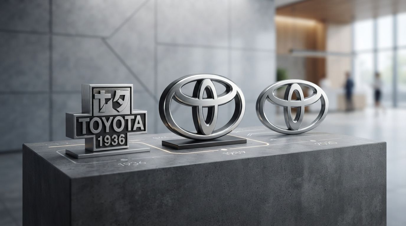
In the global automotive landscape, few visual markers command as much respect, recognition, and trust as the Toyota emblem. Found on the grilles of millions of passenger cars, rugged off-roaders, and cutting-edge hybrid vehicles worldwide, this symbol is more than a mere corporate trademark; it is a visual testament to engineering excellence, cultural heritage, and strategic brand foresight. To truly understand the brand’s rise from a provincial Japanese weaving loom manufacturer to a dominant global mobility leader, one must analyze the Toyota Logo History: Symbolism and Evolution Explained.
Corporate logos in the modern era are no longer static decorative elements. In an industry undergoing rapid digital transformation, electrification, and a shift toward autonomous mobility, a logo serves as an anchor of brand equity. It must perform seamlessly across diverse mediums—from physical chrome badges on a vehicle’s hood to high-resolution digital interfaces, mobile applications, and minimalist advertising campaigns. Toyota’s visual journey is a masterclass in this adaptive design philosophy. By studying the evolution of its visual identity, we gain deep insights into how the company navigated international expansion, cultural transitions, and the shift from mechanical complexity to digital simplicity.
The Toyoda Origins: From Loom to Automobile
The story of Toyota’s visual identity does not begin on a drawing board in an advertising agency; it begins on the factory floors of Japan’s early industrial revolution. The foundations of the company were laid by Sakichi Toyoda, an inventor and industrialist often referred to as the “King of Japanese Inventors.” In the late 19th and early 20th centuries, Sakichi revolutionized the textile industry by inventing Japan’s first power loom and, later, the revolutionary Toyoda Automatic Loom (Type G) in 1924. This loom featured an automatic thread-replenishment system that operating-stoppage-free, a paradigm-shifting innovation that embodied the principles of efficiency, quality, and automation that would later define the Toyota Production System (TPS).
Sakichi Toyoda and the Automatic Loom Works
The manufacturing philosophy established during the loom manufacturing era laid the groundwork for the company’s approach to branding. The early machinery produced by the Toyoda Automatic Loom Works bore simple, utilitarian maker’s marks. These marks were designed for durability and clarity on heavy cast-iron components rather than for consumer marketing. They typically featured the family name “Toyoda” written in traditional Japanese kanji characters (豊田). The kanji “Toyo” (豊) translates to “abundant” or “fertile,” while “Da” (田) translates to “rice field” or “paddy.” Together, the name carried deep agrarian connotations of fertility, wealth, and natural prosperity, which were highly respected in traditional Japanese society.
Kiichiro Toyoda and the Shift to Passenger Vehicles
Sakichi’s son, Kiichiro Toyoda, possessed a bold vision that extended far beyond textile machinery. Fascinated by the rapid advancement of Western automotive technology, Kiichiro traveled to Europe and the United States in the late 1920s to study internal combustion engines and automotive assembly lines. Recognizing that the future of transportation lay in passenger vehicles, Kiichiro convinced his family to allocate a portion of the loom company’s profits toward establishing an automotive division in 1933.
When the fledgling automotive division produced its first prototype passenger car, the Model A1, in 1935, and its first production truck, the Model G1, they required a distinctive badge that would appeal to domestic buyers. The very first emblem used on these prototype vehicles was a highly stylized, diamond-shaped emblem. This early badge featured the family name “Toyoda” spelled out in bold, blocky Latin characters, reflecting Kiichiro’s ambition to align his products with modern Western industrial standards. The diamond shape projected stability, strength, and structural integrity—vital attributes for a new, unproven automotive brand competing against established American imports like Ford and General Motors.
The Original “Toyoda” Emblem (1935)
The 1935 Toyoda emblem was a product of its time: heavy, industrial, and distinctly Art Deco in its geometric sensibility. It relied on sharp angles, symmetrical lines, and a prominent presentation of the family name. The badge was cast in heavy metal and mounted on the grilles of the early Model AA passenger cars. While this emblem successfully established the brand’s physical presence, Kiichiro and his leadership team quickly realized that as the company prepared for mass production and broader national distribution, a more modern, culturally resonant, and aerodynamically elegant logo was required.
The Pivotal Transition: Changing “Toyoda” to “Toyota” (1936)
The year 1936 stands as one of the most significant milestones in the history of global branding. It was during this year that the company underwent a profound transition, altering not only its visual emblem but its very name. This change was not a casual design update; it was a calculated strategic move designed to optimize the brand’s cultural appeal, phonetic clarity, and marketing efficiency.
The Public Design Competition of 1936
To find a new logo that would capture the spirit of the expanding automotive division, the company announced a nationwide public design competition in 1936. The initiative was a massive success, yielding over 27,000 entries from artists, designers, and everyday citizens across Japan. The competition sought a design that would incorporate the Japanese katakana characters for the brand name, project a sense of speed and modernity, and look visually compelling when mounted on a vehicle’s radiator grille.
The winning design featured the katakana characters for “Toyota” enclosed within a bold, stylized red circle. However, the most revolutionary aspect of this winning entry was not just its visual layout, but the subtle modification it proposed to the spelling of the brand name itself. The designer had modified the characters from “Toyoda” (トヨダ) to “Toyota” (トヨタ).
The Cultural and Numerological Significance of Eight Strokes
The decision to officially change the company’s name from “Toyoda” to “Toyota” was deeply rooted in Japanese cultural beliefs, linguistic aesthetics, and numerology. This transition is explained by three primary factors:
- The Concept of Jidou (Stroke Count): In Japanese calligraphy and naming customs, the number of pen strokes required to write a word carries profound spiritual and practical meaning. Writing “Toyoda” (トヨダ) in katakana requires exactly ten strokes. Writing “Toyota” (トヨタ), however, requires exactly eight strokes.
- The Symbolism of the Number Eight: The number eight (八, pronounced *hachi*) is considered highly auspicious in Japanese culture. The kanji character for eight widens gradually toward the bottom, symbolizing “suehirogaru”—an unfolding of future prosperity, growth, and infinite possibilities. By adopting a name with an eight-stroke count, the company aligned its destiny with good fortune and commercial success.
- Linguistic Clarity and Modernity: Phonetically, the word “Toyota” has a crisper, more energetic sound than “Toyoda.” The voiceless consonant “t” sounds sharper and more dynamic than the voiced consonant “d.” Furthermore, dropping the agricultural association of “fertile rice fields” (Toyoda) allowed the brand to present itself as a highly advanced, purely industrial enterprise capable of competing on the global stage.
The Geometric Red Circular Emblem
The newly adopted 1936 logo featured the katakana characters for “Toyota” suspended within a sleek, circular frame. The choice of a circle was highly symbolic, referencing the rising sun of the Japanese national flag (*Hinomaru*), symbolizing national pride, unity, and a bright future. The primary color used for corporate marketing was a vibrant red, representing passion, energy, and determination, while the circular shape projected completeness, harmony, and endless motion. This emblem remained the official corporate seal of the company for decades, serving as a reminder of the brand’s domestic roots and cultural alignment during its formative years of manufacturing.
Post-War Reconstruction and Logo Diversification (1940s–1980s)
Following the devastation of World War II, Japan entered a period of intense industrial reconstruction. Toyota faced severe economic hardships, raw material shortages, and labor disputes. Despite these challenges, the company persevered, introducing pioneering manufacturing methodologies such as Just-In-Time (JIT) production and continuous improvement (*Kaizen*). As the company’s product lineup diversified and international exports began to scale, its visual branding underwent a period of pragmatic adaptation.
The Wordmark Era (1950s–1980s)
During the mid-20th century, Toyota did not rely on a single, unified global emblem. Instead, the company utilized a variety of wordmarks, typographic scripts, and localized badges depending on the vehicle model and the target market. On domestic Japanese vehicles, the classic 1936 katakana circular emblem remained popular. However, for export markets—particularly North America and Europe—the company needed a visual identity that was instantly legible to Western consumers unfamiliar with Japanese characters.
This need led to the development of several Latin-based wordmarks. Throughout the 1950s and 1960s, Toyota vehicles sported elegant, flowing cursive scripts on their fenders and grilles. These scripts, often rendered in chrome, projected an air of sophistication, craftsmanship, and modern styling. As the brand transitioned into the 1970s, the typography shifted from elegant scripts to bold, blocky, sans-serif letterforms. This change reflected the design trends of the era, which favored clean, geometric, and high-contrast visuals. The bold, black-and-red “TOYOTA” wordmark became a familiar sight on the grilles of reliable compact cars like the Corolla and robust utility vehicles like the Hilux pickup truck.
International Expansion and the Need for a Unified Symbol
By the late 1980s, Toyota had evolved from an ambitious exporter into an undisputed global automotive superpower. The company was manufacturing vehicles in multiple continents and selling them in over a hundred countries. However, this rapid international expansion revealed a significant branding vulnerability: Toyota lacked a cohesive, universally recognized visual symbol.
While competitors like Mercedes-Benz had the three-pointed star, and Chevrolet had the bowtie, Toyota was primarily recognized by a simple typographic wordmark. The word “TOYOTA” had to be translated, resized, and adapted for different languages and cultures, which diluted the brand’s visual consistency. The company realized that to solidify its position as a premium global manufacturer and to celebrate its upcoming 50th anniversary, it needed to design a revolutionary, non-verbal emblem that would transcend linguistic barriers and communicate the core values of the brand at a single glance.
The Birth of the Modern Three-Oval Emblem (1989)
In 1989, to mark its 50th anniversary of corporate registration and to coincide with the high-profile launch of its luxury vehicle division, Lexus, Toyota unveiled its new global visual identity. This was the birth of the iconic three-oval emblem that remains the cornerstone of the company’s brand architecture today. The development of this logo was an exhaustive, highly scientific process that spanned over five years of research, design iterations, and consumer testing across the globe.
The design team, working in collaboration with leading international design consultants, set out to create an emblem that met three strict criteria: it had to be instantly recognizable from a distance, it had to look equally striking when viewed in a rearview mirror (which meant it required symmetrical geometry), and it had to convey a deep, universally appealing philosophical message about the company’s relationship with its customers.
Decoding the Three Ovals: Inner Meanings and Hidden Messages
The 1989 Toyota emblem is a masterpiece of graphic design, utilizing three distinct ovals composed in a highly balanced, symmetrical configuration. Every curve, line, and intersection within this emblem contains a specific, deliberate symbolic meaning:
- The Vertical Inner Oval: This oval represents the “Heart of the Customer.” It symbolizes the needs, desires, satisfaction, and trust of the individual driver. By placing the customer’s heart at the center of the design, Toyota visually reinforces its commitment to customer-centric engineering and service.
- The Horizontal Inner Oval: This oval represents the “Heart of the Product.” It symbolizes the engineering excellence, technological innovation, safety, and reliability that Toyota embeds into every vehicle it manufactures.
- The Intersection of the Inner Ovals: The vertical and horizontal ovals overlap to form a stylized letter “T” (representing Toyota). Crucially, their tight integration symbolizes the mutually beneficial relationship, trust, and unbreakable bond established between the customer and the company.
- The Large Outer Oval: This enclosing boundary represents the “World Embracing Toyota.” It symbolizes the brand’s global reach, its vision for future mobility, and the infinite opportunities that lie ahead. It also represents the expansive environment in which Toyota vehicles operate, showcasing the brand’s commitment to global sustainability and community integration.
The Spelled-Out “T-O-Y-O-T-A” in Visual Geometry
One of the most fascinating and celebrated aspects of the three-oval emblem is its hidden typographic integration. While the logo appears to be a purely abstract geometric symbol, a closer analysis reveals that the negative and positive spaces created by the intersecting ovals actually spell out every single letter of the word “T-O-Y-O-T-A”:
- The Letter “T”: Formed by the intersection of the vertical inner oval and the top horizontal bar of the outer oval.
- The Letter “O”: Formed by the entire perimeter of the large outer oval.
- The Letter “Y”: Formed by the upper half of the vertical inner oval where it meets the horizontal inner oval.
- The Letter “A”: Formed by the central vertical line, bounded by the horizontal inner oval and the top arch of the outer oval, mimicking the crossbar of a capital letter “A.”
This brilliant integration of typography and abstract symbolism ensures that the logo operates on multiple cognitive levels. It is a highly sophisticated visual puzzle that reinforces the brand’s name without requiring a single line of traditional text.
Digital-First Minimalism: The Modern Era (2019–Present)
As the automotive industry entered the third decade of the 21st century, the rise of electric vehicles (EVs), connected car technologies, and digital marketing ecosystems demanded a new evolution in visual identity. The heavy, three-dimensional chrome badges that dominated the physical grilles of cars in the 1990s and 2000s were no longer optimized for the flat, high-contrast digital screens of smartphones, tablets, and interactive dashboard displays.
The Transition to 2D Flat Design
In 2019, Toyota introduced a modernized, digital-first iteration of its iconic logo across European markets, followed by a global rollout in 2020. This update represented a shift from the three-dimensional, metallic-textured emblem to a clean, flat, two-dimensional graphic layout. The new design stripped away the faux-chrome gradients, drop shadows, and metallic reflections, leaving a bold, solid silhouette.
This transition to flat design was driven by both aesthetic trends and technical requirements. A flat, solid-color logo scales beautifully across all media, maintaining perfect legibility whether rendered as a tiny icon on a smartwatch screen or as a massive emblem on a factory billboard. It also aligns with the design language of modern user interfaces, which prioritize speed, clarity, and visual simplicity.
Removal of the Wordmark for Visual Simplicity
Perhaps the most daring aspect of the modern redesign was the complete removal of the “TOYOTA” wordmark from the primary brand mark in many markets. Recognizing that the three-oval emblem had achieved a level of global recognition on par with the Apple silhouette or the Nike swoosh, Toyota’s brand strategists determined that the accompanying text was redundant. Removing the wordmark decluttered the design, allowing the iconic symbol to stand alone as a pure, confident marker of quality and innovation.
Adaptation for Mobile Interfaces and Electric Vehicles (EVs)
The digital-first logo also serves a functional purpose on the physical vehicles themselves. Modern cars are increasingly equipped with advanced driver-assistance systems (ADAS), which rely on radar, lidar, and camera sensors often mounted directly behind the vehicle’s front grille badge. The flat, solid-material logos are far more compatible with these sensor technologies than traditional, thick metal badges, which can interfere with radar signals. Furthermore, as Toyota rolls out its “Beyond Zero” (bZ) lineup of battery-electric vehicles, the flat logo is frequently illuminated with a subtle blue backlighting, visually signaling the transition to clean, zero-emission mobility.
Inspiration for Your Brand: Professional Logo Designs
The incredible journey of Toyota’s visual branding demonstrates that a logo is never just a static drawing; it is a dynamic asset that must grow, adapt, and speak to your audience across generations. For modern businesses seeking to build their own legacy of trust, authority, and global appeal, investing in professional visual identity is paramount. Partnering with experts who understand the delicate balance of cultural symbolism, geometry, and digital scalability—such as the creative minds at Logo Designs—can transform your brand from a local competitor into an iconic industry leader.
Whether you are launching a new startup or revitalizing an established enterprise, your logo must be engineered to perform across physical and digital platforms alike. Just as Toyota refined its emblem to match its evolving manufacturing prowess, your business deserves a visual signature that reflects your unique values and captures the imagination of your target market.
Key Takeaways: Lessons from Toyota’s Branding Journey
The rich history of the Toyota logo offers invaluable lessons for graphic designers, brand strategists, and business leaders alike. Here are the key takeaways from Toyota’s evolution:
- Adaptability is Crucial: Toyota successfully transitioned from a localized textile mark to an industrial automotive badge, and finally to a digital-first, 2D minimalist icon. Brands must evolve to match changing consumer habits and technology media.
- Embrace Cultural Resonance: The transition from “Toyoda” to “Toyota” in 1936 was a brilliant alignment with Japanese numerology (the eight-stroke count), demonstrating how cultural understanding can boost a brand’s fortunes.
- Symbolism Adds Depth: The three-oval emblem is not merely an abstract shape; it tells a compelling story of partnership, trust, and global vision. This narrative depth fosters a stronger emotional connection with consumers.
- Design for Symmetry and Scalability: Toyota’s 1989 emblem was specifically designed to be symmetrical so that it would look identical when viewed in a rearview mirror. Its bold lines ensure it remains legible at any size.
- Simplify to Stand Out: By removing the word “TOYOTA” from its modern logo, the company demonstrated supreme brand confidence, proving that a truly great symbol can transcend language and speak for itself.
Frequently Asked Questions
Why did Toyoda change its name to Toyota?
The name was changed in 1936 for three primary reasons: to reduce the stroke count from ten to an auspicious eight strokes (which symbolizes prosperity in Japanese culture), to simplify the pronunciation for international markets, and to distance the brand from its agrarian literal translation (“fertile rice fields”) in favor of a modern, industrial identity.
What do the three ovals in the Toyota logo represent?
The two intersecting inner ovals represent the heart of the customer and the heart of the product, overlapping to symbolize trust and a mutually beneficial relationship. The outer oval represents the world embracing the Toyota brand, signifying its global reach and future-oriented vision.
Can you actually spell “Toyota” using the logo?
Yes. The geometric lines and negative spaces created by the three intersecting ovals are mathematically designed to contain every letter of the word “T-O-Y-O-T-A.” This clever typographic integration is a hallmark of the emblem’s sophisticated design.
When was the modern three-oval Toyota logo introduced?
The three-oval emblem was officially introduced in October 1989 to commemorate the company’s 50th anniversary of corporate registration. It debuted alongside the launch of the luxury Lexus brand and was rolled out globally across all vehicle models over the subsequent years.
Why did Toyota transition to a flat, 2D logo design?
Toyota transitioned to a flat, 2D design in 2019/2020 to optimize its visual identity for the digital era. The simplified, solid-color design offers superior legibility on mobile screens, digital dashboards, and online marketing channels, while also facilitating the integration of advanced safety sensors behind the physical car badges.
What color palette does Toyota primarily use?
Historically, Toyota’s corporate color palette has focused on red, white, and black. Red represents passion, energy, and determination; white represents purity, innovation, and safety; while black represents sophistication, strength, and professionalism. In the modern era, blue is also used to represent hybrid and battery-electric vehicle technologies.
Conclusion
The history of the Toyota logo is a compelling narrative of strategic foresight, cultural integration, and design innovation. From the rugged, industrial “Toyoda” badges of the 1930s to the highly sophisticated, digital-ready three-oval emblem of today, Toyota has consistently demonstrated an understanding of the power of visual communication. By aligning its visual identity with the core philosophies of customer trust, engineering excellence, and global sustainability, the company has created an emblem that is not just recognized, but revered worldwide.
As we look toward a future defined by autonomous driving, carbon neutrality, and connected mobility, the Toyota emblem will undoubtedly continue to adapt. Yet, no matter how the physical or digital rendering of the logo changes, its core message—the unbreakable bond of trust between the customer and the product—will remain the driving force behind the brand’s enduring global legacy.