Introduction: The Power of Visual Identity in Global Commerce
In the modern financial ecosystem, trust is the ultimate currency. Every day, hundreds of millions of people across the globe swipe plastic cards, tap smartphones against terminals, or enter sixteen-digit numbers into online checkout portals. Behind these seamless transactions lies a complex infrastructure of security, technology, and clearinghouses. Yet, for the average consumer, this entire global network is distilled into a single, instantly recognizable visual anchor: the Visa logo. Understanding the Visa Logo History: The Evolution of a Global Payment Brand is not merely an exercise in studying graphic design; it is a journey through the history of modern consumer capitalism, global banking, and the digital transformation of money itself.
As we transition deeper into a cashless, decentralized, and digital-first global economy, the visual identifiers of financial institutions must work harder than ever. A logo is no longer just a signpost on a brick-and-mortar building or a stamp on a piece of plastic. It must scale down to fit the micro-display of a smartwatch, remain legible as a tiny app icon on a mobile home screen, and convey absolute security in web-based decentralized finance (DeFi) interfaces. The evolution of the Visa logo illustrates how a brand can systematically strip away non-essential design elements to achieve maximum functional simplicity while preserving decades of hard-earned brand equity.
This comprehensive analysis explores the rich history of Visa’s visual identity, tracking its journey from a localized California bank experiment in the late 1950s to its current status as a ubiquitous symbol of global financial empowerment. We will dissect the strategic decisions, aesthetic philosophies, and technological shifts that prompted each major redesign, offering valuable lessons for designers, marketers, and business leaders worldwide.
The Psychology of Financial Branding
Before diving into the historical timeline, it is essential to understand why the Visa logo looks the way it does. Financial branding operates under strict psychological constraints. Unlike entertainment or fashion brands, which can afford to be whimsical, avant-garde, or highly volatile in their visual expressions, payment networks must project stability, safety, universality, and authority. The colors, typography, and geometry chosen for these logos are engineered to elicit specific subconscious responses.
For decades, Visa has relied on a core palette of blue and gold. In the language of color psychology, blue is universally associated with trust, dependability, security, and intellect. It is the color of the stable sky and the deep ocean, signaling to the consumer that their hard-earned money is safe. Gold (or yellow) represents prosperity, warmth, optimism, and wealth. By combining these two hues, Visa created a visual narrative of secure prosperity—a promise that using their payment network would safely facilitate personal and business financial growth.
The Genesis of BankAmericard (1958–1976)
To understand the roots of the Visa logo, we must travel back to 1958. At the time, the concept of a universal credit card did not exist. Individual department stores, oil companies, and hotels issued their own proprietary credit tokens or charge plates, but consumers had to carry dozens of different cards, each usable only at specific locations. Bank of America, based in California, sought to disrupt this fragmented landscape by launching a single, multi-purpose credit instrument: the BankAmericard.
The Fresno Drop and the Birth of a Plastic Revolution
In September 1958, Bank of America initiated what became known in marketing history as the “Fresno Drop.” The bank mailed approximately 60,000 ready-to-use, activated plastic BankAmericards to residents of Fresno, California. This audacious experiment created an instant marketplace of cardholders, which in turn incentivized local merchants to accept the card. The visual design of this original card was critical; it had to look official, secure, and highly distinct from the promotional junk mail of the era.
The original BankAmericard design featured three horizontal bands: blue on the top, white in the middle, and gold on the bottom. Across the central white band, the name “BankAmericard” was printed in a bold, sans-serif, all-caps typeface. The color choices were deeply symbolic of the bank’s home state of California:
- The Blue Band: Represented the vast, bright blue skies of California.
- The Gold Band: Symbolized the golden hills of California, its rich agricultural heritage, and the historic Gold Rush that originally built the state’s wealth.
- The White Band: Served as a neutral, high-contrast canvas for the brand’s name, ensuring legibility at a glance.
Establishing Consumer Trust Through Material Consistency
During this foundational period, the logo and the physical card were virtually synonymous. Because consumers were deeply skeptical of “virtual” money and the concept of revolving credit, the visual identity had to project the physical gravity of a traditional bank vault. The clean, horizontal block design achieved this by mimicking the architectural stability of mid-century modern bank branches. It was structured, balanced, and unyielding. This design successfully guided consumers through the psychological transition from paper checks and physical cash to plastic-based credit transactions.
The Birth of “Visa” and the 1976 Identity Revolution
By the mid-1970s, the BankAmericard system had grown far beyond the borders of California and even the United States. Through various licensing agreements, banks around the world were issuing their own localized versions of the card. In the United Kingdom, it was known as the Barclaycard; in Canada, Chargex; in France, Carte Bleue. This patchwork of local brand names created massive confusion for international travelers and merchants, undermining the core utility of a global payment system.
The Linguistic Genius of Dee Hock
The visionary founder of the national bank card association, Dee Hock, realized that to create a truly global payment network, the brand needed a unified name and visual identity. Hock established a set of strict criteria for the new name:
- It had to be short and highly memorable.
- It had to be easily pronounceable in every language on Earth.
- It could not be tied to any specific nation, bank, or geographic region.
- It had to imply travel, access, and universal acceptance.
After an exhaustive search, the word “Visa” was selected. It was a linguistic masterpiece. It meant the same thing in dozens of languages—an official endorsement in a passport allowing entry into a foreign territory. It suggested seamless passage across borders, global mobility, and international trust.
Translating BankAmericard into the Classic Visa Logo
In 1976, the transition from BankAmericard to Visa was officially completed. To preserve the immense brand equity and consumer trust built over the previous two decades, the design team chose an evolutionary approach rather than a revolutionary one. They retained the iconic blue, white, and gold horizontal bands that consumers had associated with safety and financial utility since 1958.
However, the typography underwent a radical transformation. The word “VISA” was rendered in a custom, heavy, italicized sans-serif typeface. The most distinctive feature of this new typography was the angled serif or “hook” on the left-hand arm of the letter ‘V’. This subtle design element served several strategic purposes:
- It broke up the mathematical monotony of the sans-serif letters, giving the logo a dynamic sense of motion and forward progress.
- It visually simulated a checkmark, subconsciously reinforcing themes of accuracy, approval, and successful transactions.
- It mimicked the angle of a card being swiped through a reader or presented to a merchant, grounding the digital brand in physical human action.
This 1976 logo became one of the most successful visual identities in history. For nearly thirty years, it remained virtually unchanged, adorning storefront windows, cash registers, ATMs, and hundreds of millions of wallets across all seven continents.
Subtle Refinements: The 1992 and 2000 Iterations
As the global economy expanded in the late 20th century, technological advancements began to transform how financial brands were displayed. The rise of electronic point-of-sale (POS) terminals, the expansion of global ATM networks, and the early infancy of the internet meant that the Visa logo had to perform in environments far more demanding than a physical plastic card or a glossy paper print ad.
The 1992 Refresh: Enhancing legibility for the Electronic Age
In 1992, Visa introduced subtle yet highly strategic modifications to its classic logo. As credit card readers became more compact and merchant decals on store windows shrank, the logo needed to maintain its high legibility at smaller scales.
The 1992 redesign focused on the following key areas:
- Color Optimization: The blue band was deepened to a rich, professional royal blue, while the gold band was brightened to a vibrant, warm yellow. This increased the chromatic contrast, making the logo pop against cluttered retail backgrounds.
- Typographic Spacing: The kerning (the spacing between letters) of the word “VISA” was slightly widened. In design, tight kerning can cause letters to bleed together when viewed from a distance or on low-resolution screens. Widening the letters ensured that “VISA” remained instantly readable even on a grainy television screen or a tiny terminal display.
- Proportional Adjustments: The horizontal bands were slightly compressed, giving the central white band and the typography greater visual prominence.
The 2000 Update: Preparing for the New Millennium
At the turn of the millennium, Visa made another round of micro-adjustments. The blue and gold colors were further saturated to align with the bright, high-contrast displays of early computer monitors and mobile devices. The angles of the italicized letters were subtly refined to project a sleeker, more aerodynamic feel. These incremental changes demonstrated Visa’s commitment to visual continuity. By avoiding jarring, radical redesigns, the brand ensured that its global consumer base never experienced a lapse in recognition or trust.
The 2005 Transformation: Dropping the Stripes
By the mid-2000s, the payment landscape was undergoing a massive paradigm shift. Visa was no longer just a “credit card” company. It had evolved into a multi-faceted digital payment engine facilitating debit transactions, prepaid cards, commercial business-to-business payments, and early-stage mobile commerce. The classic three-banded logo, which strongly resembled the physical shape of a credit card, was starting to feel limiting.
Breaking Out of the Credit Card Box
In 2005, Visa unveiled its most radical redesign since 1976. The company took the bold step of completely removing the horizontal blue and gold bands that had framed its name for nearly half a century. This decision was driven by a clear strategic imperative: Visa needed to visually decouple its brand from the physical medium of plastic cards.
The new logo presented the word “VISA” on a clean, solid white background. Without the confining horizontal bands, the typography was allowed to breathe, projecting an aura of modern, unrestricted global access. However, completely abandoning the brand’s historic colors would have been a catastrophic waste of brand equity. To bridge the past and the future, the design team integrated a brilliant visual nod to Visa’s heritage.
The Golden Wing of the ‘V’
In the 2005 logo, the word “VISA” was rendered in a rich, solid blue, but the distinctive angled serif on the left arm of the ‘V’ was highlighted in bright gold. This single golden accent, often referred to by designers as the “wing” or the “spark,” served as a powerful focal point. It distilled the entire history of the gold band into a single, elegant brushstroke. It symbolized forward momentum, global flight, and the premium nature of Visa’s services, all while maintaining a direct visual link to the 1976 classic.
This logo coincided with Visa’s corporate reorganization. In 2007, several regional Visa entities merged to form Visa Inc., which went public in 2008 in one of the largest initial public offerings (IPOs) in U.S. history. The clean, professional, and corporate look of the 2005 logo was perfectly suited for this new era of public ownership and institutional investor relations.
Modern Minimalism: The 2014 Digital-First Shift
As the 2010s progressed, the smartphone went from a luxury device to an essential human utility. The rapid rise of mobile apps, digital wallets (like Apple Pay and Google Wallet), and contactless tap-and-go terminals created a new set of design challenges. On a smartphone screen, real estate is measured in pixels. A logo with multiple colors, subtle gradients, or intricate accents can quickly become muddy and illegible when compressed into a 16×16 pixel favicon or an app icon.
The Pursuit of Absolute Simplicity
In 2014, Visa responded to this digital-first reality by stripping its logo down to its absolute essence. The company eliminated the gold accent on the ‘V’ entirely, transitioning to a single, solid-color wordmark. The entire logo was rendered in a deep, authoritative royal blue, with a very subtle, almost imperceptible gradient running through it to prevent the letters from looking flat on high-definition displays.
This move to monochromatic minimalism was highly characteristic of the mid-2014 graphic design landscape, where brands across all industries—from tech giants like Google and Apple to automotive manufacturers—were abandoning skeuomorphism and complex details in favor of “flat design.” For Visa, the single-color blue logo offered unparalleled operational advantages:
- Perfect Scalability: It could be scaled down to the size of a pinhead on a smartwatch screen or blown up to the size of a billboard without losing its structural integrity or legibility.
- Universal Adaptability: It could easily be rendered in white on dark backgrounds, or in black-and-white for print invoices and receipts, without losing its brand recognition.
- Digital Harmony: The solid blue hue blended seamlessly with modern user interfaces, projecting a clean, tech-forward aesthetic that appealed to younger, mobile-native consumers.
The 2021 Rebrand: Purpose-Driven Identity and the Return of the Stripes
By 2021, the global financial landscape had been completely transformed. The COVID-19 pandemic had accelerated the adoption of contactless payments, e-commerce, and digital-first banking by several years. Concurrently, a new generation of fintech startups, peer-to-peer payment apps, and decentralized payment protocols were challenging traditional financial institutions. Visa was no longer just a network for swiping cards; it was a massive, multi-dimensional network of networks, facilitating everything from micro-payments and gig-economy payouts to cross-border blockchain transactions.
To reflect this profound evolution, Visa partnered with the world-renowned design agency Mucho to execute a comprehensive global brand refresh. The goal was to shift public perception of Visa from being “just a credit card company” to an “engine of economic inclusion and commerce.”
Introducing a More Vibrant Palette
The 2021 rebrand retained the iconic “VISA” wordmark but updated its color to an ultra-vibrant, highly saturated custom blue. This new shade was specifically engineered for maximum brilliance on digital screens, radiating energy, modernism, and optimism. It moved away from the somewhat conservative, institutional dark blue of 2014, signaling that Visa was a dynamic, forward-looking technology partner rather than a legacy financial gatekeeper.
The Return of the Brand Mark as a Symbol of Access
The most exciting aspect of the 2021 brand refresh was the triumphant return of the classic blue, white, and gold stripes. However, instead of returning to the old horizontal band configuration of 1976, Mucho reimagined these colors as a highly versatile, abstract brand symbol.
The new symbol consisted of three equal, vertical or horizontal blocks of blue, white, and gold. This mark was not meant to sit on a plastic card; rather, it was designed as a dynamic “equalizer” or “portal” symbol. Visa utilized this color block in marketing materials to frame human-centric stories, representing access, equality, and the opening of doors for small businesses, marginalized entrepreneurs, and everyday consumers around the world. The brand launched this new visual system alongside the global campaign “Meet Visa,” emphasizing the brand’s purpose to uplift everyone, everywhere.
By decoupling the iconic colors from the wordmark itself, Visa created a highly flexible visual toolkit. The solid blue wordmark remains the clean, professional signature of the corporation, while the vibrant blue, white, and gold brand mark serves as an emotional, purpose-driven flag of economic inclusion.
Lessons in Brand Strategy from Logo Designs
The long and successful history of Visa’s visual evolution offers incredibly valuable insights for contemporary business owners, brand managers, and creative professionals. When analyzing how a multi-billion-dollar global entity manages its visual assets, several universal design truths emerge. For businesses looking to emulate this level of branding success, working with an experienced agency like Logo Designs can help translate these high-level corporate strategies into practical, high-impact assets for growing brands.
1. Honor Your Heritage, but Never Become Prisoner to It
One of the greatest dangers in rebranding is the temptation to completely discard the past in pursuit of the “new.” Visa has consistently avoided this trap. Even when they removed the horizontal bands in 2005, they kept the golden accent on the ‘V’. When they went monochromatic in 2014, they kept the iconic italicized typography. When they refreshed the brand in 2021, they brought back the classic colors in a modernized format. Brands must identify their “core visual DNA”—the specific colors, shapes, or curves that consumers subconsciously associate with trust—and preserve those elements at all costs during a redesign.
2. Design for the Medium of the Era
A logo does not exist in a vacuum; it exists on physical and digital surfaces. The Visa logo evolved from a heavy, physical-looking card design in 1958 to a high-contrast POS sticker in 1992, to an ultra-simplified digital icon in 2014. As a business owner, you must analyze where your customers interact with your brand most frequently. If you are an e-commerce brand, your logo must look flawless on a smartphone. If you are a premium physical product, your logo must translate beautifully into tactile materials like embossing, foil stamping, or engraving.
3. Simplicity is the Ultimate Sophistication
As Leonardo da Vinci famously noted, simplicity is the ultimate sophistication. The trajectory of the Visa logo is a masterclass in subtraction. By systematically removing borders, gradients, secondary colors, and non-essential accents, Visa arrived at a design that is impossibly simple yet immediately recognizable. Simple logos are easier for the human brain to process, easier to remember, and infinitely easier to reproduce across diverse media.
Key Takeaways of Visa’s Brand Evolution
- Consistent Color Psychology: Visa has maintained a core reliance on blue (trust, security) and gold (prosperity, warmth) for over six decades, cementing these colors in the global consciousness as symbols of secure payment.
- Strategic Typography: The custom italicized sans-serif font, with its signature angled serif on the ‘V’, projects a sense of motion, speed, and validation (resembling a checkmark).
- Adaptability to Technology: Every major redesign of the Visa logo was directly prompted by a technological shift—from physical plastic cards in 1958, to POS terminals in the 90s, to mobile smartphones in the 2010s, and multi-network digital commerce in the 2020s.
- Decoupled Brand Assets: The 2021 rebrand demonstrated the power of separating a brand’s wordmark from its symbolic colors, allowing the company to use its blue logo for corporate utility and its tricolor mark for emotional, purpose-driven marketing.
- Evolution Over Revolution: By making incremental, highly calculated adjustments rather than sudden, jarring changes, Visa preserved its massive brand equity and avoided alienating its global user base.
Frequently Asked Questions
Why did Visa change its name from BankAmericard in 1976?
The name BankAmericard was highly localized and tied directly to the Bank of America. As the payment network expanded globally, international banks and consumers resisted using a card that bore the name of a competitor bank and a specific nation. The name “Visa” was chosen because it was short, universally pronounceable, meant the same thing in multiple languages, and symbolized international travel and access.
What do the colors blue and gold represent in the Visa logo?
Historically, the blue represented the bright skies of California (the birthplace of the brand), and the gold represented the state’s golden hills and rich history of prosperity. Psychologically, blue projects trust, safety, and reliability, while gold represents wealth, warmth, and financial opportunity.
Why did Visa remove the gold accent from its logo in 2014?
Visa transitioned to a solid, single-color blue logo in 2014 to optimize its visual identity for digital screens. Mobile apps, smartwatches, and digital checkout portals required highly simplified, scalable, and high-contrast logos that remained perfectly legible at incredibly small sizes.
What was the concept behind the 2021 Visa brand refresh?
The 2021 refresh, designed by Mucho, aimed to shift public perception of Visa from a credit card issuer to a global network facilitating modern commerce. It introduced a highly vibrant, screen-optimized blue wordmark and brought back the iconic blue, white, and gold stripes as a symbolic “equalizer” or “portal” representing universal access and economic inclusion.
How does Visa’s logo maintain security and trust in a cashless society?
By maintaining visual consistency for over sixty years, Visa has built an unparalleled reservoir of brand equity. When consumers see the familiar typography and color palette on an unfamiliar website, a mobile app, or a contactless terminal, their subconscious associates that interface with the safety, fraud protection, and reliability of the global Visa network.
Conclusion: The Future of a Global Brand
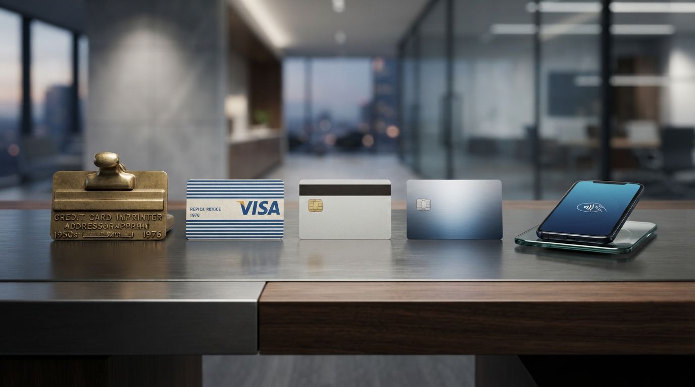
The journey of the Visa logo is a testament to the power of deliberate, strategic visual evolution. Over the course of more than six decades, the brand has navigated massive cultural, economic, and technological upheavals. It has survived the transition from paper vouchers to plastic cards, from magnetic stripes to EMV chips, and from physical cash registers to mobile wallets and decentralized digital ledgers.
Through it all, the Visa logo has remained a steadfast beacon of trust. By understanding when to hold onto its heritage and when to boldly strip away the old to embrace the new, Visa has built one of the most resilient and valuable visual identities in human history. As we look toward a future dominated by artificial intelligence, contactless biometrics, and virtual reality marketplaces, the Visa logo will undoubtedly continue to evolve, proving that no matter how the medium of exchange changes, the need for a trusted, recognizable symbol of secure commerce remains eternal.