Introduction: The Power of Visual Identity in Global Communication
In the contemporary digital landscape, instant messaging has evolved from a niche utility into the very fabric of global human connection. At the absolute forefront of this communication revolution sits WhatsApp, an application that hosts over two billion active users globally. While the platform’s robust architecture, end-to-end encryption, and seamless user interface have cemented its market dominance, its visual identity has played an equally critical role in its global adoption. The green speech bubble with an enclosed landline telephone receiver is one of the most recognized symbols on earth, transcending language barriers, cultural divides, and technological literacy levels. Understanding the WhatsApp Logo History: Design Evolution and Brand Identity provides a masterclass in how a digital brand can maintain visual consistency while adapting to shifting design aesthetics, operating system guidelines, and corporate acquisitions.
Every day, billions of fingers tap on this specific green icon. It represents safety, immediacy, and personal connection. In the realm of user experience (UX) and user interface (UI) design, the longevity of a logo is a rare achievement. While competitors like Instagram, Twitter (now X), and Slack have undergone radical, sometimes controversial rebrands, WhatsApp has chosen a path of disciplined, evolutionary refinement. This comprehensive analysis explores how a simple status update application transformed its visual assets into an iconic beacon of global communication, analyzing the psychological, technical, and strategic choices that have preserved its brand equity for over a decade and a half.
The Genesis of WhatsApp: Founding and Initial Visual Identity (2009)
To fully grasp the WhatsApp Logo History: Design Evolution and Brand Identity, one must return to the tech landscape of 2009. Founded by former Yahoo! employees Jan Koum and Brian Acton, WhatsApp was not initially conceived as the multi-featured messaging powerhouse we know today. Its original purpose was far simpler: to display “statuses” next to individual names in a user’s phone contact list. If you were at the gym, in a meeting, or running low on battery, WhatsApp would broadcast this state to your network.
The Apple App Store Revolution
The launch of the Apple App Store in 2008 had opened up a new frontier for mobile application developers. However, the design paradigms of the era were vastly different from today’s minimalist interfaces. Under the leadership of Steve Jobs and Scott Forstall, Apple promoted “skeuomorphism”—a design concept where digital elements mimic their real-world, physical counterparts to help users understand how to interact with them. It was within this skeuomorphic environment that the original WhatsApp logo was conceived.
The Symbolic Roots: Why a Telephone and a Speech Bubble?
The founders needed a visual metaphor that would immediately signal the app’s utility to a brand-new market. They merged two highly recognizable physical objects:
- The Speech Bubble: A universal comic-strip and cartoon convention representing spoken word, dialogue, and ongoing conversation. It signaled that the app was a space for text-based communication.
- The Landline Telephone Receiver: An interesting, slightly anachronistic choice. Even in 2009, mobile phones did not look like the traditional curved telephone handset. However, the classic receiver remained the universal icon for a phone call. By placing this receiver inside the speech bubble, the logo communicated a dual message: this is an app tied directly to your phone number, designed for direct, real-time, voice-like communication.
This clever combination of symbols bypassed the need for textual explanation. Whether a user was in Silicon Valley, São Paulo, or Mumbai, the icon clearly communicated: “This app is for talking on your phone.” This immediate clarity was a foundational pillar of WhatsApp’s explosive early growth.
Detailed Chronological Evolution of the WhatsApp Logo
The journey of the WhatsApp logo is a story of subtle perfectionism. Rather than executing disruptive redesigns, the brand has opted for microscopic adjustments that align with broader technological and design trends. Below, we break down the key phases of this evolution.
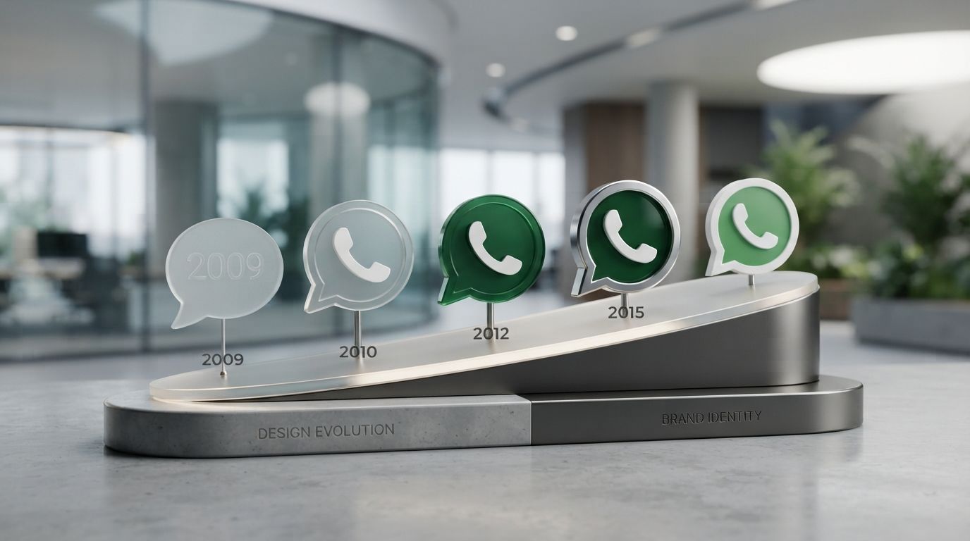
Phase 1: The Skeuomorphic Era (2009 – 2010)
The earliest iteration of the WhatsApp logo was a product of its time. It featured a rich, three-dimensional aesthetic designed to look like a physical, tactile button on an iPhone screen. The speech bubble was rendered with a pronounced, glossy glass overlay across its upper half, mimicking the way light refracts off a polished plastic or glass surface. This was accompanied by a distinct, dark green gradient that shifted from a lighter, yellowish-green at the top to a deep forest green at the bottom.
The white border surrounding the speech bubble was thick and featured a subtle inner shadow, giving the entire emblem a sense of depth and physical weight. The landline telephone receiver inside was also rendered with a slight 3D extrusion and a soft drop shadow, making it appear as though it was hovering slightly above the green background. This design succeeded because it looked clickable, inviting users to press down on their capacitive touchscreens.
Phase 2: Refined Textures and Android Integration (2010 – 2013)
As WhatsApp expanded beyond iOS to platforms like Android, BlackBerry, and Symbian, the logo required slight modifications to ensure it looked crisp across a highly fragmented landscape of screen resolutions. During this period, the glossy “glass” reflection was slightly toned down, and the green color palette was adjusted to a slightly brighter, more energetic hue. The gradient was made smoother, transitioning more naturally from top to bottom. The goal was to maintain the premium feel of the iOS application while adapting to the flatter, more utilitarian design languages of early Android versions.
Phase 3: The Flat Design Revolution (2013 – 2016)
In 2013, Apple released iOS 7, a historic turning point in digital design. Spearheaded by Jony Ive, iOS 7 completely abandoned skeuomorphism in favor of “flat design.” Out went the leather textures, wood grains, and glass reflections; in came bright gradients, stark minimalism, and thin typography. This shift forced every major app developer to overhaul their visual assets.
WhatsApp responded with its first major simplification. The glossy reflection on the speech bubble was completely removed. The deep 3D drop shadows were stripped away, leaving a flat, clean vector graphic. The thick, shadowed white border was replaced with a crisp, solid white outline. The green background was transitioned to a vibrant, solid tone (often referred to as WhatsApp Green, #25D366). This change made the logo incredibly versatile, allowing it to scale down to tiny sizes on low-resolution screens without losing its legibility.
Phase 4: The Meta Acquisition and Visual Standarization (2014 – 2020)
When Facebook (now Meta) acquired WhatsApp in 2014 for a historic $19 billion, branding experts wondered if the app would be absorbed into the Facebook blue ecosystem. However, Meta recognized the immense brand equity tied to WhatsApp’s distinct green identity. Instead of changing the brand, they standardized it.
During this phase, minor tweaks were made to the exact curvature of the speech bubble’s pointer (the triangular tail at the bottom-left). The tail was made slightly more rounded and organic. Additionally, the telephone receiver icon inside was mathematically realigned to sit perfectly in the optical center of the bubble, correcting minor geometric imperfections from the early hand-drawn vector days. This period also saw the introduction of strict brand guidelines, ensuring that third-party developers, advertisers, and partners used the exact same green hex codes and logo proportions globally.
Phase 5: Modern Adaptations, Dark Mode, and Meta Branding (2020 – Present)
With the rise of system-wide Dark Modes on iOS and Android, the WhatsApp logo had to become more adaptable than ever. The classic vibrant green icon, while perfect for light backgrounds, could cause visual strain on dark interfaces. WhatsApp introduced alternative colorways for the logo, including a deep teal-green variant (#075E54) and a simplified monochrome outline version for dark mode interfaces and in-app menus.
Furthermore, in late 2021, Facebook rebranded to Meta. This brought a subtle addition to the WhatsApp loading screens and settings pages: the “from Meta” wordmark, accompanied by the blue-to-purple infinity loop logo. However, the core WhatsApp logo remained completely untouched, reinforcing its status as an untouchable, highly protected corporate asset.
Anatomy of the WhatsApp Logo: Deconstructing the Design Elements
The enduring success of the WhatsApp logo lies in its mathematical simplicity and emotional resonance. By deconstructing the logo into its core design components, we can understand why it continues to perform so exceptionally well across diverse global markets.
1. The Speech Bubble (The Container)
The container of the logo is a rounded square (often referred to in design circles as a “squircle”) with a triangular pointer extending from the bottom-left corner. Unlike a sharp, mathematical square, the squircle feels friendly, approachable, and safe. The left-pointing tail mimics the standard alignment of incoming message bubbles in almost all chat applications. This instantly positions the user as the receiver of communication, establishing an subconscious expectation of connection and incoming news from loved ones.
2. The Telephone Receiver (The Core Symbol)
The white telephone receiver is angled at approximately 45 degrees, pointing upwards and to the right. In visual psychology, upward-right diagonals represent progress, positivity, growth, and forward movement. If the receiver were pointing downwards, it would subtly convey a dropped call, sadness, or operational failure. By maintaining this upward angle, the logo projects an aura of active, positive communication.
3. The Color Palette: The Psychology of Green
The choice of green as WhatsApp’s primary brand color was a stroke of genius, whether driven by deliberate psychological research or intuitive design. In branding, color is the first element a brain registers, long before it deciphers shapes or words. Let’s look at why green works so effectively for WhatsApp:
- Safety and Trust: Green is universally associated with safety (green lights mean “go”). In an era plagued by data breaches, digital surveillance, and spam, WhatsApp’s core selling point is its secure, end-to-end encryption. The green color reinforces the feeling that your private conversations are safe within a secure digital sanctuary.
- Freshness and Vitality: Unlike blue (which is corporate, cold, and heavily used by Facebook, Twitter, LinkedIn, and Zoom) or red (which signals urgency, danger, and passion), green represents growth, freshness, and calm energy. It makes the act of messaging feel organic and stress-free.
- Accessibility: The specific shade of WhatsApp green provides excellent contrast against both white and black backgrounds, meeting strict web accessibility standards (WCAG) to ensure readability for visually impaired users.
The primary colors used in the official brand guidelines include:
| Element | Hex Code | RGB Values | CMYK Values |
|---|---|---|---|
| WhatsApp Light Green | #25D366 | RGB(37, 211, 102) | CMYK(63, 0, 81, 0) |
| WhatsApp Teal Green (Dark) | #075E54 | RGB(7, 94, 84) | CMYK(88, 39, 65, 31) |
| WhatsApp Teal Blue | #128C7E | RGB(18, 140, 126) | CMYK(85, 24, 55, 6) |
4. Typography: The Silent Partner
While the icon is the star of the show, the WhatsApp wordmark is equally refined. The brand uses a clean, geometric sans-serif typeface. Originally relying on Helvetica Neue (the default iOS system font), the brand has transitioned to a customized, highly legible sans-serif that features clean vertical cuts, balanced tracking, and a sturdy, professional weight. The wordmark is set in all-lowercase or standard title case (“WhatsApp”), maintaining a casual, friendly, and non-intimidating brand voice.
Strategic Brand Consistency: Lessons for Modern Logo Designs
When studying the WhatsApp Logo History: Design Evolution and Brand Identity, there are invaluable lessons for contemporary businesses, brand strategists, and graphic designers. In a highly competitive digital market, the temptation to completely rebrand or execute dramatic visual pivots is incredibly high. However, WhatsApp’s discipline proves that visual equity is one of a company’s most valuable assets.
For businesses looking to craft a timeless brand identity, partnering with experienced agencies like Logo Designs can help navigate these complex creative choices. A great logo must be more than just aesthetically pleasing; it must be a strategic tool capable of scale, cultural translation, and long-term survival. Here are three critical strategic takeaways from WhatsApp’s visual journey:
1. Respect Visual Equity
Visual equity is the cumulative familiarity and trust a customer base associates with a brand’s design assets over time. When a user looks at their phone screen, their brain automatically scans for the green bubble to open WhatsApp. If Meta had changed this icon to a blue circle or a stylized ‘W’, millions of users would have experienced cognitive friction, potentially opening up opportunities for competitors like Telegram or Signal to capture their attention. WhatsApp understood that their design belonged to the users as much as it belonged to the company.
2. Design for Scalability and Versatility
A modern logo does not exist in a vacuum. It must look equally exceptional on a massive billboard in Times Square, a tiny favicon in a web browser tab, a push notification on a smartwatch screen, or embroidered on a corporate polo shirt. By simplifying their logo from a complex, skeuomorphic 3D image to a clean, flat vector graphic, WhatsApp ensured that their logo could scale infinitely without losing its structural integrity or becoming an unreadable blob.
3. Maintain Universal Symbolism
The choice of highly recognizable, culturally agnostic symbols (the speech bubble and the phone receiver) meant that WhatsApp never had to localize its logo for different global markets. The design speaks a universal visual language, allowing the brand to launch seamlessly in hundreds of countries without needing to redesign its core assets to fit local cultural sensitivities.
The Psychology of the Green Icon: Cultivating Trust and Security
In the digital age, trust is the ultimate currency. When users send personal messages, share intimate photos, or conduct business transactions, they require an environment that feels private and secure. The green hue of the WhatsApp logo works on a deep, subconscious psychological level to cultivate this sense of security.
According to extensive color psychology research, green is processed by the human eye with the least amount of strain. It is a color associated with homeostasis, balance, and peace. By presenting users with a calm green interface and icon, WhatsApp reduces the anxiety often associated with digital communication (such as the pressure of instant replies or the fear of digital exposure). This color choice has helped position WhatsApp not just as a tool, but as a safe, comfortable daily habit.
Furthermore, because green is so strongly associated with nature and growth, it gives the brand an organic feel. In contrast, the cold blues of Facebook or the aggressive reds/oranges of other platforms can feel corporate or high-pressure. WhatsApp feels like an extension of your natural social circle—a digital living room where you can speak freely.
Technical Specifications and Brand Guidelines of the WhatsApp Logo
To maintain absolute consistency across thousands of platforms, devices, and marketing materials, Meta enforces strict brand guidelines regarding the usage of the WhatsApp logo. These rules ensure that the visual identity is never diluted, distorted, or misrepresented.
Clear Space Requirements
To maintain visual impact, the WhatsApp logo must always be surrounded by a minimum amount of clear space. This prevents other graphic elements, text, or page borders from crowding the logo and reducing its legibility. The standard rule is that the clear space must be equal to at least 25% of the total width of the logo icon itself.
Prohibited Modifications
The official WhatsApp brand guidelines strictly prohibit several common design mistakes:
- No Color Alterations: The logo must never be rendered in colors other than the officially approved shades of green, white, or black.
- No Rotation or Tilting: The speech bubble and the internal telephone receiver must remain at their exact, designated angles. Rotating the logo is strictly forbidden.
- No Shadow Additions: In modern flat-design applications, adding drop shadows or glows to the logo is prohibited to maintain a clean aesthetic.
- No Modification of Elements: You cannot separate the telephone receiver from the speech bubble, nor can you replace the receiver with a modern smartphone icon.
Adaptive Icons on Modern Operating Systems
On modern mobile operating systems, app icons must adapt to different shapes defined by the user’s launcher theme—such as circles, squares, squircles, or teardrops. To accommodate this, the WhatsApp logo is designed as an “adaptive icon.” This means the core green speech bubble and white receiver exist on a separate foreground layer, while the green background exists on a flexible background layer. This ensures that no matter how an Android or iOS device crops the outer edges of the icon, the core brand assets remain perfectly centered, proportional, and undistorted.
Key Takeaways: The Evolution of an Icon
- Universal Metaphors Drive Adoption: The combination of a speech bubble and a classic telephone receiver bypassed language barriers, making the app immediately understandable to a global audience.
- Evolution Over Revolution: WhatsApp’s design strategy has prioritized subtle, evolutionary refinements rather than radical, disruptive rebrands, successfully preserving immense brand equity.
- Skeuomorphism to Minimalism: The logo’s journey mirrors the broader history of digital UI design, transitioning from a glossy, 3D tactile button in 2009 to a flat, highly versatile vector graphic today.
- Color Psychology is Crucial: The strategic use of green fosters a subconscious sense of safety, trust, and organic connection, aligning perfectly with WhatsApp’s core offering of secure, encrypted messaging.
- Strict Brand Standards Ensure Quality: By implementing rigid technical guidelines and adaptive icon designs, Meta ensures that the WhatsApp logo looks flawless across millions of unique devices and platforms.
Frequently Asked Questions
Who designed the original WhatsApp logo?
The original WhatsApp logo was designed in 2009 by a professional designer hired by founders Jan Koum and Brian Acton during the app’s initial development phase. The design was carefully crafted to align with Apple’s skeuomorphic design guidelines for the newly launched App Store.
Why is there a landline phone receiver in the WhatsApp logo instead of a modern smartphone?
The landline telephone receiver is a universal, instantly recognizable symbol for voice communication. Even though smartphones look different today, the classic curved receiver remains the international visual metaphor for a call. Using a modern flat rectangle (smartphone) would have lacked the immediate, intuitive clarity of the classic receiver.
What does the green color of the WhatsApp logo represent?
In color psychology, green represents safety, trust, freshness, and calm. For WhatsApp, this color reinforces the secure nature of their end-to-end encrypted messaging platform, making users feel safe while communicating privately with friends, family, and businesses.
Has the WhatsApp logo changed since the Facebook/Meta acquisition?
No major changes were made to the core logo after the acquisition. Meta recognized the immense value of WhatsApp’s established visual identity and chose to preserve the green speech bubble and phone receiver, making only microscopic geometric refinements and introducing a subtle “from Meta” wordmark on loading screens.
Can I use the WhatsApp logo on my business website or marketing materials?
Yes, you can use the WhatsApp logo to direct customers to your WhatsApp chat or business profile. However, you must adhere strictly to the official brand guidelines, which prohibit changing the logo’s color, rotating it, adding shadows, or distorting its proportions.
Conclusion: The Future of WhatsApp’s Brand Identity
The WhatsApp Logo History: Design Evolution and Brand Identity is a testament to the power of thoughtful, disciplined design. By anchoring their visual identity in universal human metaphors and maintaining an unwavering commitment to brand consistency, WhatsApp has created an icon that is as functional as it is culturally significant. It is a symbol that does not need to shout to be heard; its quiet green presence on a smartphone screen is a reassuring promise of instant, secure connection.
As we look to the future, the boundaries of communication will continue to expand. With the rise of augmented reality (AR), virtual reality (VR), and artificial intelligence (AI), the ways we interact with digital interfaces will inevitably shift. However, because WhatsApp’s visual identity has been stripped of unnecessary complexity and refined to its absolute essence, it is uniquely positioned to transition into these new digital dimensions. Whether displayed on a flat mobile screen, projected in a holographic interface, or integrated into a smart wearable device, the little green speech bubble will undoubtedly remain a global beacon of human connection, continuing its legacy as one of the greatest achievements in modern logo design history.