Introduction
The artificial intelligence landscape has undergone a tectonic shift over the past few years. From the public release of generative pre-trained transformers to the integration of machine learning algorithms in everyday enterprise software, AI has transitioned from a futuristic concept into a core pillar of modern global industry. In this highly competitive environment, branding is not merely an afterthought; it is a critical asset. Companies must establish trust, project technological superiority, and convey complex philosophical orientations through a single visual mark. Within this context, the visual identity of Elon Musk’s artificial intelligence venture, xAI, stands out as a masterclass in minimalist design and strategic messaging. Understanding the xAI Logo History: The Story Behind Elon Musk’s AI Brand offers profound insights into how modern tech conglomerates construct their visual narratives to capture market share and project long-term vision.
To fully appreciate the significance of the xAI logo, one must look at the broader macro-trends in technology branding. Historically, tech companies relied on friendly, approachable logos—often characterized by soft curves, playful primary colors, and anthropomorphic elements—to ease public anxiety surrounding new technologies. Think of early Apple, Google, or even the whimsical nature of early internet browser icons. Today, however, the paradigm has shifted. As artificial intelligence approaches artificial general intelligence (AGI), the visual language of the industry has become more abstract, mathematical, and starkly industrial. The xAI logo is a prime example of this new era of design: it is sharp, monochromatic, geometrically precise, and deeply intertwined with the personal brand of its founder, Elon Musk. This comprehensive analysis explores the history, design philosophy, cultural context, and market impact of the xAI logo, tracing how it fits into Musk’s broader “X” ecosystem.
The Genesis of xAI: Elon Musk’s Vision for Artificial Intelligence
To understand the visual identity of xAI, one must first understand why the company was founded. Elon Musk has had a long, complex, and often contentious relationship with the development of artificial intelligence. As an early co-founder and major financial backer of OpenAI in 2015, Musk’s initial goal was to create a non-profit research lab that would act as a counterweight to the proprietary AI development being conducted by tech giants like Google. However, due to disagreements over the direction of the company and its transition into a capped-profit model, Musk departed OpenAI’s board in 2018.
The Founding of xAI and Its Mission
In July 2023, Elon Musk officially announced the formation of xAI. The company was established with an incredibly ambitious, almost philosophical mission statement: “to understand the true nature of the universe.” Unlike competitors who focused primarily on conversational utility or productivity tools, xAI was positioned as a scientific endeavor. Musk assembled a team of elite researchers from top institutions and companies, including Google DeepMind, Microsoft Research, Tesla, and the University of Toronto, to build an AI capable of advanced mathematical reasoning, scientific discovery, and objective truth-seeking.
Challenging the Status Quo: OpenAI and Anthropic
The establishment of xAI was also a direct challenge to the dominant players in the generative AI space, namely OpenAI (the creators of ChatGPT) and Anthropic (the creators of Claude). Musk publicly criticized these organizations for what he perceived as politically biased, overly censored, or commercially compromised AI models. He argued that the world needed a truth-seeking AI that was not afraid to tackle complex, controversial, or mathematically rigorous questions. This philosophical stance required a brand identity that was radically different from the soft, organic, and safe branding of its rivals. It demanded an identity that was bold, raw, and uncompromisingly intellectual.
The Fascination with “X”: The Historical Context of Elon Musk’s Branding
The xAI logo does not exist in a vacuum. It is the latest chapter in a multi-decade obsession that Elon Musk has had with the letter “X.” For Musk, the letter “X” represents the unknown variable, the future, exploration, and the ultimate destination. To understand the xAI Logo History: The Story Behind Elon Musk’s AI Brand, we must first trace the lineage of this single letter across his business portfolio.
From X.com (1999) to PayPal
The origin of Musk’s use of the letter “X” dates back to 1999 when he co-founded X.com, an online financial services and e-mail payment company. While business partners and marketing consultants advised against the name, fearing it carried inappropriate connotations, Musk was steadfast. X.com eventually merged with Confinity to become PayPal, but Musk never lost his passion for the original domain name or the brand concept. Decades later, in 2017, Musk repurchased the X.com domain name from PayPal, stating that it held great sentimental value to him.
SpaceX and Tesla Model X
In 2002, Musk founded Space Exploration Technologies Corp., which would become universally known as SpaceX. The logo of SpaceX features a highly stylized “X” where the rightmost stroke of the letter is transformed into a rocket’s trajectory, symbolizing the company’s mission to reach orbit and eventually colonize Mars. Later, when designing Tesla’s product lineup, Musk insisted on naming their premium SUV the Model X, which, alongside the Model S, Model 3, and Model Y, completed the cheeky acronym “S3XY.”
The Acquisition and Rebranding of Twitter to X
The ultimate realization of Musk’s “X” brand ecosystem occurred in 2023, following his $44 billion acquisition of Twitter. In a swift and highly publicized move, Musk retired the iconic blue bird logo—one of the most recognizable brand assets in the world—and replaced it with a stark, mathematical Unicode character: the mathematical double-struck capital X. This rebranding marked the transition of the microblogging platform into an “everything app” named X. It was during this massive consolidation of the “X” brand that xAI was launched, ensuring that the new artificial intelligence company would share the same visual DNA as the rest of Musk’s empire.
xAI Logo History: The Story Behind Elon Musk’s AI Brand
The official unveiling of the xAI logo in July 2023 marked a significant moment in the visual history of artificial intelligence branding. The logo serves as a bridge between the mathematical abstraction of advanced compute structures and the stark minimalism that defines modern luxury and tech branding.
The Unveiling of the xAI Logo
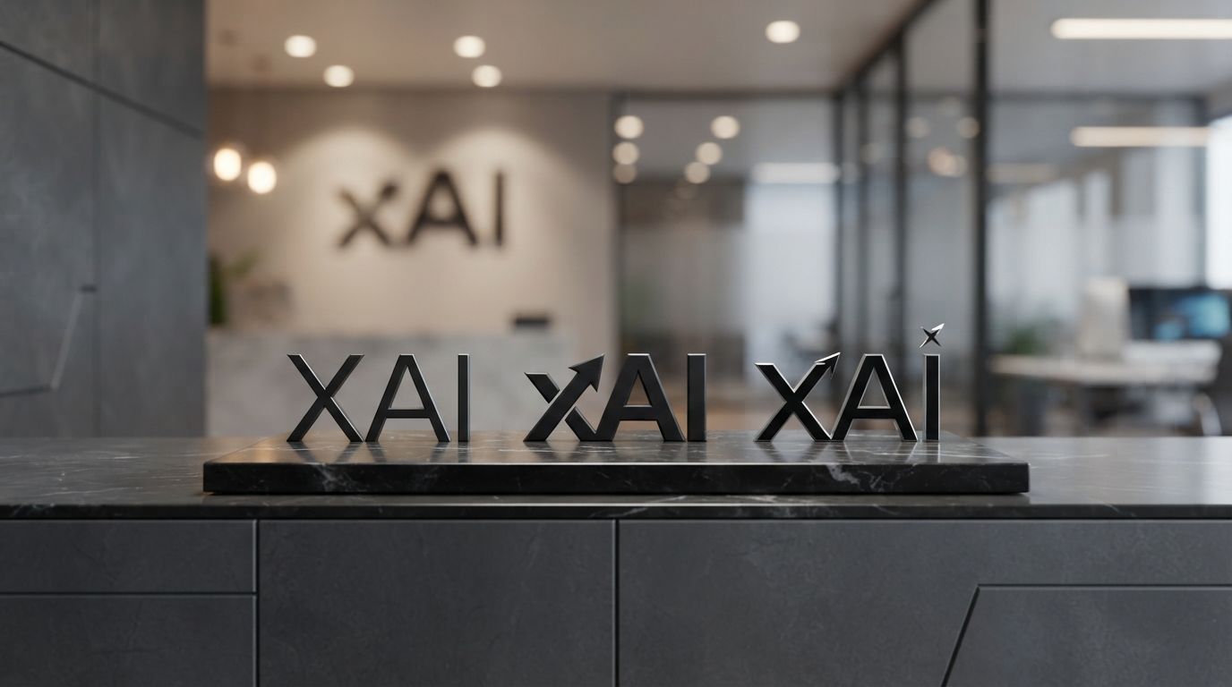
When xAI launched its website and official social media accounts, the world was introduced to a logo that was both strikingly simple and conceptually dense. The design consists of a custom-designed, lowercase letter “x” that seamlessly integrates with uppercase letters “A” and “I”. Unlike traditional logos that display these letters as separate, distinct entities, the xAI logo merges them into a single, continuous glyph. This design choice immediately signaled that xAI was not just another software company; it was an integrated ecosystem where the variable “x” and “AI” were fundamentally inseparable.
Visual Aesthetics: Minimalism Meets Mathematical Precision
At first glance, the xAI logo appears as a sleek, geometric monogram. The lines are clean, with consistent stroke weights that suggest mathematical precision. It avoids any unnecessary decorative elements, gradients, or shadows. This commitment to extreme minimalism is a deliberate design strategy. In the digital age, logos must scale seamlessly from massive outdoor billboards to tiny 16×16 pixel favicons on web browsers or mobile app screens. By utilizing a clean, high-contrast black-and-white design, the xAI logo ensures perfect legibility and brand recognition across all digital and physical mediums.
Structural Analysis of the “x” and “AI” Glyphs
A closer look at the anatomy of the xAI logo reveals a fascinating interplay of positive and negative space. The left side of the logo features the classic diagonal strokes of the lowercase “x”. However, the right-descending stroke of the “x” does not simply end; instead, it transitions smoothly into the left vertical incline of the letter “A”. The letter “I” stands adjacent, rendered as a simple, elegant vertical bar. This fluid transition creates a sense of motion and integration. It suggests that artificial intelligence (AI) is the natural progression and solution to the unknown variables (x) of our universe.
The Evolution of Modern Tech Branding and Logo Designs
The creation of the xAI logo reflects a broader evolution in the field of professional graphic design, particularly within the technology sector. Modern tech brands have largely abandoned the complex, multi-colored, and highly detailed emblems of the early 2000s in favor of flat, geometric, and highly versatile vector marks. This shift has redefined how design agencies approach brand identity creation.
Geometric Sans-Serif and Custom Glyphs
In contemporary brand development, generic fonts are rarely sufficient for high-profile tech firms. Designers increasingly turn to custom typography and bespoke glyphs to establish a unique visual footprint. The xAI logo utilizes a custom-drawn typeface that cannot be found in standard font libraries. This ensures that the logo remains entirely unique and legally protectable. The geometry of the letters is carefully calibrated, utilizing precise angles and ratios that evoke a sense of structural engineering and architectural stability.
Negative Space and Spatial Balance in Tech Logos
One of the hallmarks of exceptional logo design is the clever use of negative space—the empty space around and between the subject of an image. In the xAI logo, the spacing (or kerning) between the integrated “xA” and the standalone “I” is meticulously balanced. This spatial relationship creates a visual rhythm that guides the viewer’s eye across the mark. The tension between the joined letters and the separate vertical bar of the “I” reflects the balance between connection and independence, a core theme in the relationship between human creators and artificial intelligence systems.
Decoding the Symbolic Meaning of the xAI Logo
A great logo is more than just an aesthetic mark; it is a visual metaphor. The xAI logo contains several layers of symbolic meaning that align with the company’s stated mission to understand the universe and build a safe, curious, and truth-seeking artificial intelligence.
The Variable “X” in Mathematics and Science
In algebra, physics, and computer science, the letter “x” is the universal symbol for the unknown variable. It represents the question that needs to be answered, the equation that needs to be solved, and the frontier that has yet to be explored. By placing the “x” at the forefront of its brand, xAI positions itself as an exploratory venture. The logo suggests that the company’s primary tool for solving these unknown variables is artificial intelligence, represented by the “AI” that is structurally fused to the “x”.
The Fusion of Humanity and Artificial Intelligence
The physical joining of the “x” and the “A” in the logo can also be interpreted as a symbol of integration. One of the greatest challenges of the 21st century is the alignment problem—ensuring that artificial intelligence remains aligned with human values, safety, and progress. The seamless connection within the logo represents the harmonious integration of human curiosity (the desire to solve for “x”) and machine intelligence (AI). It visualizes a future where AI does not replace humanity, but rather acts as an extension of human intellect and capability.
The Monochromatic Palette: Why Black and White?
Color psychology plays a vital role in brand perception. While many AI companies use shades of blue (signifying trust and stability) or green (signifying growth and intelligence), xAI opts for a strict monochromatic palette of deep black and stark white. Black represents sophistication, power, mystery, and the deep, unexplored reaches of space and computation. White represents clarity, truth, and simplicity. Together, this high-contrast pairing reflects xAI’s commitment to cutting through the noise of the tech industry to deliver objective, unvarnished truths.
Comparing xAI’s Brand Identity with Competitors
To fully grasp the strategic positioning of the xAI brand, it is highly instructive to compare its logo and visual identity with those of its primary competitors in the artificial intelligence sector. This comparison highlights how different philosophical approaches to AI development manifest in visual design.
OpenAI’s Spiral: Natural Complexity vs. Rigid Geometry
OpenAI’s logo is a highly recognized, symmetrical spiral that resembles a flower, a camera aperture, or a stylized representation of a neural network. Designed to evoke organic growth, complexity, and the interconnectedness of all things, OpenAI’s logo feels warm, mathematical yet natural, and approachable. In contrast, the xAI logo is sharp, angular, and industrial. While OpenAI presents AI as a natural, evolving ecosystem, xAI presents it as a precise, engineered tool designed for rigorous scientific inquiry.
Anthropic’s Organic Serif: Human-Centric AI Branding
Anthropic, the safety-focused AI research company founded by former OpenAI employees, takes a radically different approach to its visual identity. Anthropic’s logo features a custom, slightly organic serif font that looks almost hand-carved or printed via letterpress. The edges are soft, and the overall aesthetic is warm, literary, and deeply humanistic. This choice reflects Anthropic’s core mission of building “constitutional” AI that is safe, helpful, and deeply aligned with human ethics. The xAI logo, by comparison, rejects this soft, literary aesthetic in favor of a hyper-modern, digital-first geometric sans-serif that emphasizes compute power and raw analytical capability over soft humanism.
Google Gemini’s Sparkle: Magical Evolution vs. Mathematical Structure
Google’s Gemini utilizes a multi-colored, four-point star or “sparkle” icon as its primary brand mark. This design is highly reminiscent of the “magic” or “auto-create” icons commonly used in software UI to denote automated, AI-driven features. It is playful, magical, and deeply integrated into Google’s consumer-friendly ecosystem. The xAI logo stands in stark opposition to this “magical” representation. Rather than framing AI as a magical trick or a whimsical assistant, xAI frames it as a structural, logical, and mathematical reality, stripped of any childish or superficial decorations.
Key Takeaways: Lessons from the xAI Brand Identity
The development of the xAI logo offers several critical lessons for branding experts, graphic designers, and tech entrepreneurs alike. Here are the key takeaways from our analysis:
- Embrace Minimalism for Scalability: The xAI logo proves that a simple, monochromatic, geometric design is highly versatile, ensuring perfect legibility across all digital platforms and physical applications.
- Leverage the Power of the Founder’s Brand: By incorporating the letter “X”, xAI instantly benefits from the massive global brand equity and media attention associated with Elon Musk’s other multi-billion-dollar ventures, such as SpaceX, Tesla, and X.
- Visual Metaphors Drive Mission Statements: The seamless physical connection between the “x” and the “AI” in the logo visually communicates the company’s core mission—using artificial intelligence to solve the unknown variables of the universe.
- Differentiate Through Contrast: In a market saturated with friendly, colorful, and organic AI logos, xAI successfully differentiated itself by adopting a stark, sharp, and uncompromisingly industrial aesthetic.
- Custom Typography Establishes Ownership: Using custom-drawn glyphs rather than standard fonts protects the brand legally and ensures that the visual identity remains entirely unique and instantly recognizable.
Frequently Asked Questions
Who designed the xAI logo?
While the exact individual designer or agency responsible for the final xAI logo has not been officially publicized, it was developed under the close creative direction of Elon Musk and his core brand design team, who handle the visual identities across his portfolio, including X and SpaceX.
What does the “x” in xAI stand for?
The “x” represents the mathematical variable for the unknown, signifying exploration, curiosity, and the company’s ultimate mission to solve complex scientific and philosophical questions to understand the true nature of the universe.
How does the xAI logo connect to the Twitter/X logo?
Both logos are part of Elon Musk’s unified “X” brand ecosystem. They share a similar minimalist, geometric aesthetic and use a high-contrast black-and-white color palette to project a futuristic, industrial, and highly cohesive brand identity.
Why did xAI choose a black-and-white color scheme?
The monochromatic palette was chosen to project sophistication, authority, and mathematical clarity. It avoids the distractions of color trends, ensuring the logo remains timeless, highly legible, and distinct from colorful competitor brands.
What is Grok, and does it have its own logo?
Grok is the conversational AI assistant developed by xAI. It features its own distinct brand identity—often represented by a stylized, minimalist slash or geometric mark—that complements the primary xAI logo while maintaining a playful, rebellious personality.
Conclusion
The story of the xAI logo is a compelling testament to the power of strategic visual communication in the high-stakes world of artificial intelligence. By seamlessly merging the historical legacy of Elon Musk’s “X” brand with the cutting-edge requirements of modern AI development, the logo stands as a powerful symbol of mathematical precision, scientific curiosity, and bold technological ambition. As we have seen throughout this exploration of the xAI Logo History: The Story Behind Elon Musk’s AI Brand, the visual identity of xAI does not merely decorate the company; it defines it. It positions xAI not as a mere software developer, but as an exploratory force determined to unlock the secrets of our universe. In an era where AI technology continues to evolve at a breakneck pace, this stark, minimalist, and deeply symbolic mark will undoubtedly remain a focal point of the global technological narrative for years to come.