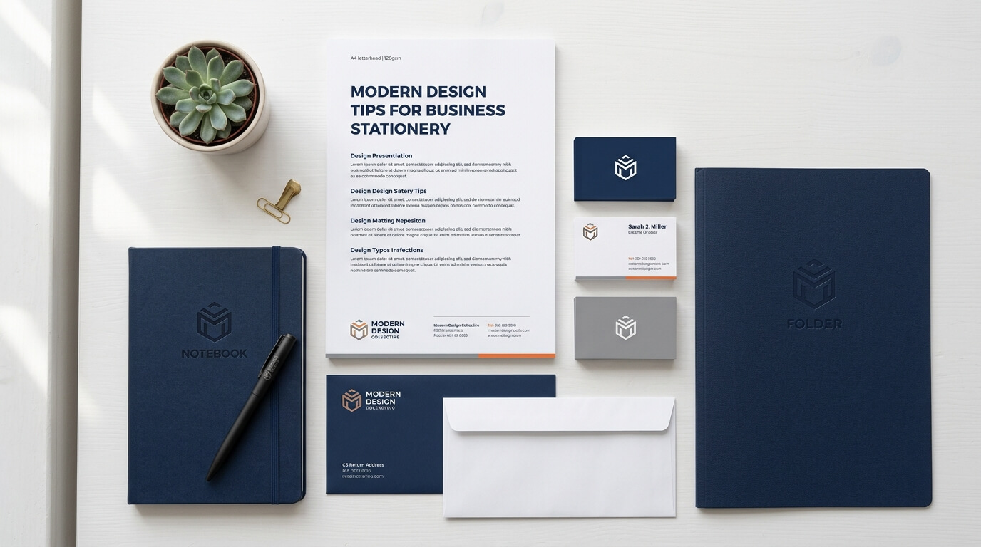
Introduction:
Business stationery is no longer limited to a simple letterhead, business card, or envelope carrying a company logo. In modern business communication, stationery plays an important role in shaping how a brand is perceived. Even as digital communication continues to dominate everyday business activity, professionally designed printed materials can create a sense of credibility, consistency, and attention to detail that digital messages do not always provide.
Modern business stationery combines practical communication with thoughtful visual design. It should look contemporary without becoming overly decorative, communicate important information clearly, and reflect the personality of the business. Whether you are creating stationery for a startup, established company, professional service provider, creative agency, retail business, or corporate organization, the design choices you make can influence how customers and business partners experience the brand.
A successful stationery system does not need to be complicated. In fact, modern design often relies on simplicity, purposeful typography, balanced layouts, and consistent branding. The goal is to create materials that look polished while remaining easy to use. From choosing the right colors and fonts to selecting paper and creating a consistent visual identity, every element has a role.
Understand Your Brand Before Designing Stationery
Before selecting colors, fonts, layouts, or decorative elements, it is important to understand the brand that the stationery represents. Business stationery should feel like an extension of the company’s existing identity rather than a completely separate design project.
A business that already has a logo, brand colors, typography guidelines, and visual style should use those elements as the foundation. If the website uses a clean minimalist design, the stationery should generally follow a similar visual direction. If the company has a more traditional identity, completely replacing that style with experimental graphics may create inconsistency.
Define the Personality of the Business
Every business has a personality, even when it has never formally documented one. A financial consultancy may want to communicate professionalism and reliability, while a creative studio may prefer a more expressive and contemporary appearance. A law firm may require a restrained and authoritative design, while a technology startup may benefit from a cleaner and more innovative visual approach.
Understanding this personality helps determine whether the stationery should be formal, minimalist, bold, elegant, friendly, traditional, or creative. The design should support the brand’s communication rather than compete with it.
Keep Brand Consistency at the Center
Consistency is one of the most important principles of modern stationery design. Letterheads, business cards, envelopes, folders, invoices, presentation materials, and other printed items should look as though they belong to the same brand family.
This does not mean every item needs to look identical. Instead, they should share recognizable elements such as typography, colors, logo treatment, spacing, graphic details, and visual proportions. This creates a unified identity that customers can recognize across different communication channels.
Embrace Simplicity in Modern Stationery Design
Modern design often favors simplicity because clean layouts are easier to understand and tend to remain visually relevant for longer. A stationery design does not need numerous decorative elements to appear professional.
A strong logo, carefully selected typography, balanced spacing, and a restrained color palette can create a sophisticated result. When too many design elements compete for attention, the most important information can become difficult to find.
Use White Space Effectively
White space is one of the most useful tools in stationery design. It refers to the empty areas surrounding text, logos, graphics, and other elements. Rather than treating empty space as wasted space, designers use it to create visual breathing room.
A letterhead with generous margins can feel more organized and professional. A business card with carefully controlled spacing can make contact details easier to read. White space also helps establish hierarchy by separating important information from supporting details.
Modern stationery should therefore avoid the temptation to fill every available area. Leaving appropriate empty space can make a design feel more intentional and premium.
Avoid Overcrowding the Layout
Business stationery has a practical purpose. It needs to communicate information efficiently. Including a logo, slogan, multiple phone numbers, social media accounts, several website addresses, decorative graphics, and excessive contact information can quickly make a design feel cluttered.
Instead, determine which information is genuinely necessary for each stationery item. A business card, for example, may need the person’s name, position, phone number, email address, website, and company branding. A letterhead may require company details and contact information but does not need every social media profile.
Choose Typography That Supports Communication
Typography can dramatically change how business stationery looks and feels. The right typeface can make a company appear modern, established, approachable, or sophisticated. The wrong combination can make even an otherwise attractive design feel confusing or outdated.
Select Readable Fonts
Readability should always come before decoration. Business stationery is used to communicate information, so the text must remain easy to read at normal viewing sizes.
Sans-serif fonts are often associated with modern and clean visual identities, while serif fonts can provide a more traditional or editorial character. Either can work effectively when selected appropriately. The most important consideration is whether the typeface remains clear in both digital previews and printed materials.
Limit the Number of Font Families
Using too many fonts can make stationery look inconsistent. In most cases, one or two complementary typefaces are enough. One font can be used for headings or names while another handles supporting information.
Typography should also have a clear hierarchy. Names, company information, headings, addresses, and contact details should not all appear at exactly the same visual weight. Differences in size, weight, spacing, and placement help readers understand what information matters most.
Create a Thoughtful Color Palette
Color is another important part of modern business stationery. It can reinforce brand recognition while influencing the overall mood of the design.
A company with an established color palette should generally use those colors consistently. If a business is developing its visual identity from scratch, it should consider how different colors relate to its industry and desired brand personality.
| Stationery Element | Modern Design Consideration | Primary Purpose |
| Letterhead | Clean header, restrained branding, generous margins | Professional communication |
| Business Card | Strong hierarchy and concise contact information | Networking and identification |
| Envelope | Consistent logo and brand placement | Brand recognition |
| Folder | Balanced branding with practical information | Presentations and documents |
| Invoice | Clear typography and organized sections | Financial communication |
| Notepad | Simple identity with functional writing space | Everyday business use |
Use Accent Colors Carefully
A small amount of color can have a significant visual impact. An accent color can highlight a name, divider, logo detail, or important contact information without overwhelming the overall design.
Using every brand color at maximum intensity, however, can make stationery appear busy. A restrained approach often produces a more contemporary result. Neutral backgrounds combined with one or two brand accents can create a clean and flexible visual system.
Design for Different Stationery Formats
One common mistake is creating one design and applying it identically to every stationery item. Different materials have different purposes and dimensions, so the visual system should be flexible.
A letterhead has more room for information than a business card. An envelope has a different viewing area and may need to prioritize the recipient’s address. A folder can support larger graphic elements, while an invoice needs highly structured information.
Business Cards Need Strong Hierarchy
Business cards are often viewed quickly, sometimes during a conversation or networking event. The design should therefore communicate essential information almost immediately.
The company name or logo should be recognizable without dominating the entire card. The person’s name and role should have clear prominence, while contact information should remain easy to locate. Modern business cards can also incorporate subtle patterns, unusual layouts, or specialty finishes, but these elements should not reduce usability.
Letterheads Should Prioritize Writing Space
A letterhead needs to provide enough branding to identify the company without taking valuable space away from the actual message. Modern letterheads often use a restrained header and footer, leaving the center of the page relatively open.
This is particularly important for companies that send proposals, formal letters, contracts, notices, or other documents. The stationery should support the content rather than compete with it.
Think About Digital and Print Compatibility
Modern business stationery increasingly exists in both physical and digital formats. A letterhead may be printed on paper, converted into a PDF, or used as part of an electronic document.
This means the design should work across different environments. Very subtle details that look attractive in high-quality printing may disappear when a document is viewed digitally or printed on an ordinary office printer.
Design With Real-World Printing in Mind
A design may look excellent on a screen but produce disappointing results when printed. Colors can shift, fine lines can disappear, and certain effects may not reproduce as expected.
Designers should consider the printing process, paper type, ink coverage, margins, and final dimensions before approving the stationery. It is also useful to produce physical proofs because printed materials can look different from digital previews.
Choose Paper That Complements the Design
The visual design is only one part of the stationery experience. Paper quality can influence how a business is perceived, especially for materials that customers physically handle.
A heavier stock can make business cards feel substantial, while a smooth professional paper may work well for formal correspondence. Textured paper can introduce a tactile quality, while recycled stocks can support brands that want a more environmentally conscious visual identity.
Match Material Choices With Brand Positioning
Paper should support the brand rather than be selected simply because it feels expensive. A premium law firm, luxury consultancy, creative studio, and environmentally focused organization may all require different material choices.
The best option depends on the purpose, audience, budget, printing process, and brand identity. Modern stationery design considers the complete experience rather than focusing only on appearance.
Incorporate Subtle Graphic Elements
Modern stationery can benefit from graphic elements such as geometric shapes, lines, patterns, icons, or abstract forms. These elements can give otherwise simple designs a distinctive personality.
The key is subtlety. A graphic element should reinforce the identity instead of becoming the primary focus. For example, a small geometric pattern inspired by the company’s logo can appear along the edge of a folder or business card. A thin line can separate contact information from the main content on a letterhead.
Develop a Signature Visual Detail
One effective approach is to create a recognizable visual feature that appears throughout the stationery system. This might be a particular corner treatment, recurring shape, subtle pattern, or distinctive color combination.
Such a detail can help different materials feel connected without making them identical. Over time, customers may begin to associate that visual feature with the company.
Consider Sustainable Stationery Choices
Sustainability has become increasingly relevant to modern business design. Companies are paying more attention to paper sourcing, production methods, packaging, and material waste.
Choosing responsibly sourced paper, recycled materials, recyclable packaging, or efficient printing methods can reduce unnecessary environmental impact. At the same time, businesses should avoid adding sustainability claims to stationery unless those claims can be supported.
Modern design can also reduce material usage through efficient layouts. A carefully planned design may require less ink or avoid unnecessary inserts while still looking professional.
Make Accessibility Part of the Design Process
Professional stationery should be usable by as many people as possible. Small text, low contrast, overly decorative typefaces, and crowded layouts can create unnecessary barriers.
Text should have sufficient contrast against its background, while font sizes should remain practical for the intended medium. Contact information should not be placed in areas where it becomes difficult to distinguish from decorative graphics.
Accessibility does not require sacrificing aesthetics. In many cases, accessible design principles naturally support the clean hierarchy and clarity associated with modern stationery.
Avoid Trends That Will Age Quickly
Modern does not necessarily mean following every current design trend. Some visual trends become outdated quickly, while a well-structured design can remain effective for many years.
Businesses should be particularly careful with excessive gradients, complicated illustrations, unusual typography, or decorative effects that may quickly become associated with a specific design era. Trends can be incorporated through subtle details while the main structure remains timeless.
Balance Contemporary and Timeless Design
A strong stationery system should feel current without requiring a complete redesign every year. A timeless foundation can include clean typography, strong spacing, consistent branding, and a carefully controlled color palette.
Contemporary touches can then be added through subtle graphic details, paper choices, finishes, or layout variations. This approach gives businesses room to evolve without constantly replacing their entire stationery collection.
Create a Consistent Stationery System
Modern stationery works best when individual pieces are treated as parts of a larger system. Instead of designing a business card, letterhead, envelope, folder, and invoice separately, consider how they will appear together.
When these materials share design principles, the brand becomes easier to recognize. The logo may appear in different positions, but its treatment remains consistent. Typography can adapt to each format while retaining the same basic hierarchy. Colors can be adjusted according to the amount of available space without losing brand identity.
This system-based approach also makes future design work easier. When the company creates new materials, designers can use established rules rather than starting from scratch.
Review the Design From the Customer’s Perspective
Before finalizing business stationery, look at it as someone who has never seen the brand before. Can the company be identified immediately? Is the most important information easy to find? Does the design communicate the intended level of professionalism? Does anything feel unnecessary?
It can also help to test designs at their actual printed size. A business card viewed on a large computer screen may look excellent but feel crowded when held in the hand. Similarly, a letterhead that appears balanced digitally may have too little writing space when used for a multi-page document.
Feedback from employees, customers, or professional designers can reveal practical issues that are easy to miss during the design process.
Conclusion
Modern business stationery combines branding, communication, usability, and visual design. The most effective designs are not necessarily the most complicated. They use clear typography, thoughtful spacing, appropriate colors, consistent branding, practical layouts, and quality materials to create a professional experience.
Businesses should approach stationery as part of their broader brand identity rather than as a collection of unrelated printed items. When letterheads, business cards, envelopes, folders, invoices, and other materials follow a consistent visual system, every piece of communication can reinforce recognition and credibility.
The strongest modern stationery designs also balance contemporary aesthetics with long-term usability. By focusing on clarity, consistency, accessibility, material quality, and purposeful design choices, businesses can create stationery that looks professional today and continues to represent the brand effectively over time.
Frequently Asked Questions
Q1. What makes business stationery look modern?
Modern business stationery usually emphasizes simplicity, clean typography, balanced spacing, restrained colors, strong visual hierarchy, and purposeful branding. The design should look contemporary while remaining practical and easy to read.
Q2. How many colors should business stationery use?
There is no fixed number, but a limited palette is usually easier to manage. Using the brand’s primary colors with one or two supporting or neutral tones can create a consistent and professional appearance without making the stationery feel crowded.
Q3. Should all business stationery use the same design?
All stationery should share a consistent visual identity, but individual materials do not need to look identical. Business cards, letterheads, envelopes, folders, and invoices have different purposes and should be adapted accordingly while maintaining common branding elements.
Q4. Is minimalist stationery better for a business?
Minimalist design can improve clarity and create a polished appearance, but it is not automatically appropriate for every business. The design should reflect the company’s personality, industry, audience, and communication needs.
Q5. Why does paper quality matter in stationery design?
Paper contributes to the physical experience of printed communication. Its weight, texture, finish, and appearance can influence how recipients perceive the professionalism and character of a brand. The right paper should complement both the design and the purpose of the stationery.